


For the third day of dashboard week for DSNY12, we were asked to create a dashboard that focused on a specific kind of accessibility enablement.
Everyone was assigned a scenario where we would need to make our dashboard usable for at least one kind of accessibility requirement, and ideally we would add others.
I was assigned to make sure my dashboard was usable for someone that used keyboard navigation to view dashboards using a dataset that explored the accessibility of London’s top attractions and their nearest stations.
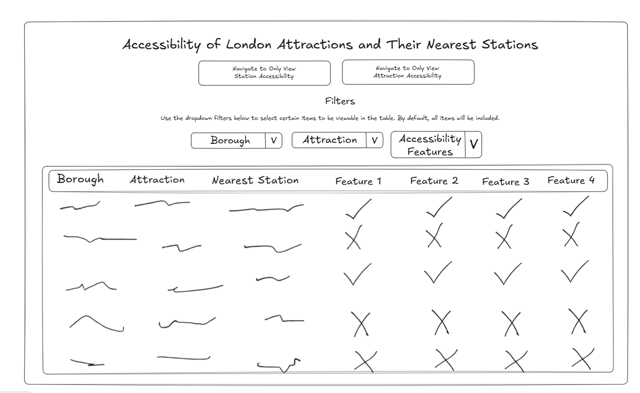
My sketch ended up being a table that a user could select filters with, and be able to navigate between a station view and an attraction view.
My final dashboard ended up being similar, but there were a few hiccups along the way. Firstly, the way the data was set up made it impossible (or at least it would’ve taken longer than I had time for before presentations) to filter the measures. That meant that I had to include all measures by default, and the only ones that could be filtered were the borough, attraction, and the nearest station.
Also, when using keyboard navigation, the section of the dashboard you currently have selected is indicated by a thin blue square, which wasn't easily visible by default, so I ended up changing the dashboard background to light yellow to make the blue box stand out a little more. For this same reason, I removed all of the object borders I had throughout the day while I was working on the dashboard because they obstructed the blue navigation box. I wish there was a way to remove the borders from filters, as they are still slightly obstructed. However, I am slightly concerned now that there is not much to visually break up the objects in the dashboard. It could be visually overwhelming.
The field names were also very long, and when using keyboard navigation, you can’t hover to view a field full name, so all of the headings had to be expanded so they were visible in full. However, publishing to Tableau Public changes the spacing of your sheets, so it took me several attempts of publishing the dashboard to get the spacing correct.
I also ended up switching the marks from checks and xs to just the words, as I felt it was more universal for screen readers. Additionally, I added instructions for people unfamiliar with keyboard navigation on how it can be used in the dashboard.
I also wanted to make sure the dashboard was intuitively navigable for keyboard users, so I adjusted the layout of the dashboard to be almost completely linear. This way, the directions the user is moving with the dashboard is much easier to grasp from the get-go.
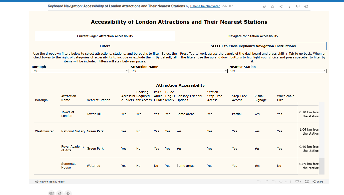
You can read the dashboard yourself here > https://public.tableau.com/app/profile/helena.r/viz/KeyboardNavigationAccessibilityofLondonAttractionsandTheirNearestStations/Attractions !
Looking forward to day 4!