


Day 4 of Dashboard Week gave us the opportunity to use APIs to create infographics using data from a List of Threatened Species.
I decided to choose the African penguin and hone in on a call to action and explain why they’re endangered.
First, I had to work on my Alteryx flow, as the API produced some very complex data.
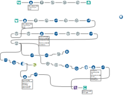
I was initially very focused on using the dataset itself, and just cleaning up what was available, but this ended up not being entirely possible. Nonetheless, I spent a good 2.5 hours working on the flow and cleaning it up.
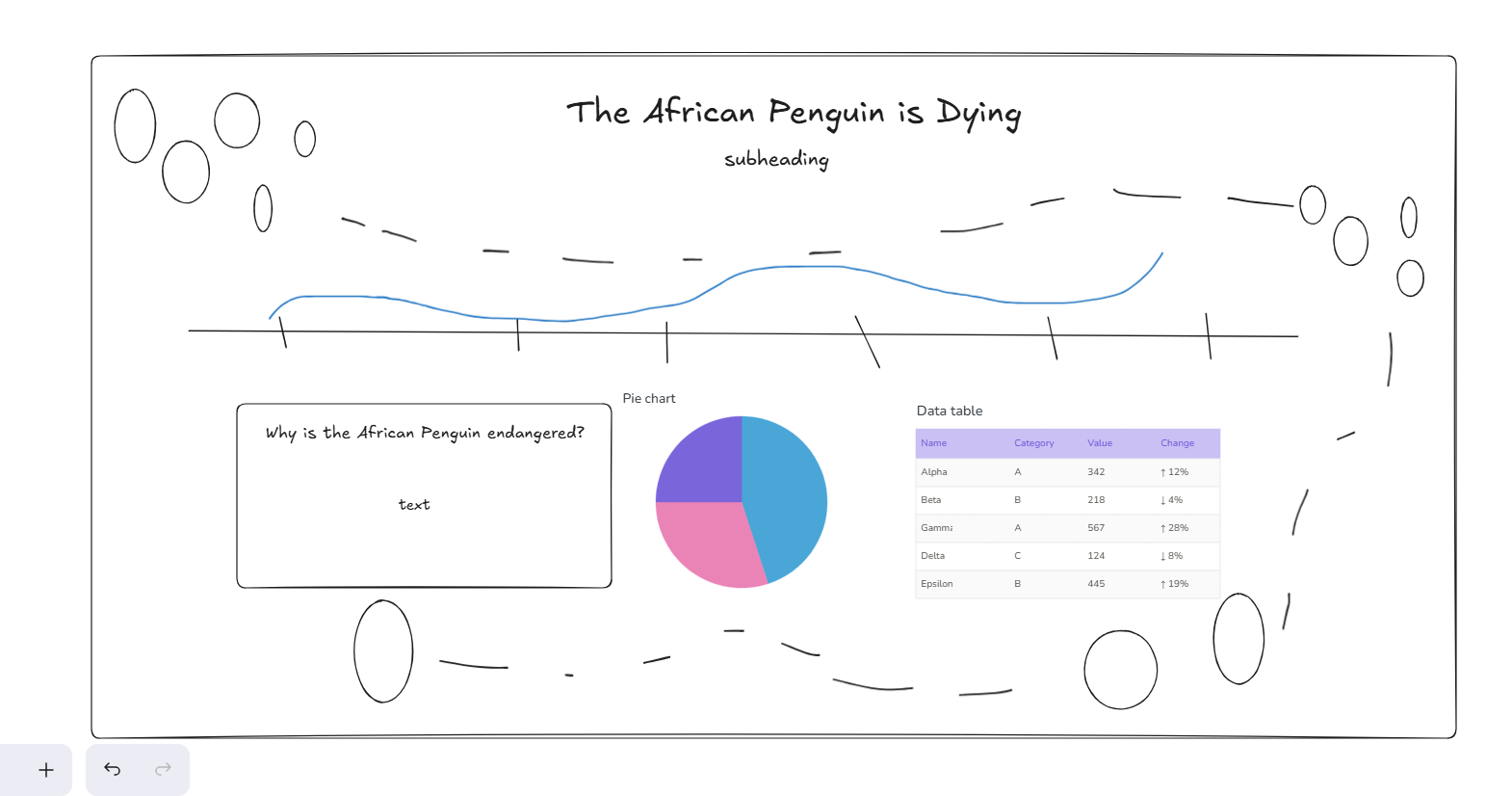
Finally, I worked on the sketch. My initial plan was to focus more on the design, as infographics tend to be more design heavy to catch people’s eye (the circles are penguins!).
My final dashboard ended up being very different from the sketch, as I had to rewrite a lot of the text because the symbols from the website wouldn’t transfer correctly from the API. I also ended up simplifying the background because it was a little too busy for the visualizations.
One day of Dashboard Week left!