


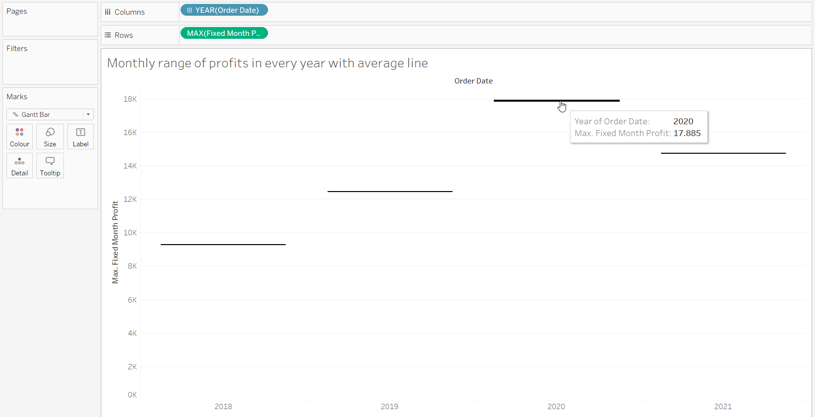
Let's imagine a use case where we want to compare different ranges, each starting above zero. For example, using the Superstore dataset, we could query the ranges of monthly profits for each year.
The problem with this, however, is that these bars would not start at the zero line, but would float somewhere else. The trick is not to use the bar chart in 'Marks', but to use the gantt chart.
But first we need a LOD to have the months fixed for the sum(profit) like this
{ FIXED DATETRUNC('month',[Order Date]):SUM([Profit])}
Now we have the option to set either the maximum month as the start of the gantt chart or the minimum month as the start. We use the maximum here because it better explains how the "filled gantt chart" works.
In the next step, we need to use the size function of the gantt chart, which behaves a little differently from the size functions of the other chart types, which are usually only used for formatting. Here we can add the size of the bar, which we can calculate this way:
MIN([Fixed Month Profit])-MAX([Fixed Month Profit])
You may have noticed that this size is negative. When we use a negative value for the size, the bar is inserted below the gantt line. So, to be precise, this is not a "filled" gantt chart, but a gantt chart with a bar that is on or below the gantt line. Since we used the maximum as the starting line, we need the negative difference between maximum and minimum to place the bar below it. If we used the minimum as the starting line, we would calculate the size the other way around.
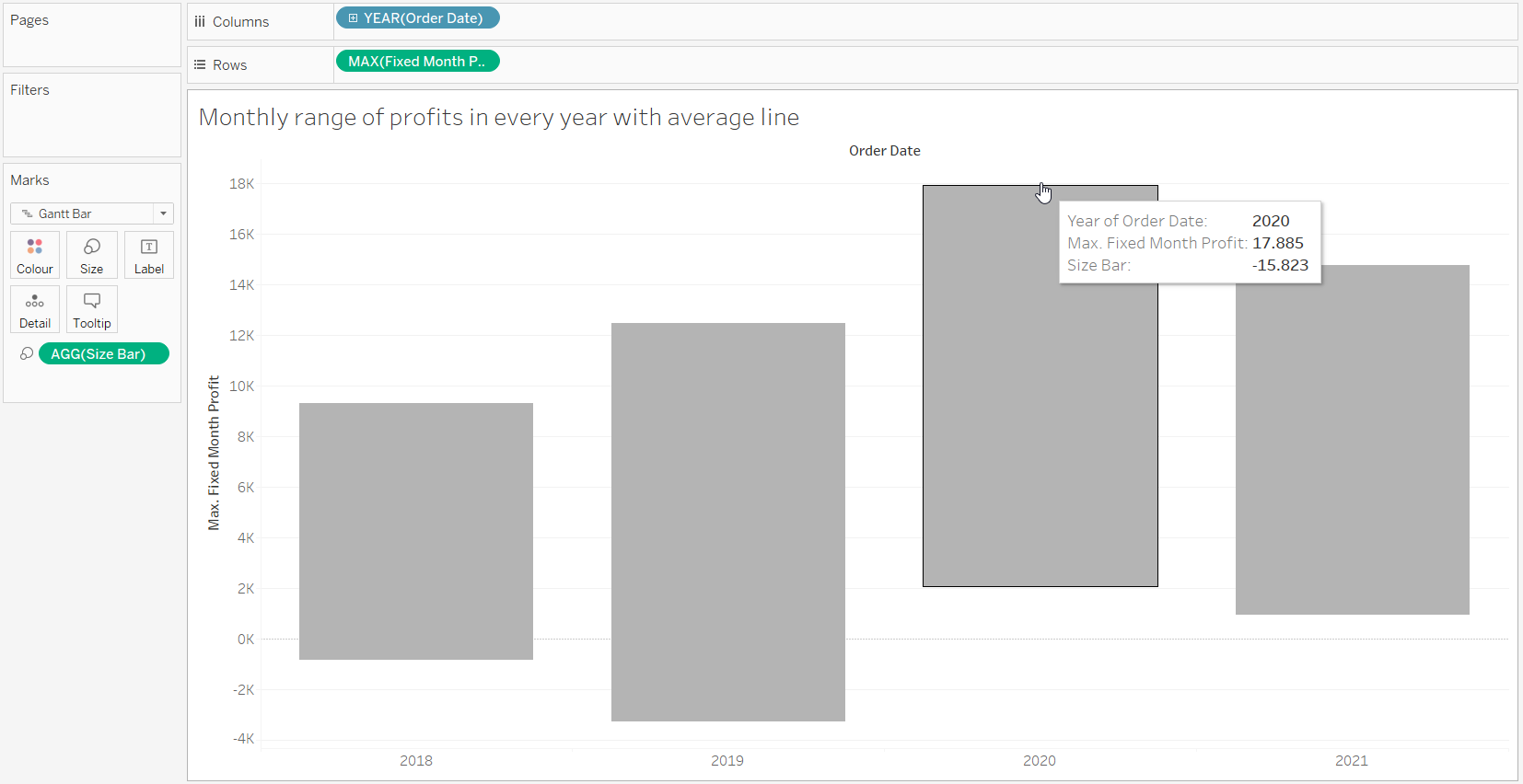
The flying bars are now finished. Actually, the first two are not flying, but rather sinking, since we have negative profits in some months in these years.
We can now add an average line for each year in the double axis.
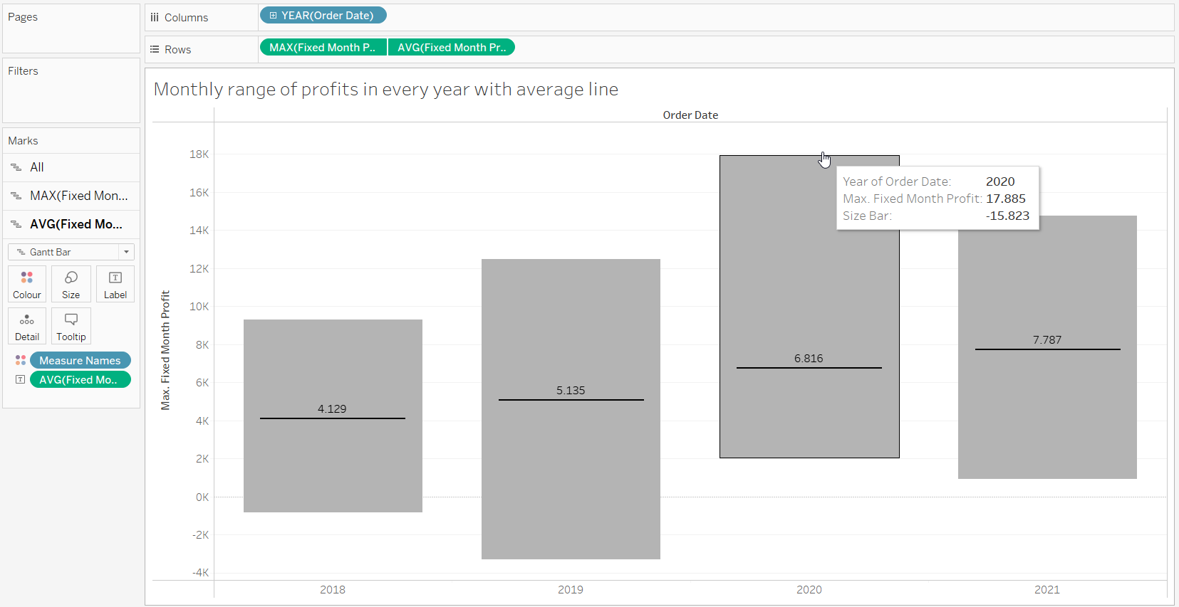
As you can see the range differs a lot to the average monthly profits.