


The third day of dashboard week was focused on accessible dashboards. Accessible dashboards is an overly broad term as the needs of a user base can be vast. I was provided with a brief which outlined the needs of an end user.
The Brief: GDS/Gov Visualisation Pitch Using Real Accessibility Data
"The London City Council and GDS have opened a new bid for accessible data visualisation services. You’re submitting a pitch using real-world public data to showcase how you meet WCAG 2.2 and GDS accessibility standards. They’ve asked for a real dashboard built using infrastructure or social inclusion data "
There were a number of considerations that I wanted to implement into my dashboard to make it accessible to a 'universal' audience. They were as follows:
- Colour contrast rules (and colour blind friendly)
- Keyboard and Screen Reader navigable
- Descriptive titles
- Simple dashboard layout for easy navigation
- Large font size
- Pictograms used to aid with visual story telling
- No abbreviations used to ensure clarity
With that in mind see figure 1 for an image of the Power BI dashboard created.
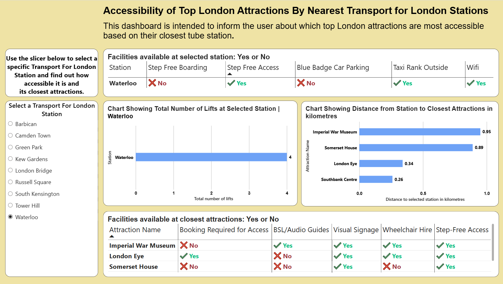
It was essential that this dashboard was simple and intuitive to read and that meant having large font sizes and bold lettering. Titles were descriptive and informed the user what the chart was showing. I was also conscious about the dashboard having a logical flow, for example starting with station accessibility and following through to the accessibility of the attraction.
Key Takeaways
Designing a dashboard with accessibility in mind is often a very difficult process. This was certainly a key lesson learnt today. My brief was quite broad and so I had to make design choices which made it as accessible as possible to the widest range of people. Often a brief with accessibility in mind will be made very specific which can help influence design choices to a degree.
Power BI reports can be built to be accessible and this project was hugely valuable in highlighting the different ways in which a user might need to interact with a dashboard. For example, navigating via a keyboard only or relying on a text interpreter to read text out loud are design considerations which need to be seriously considered depending on the end user.
The text interpreter which can be accessed via ctrl, windows, enter can be somewhat temperamental depending on the layout of the dashboard. It will often read things in the wrong order but as a feature it can certainly be beneficial.
With regards to the report I made a couple of things could still be improved upon. Firstly using a neutral tone such as a faded orange as the background instead of white could be more beneficial to visually impaired who may find black text on white too contrasty. Secondly, including instructions on how to navigate a dashboard without a mouse would certainly be useful for the user. Finally, including row banding in tables could help distinguish between rows. Overall, the project was extremely insightful and thought provoking.