


Today we had our first Personal Development Time (PDT), which is a chunk of time allocated to going back over anything from training that you know you have not properly bedded in yet. We cover loads of material and it is explained really well, but if you do not actually build with it, you forget it. And when I am building vizzes under time pressure I definitely default to the techniques I am most comfortable with, even if something else would be better.
So for PDT I wanted to deliberately practice two things I do not feel fully fluent in yet: ranks and parameters in Tableau. Coach Lorna gave me two Workout Wednesday challenges to do, one on a tolerance parameter for profit vs target, and one on ranked sales in a heatmap layout.
Exercise 1: Parameters
link: https://public.tableau.com/app/profile/harry.singler5859/viz/WOW2023Week21ProfitvsTargetwithTolerance_17708233806960/Dashboard1
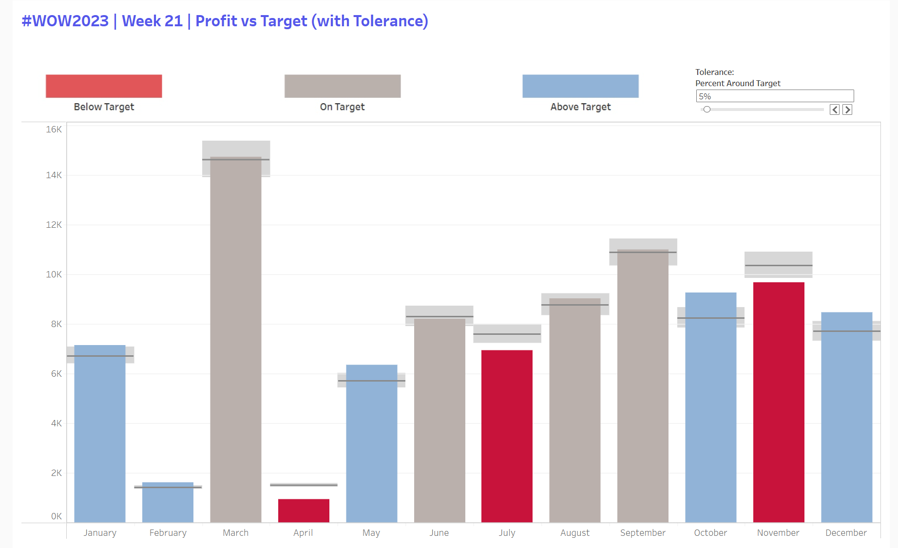
This one is the classic monthly actual vs target chart, but with a tolerance parameter so the colouring only flags months that are meaningfully above or below target. The key is that the parameter drives a min and max band around the target, and profit gets classified relative to that band.
Calculations:
Tolerance parameter (as a percent)
Target tolerance min = SUM(Target Profit) * (1 - pTolerance)
Target tolerance max = SUM(Target Profit) * (1 + pTolerance)
Bar Colour:
If Profit < min then Below
If Profit > max then Above
Else On target
The nice part is the tolerance band itself. I added it as a reference band per month using those min and max fields, then used the barcalc to colour the bars. Remembering how to use parameters to control calculated fields has been tough to get my head around, so hopefully I'll be able to use this to do it next time.
Exercise 2: Ranks on Heatmaps
link:https://public.tableau.com/app/profile/harry.singler5859/viz/WOW2025W43RankedSalesHeatmap/Dashboard2
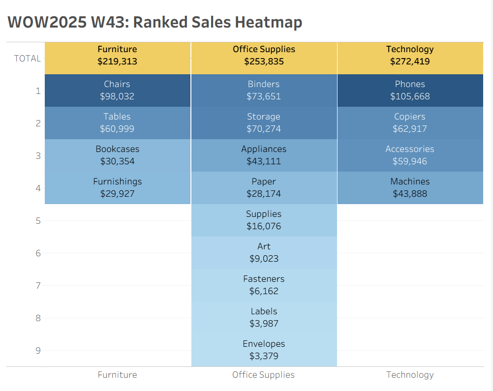
This exercise involved a ranked heatmap where each Category is a column, each Sub Category is a tile, and the tiles are stacked by rank within the category. The header row is treated as part of the same layout so it behaves as one block when you interact with it.
Core logic and Calculated Fields
Rank within each category
Sales Rank = RANK(SUM(Sales)) and compute using Sub Category so it restarts per Category
Tiles as Gantt marks
Use a constant “1” on Size, mark type Gantt Bar, Sales on Colour, white borders
Header row trick
Plot a second mark at -0.5 for the header row, dual axis and sync
TOTAL label trick
Custom axis formatting so 0 displays as TOTAL
This one looked simple, but it actually took me a lot longer, with a few tricky parts that I had to search around on the internet for (formatting axis to display TOTAL; making the tab sizes constant as originally they had the width of the rank that sub-category represented; getting the headers as a row) but the main takeaway was practicing editing table calcs: your instinct tells you to select Category but you actually want that deselected so it restarts every category instead of computing by it.
Overall Thoughts
I thought this first PDT was a good use of my time, as I was able to go back over some parts of the syllabus I haven't done much with since we learnt them first. I definitely think I'll be more confident next time a viz I'm building calls for a rank or parameter with reference bands, and doing these in PDTs weekly will be great for getting them into my long term memory.