


Hi everyone!
Today we learnt how to hide and show specific graphs in a dashboard using Tableau which I thought was a really handy trick - and something that took up too much time in my application.
As always, I will be using the Sample Superstore dataset to go through this.
Step 1 - Make your graphs
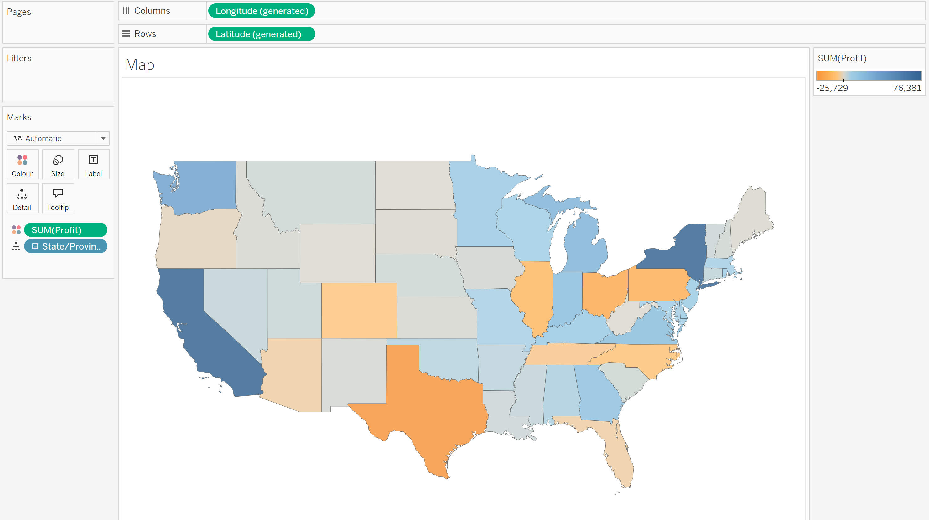
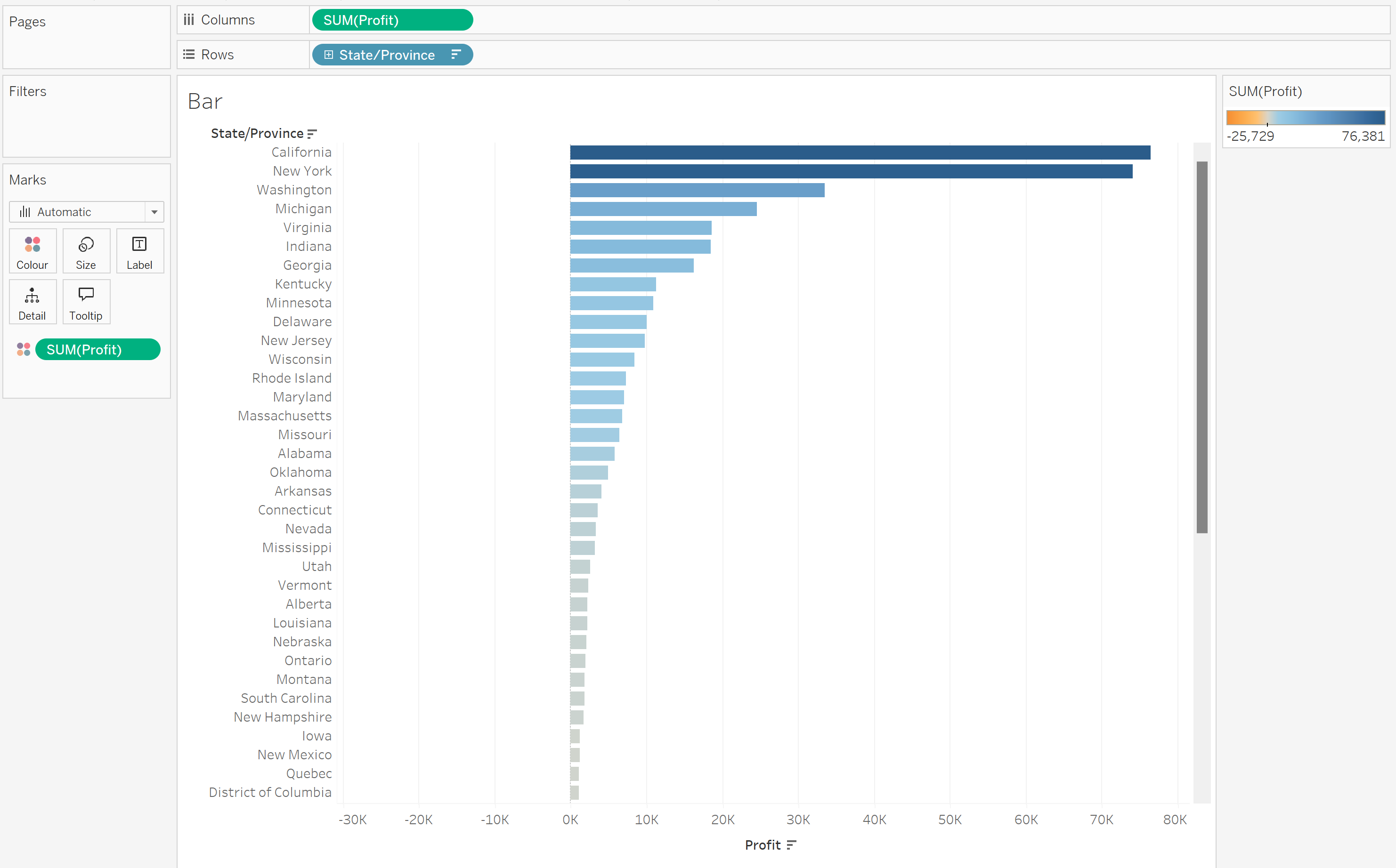
I want to look at the Profit for different States, looking at it both as a Map and a Bar chart. So I'm going to create two separate sheets for each of these.
Sheet 1:
Sheet 2:
Step 2 - Create a Parameter for Sheet Selection
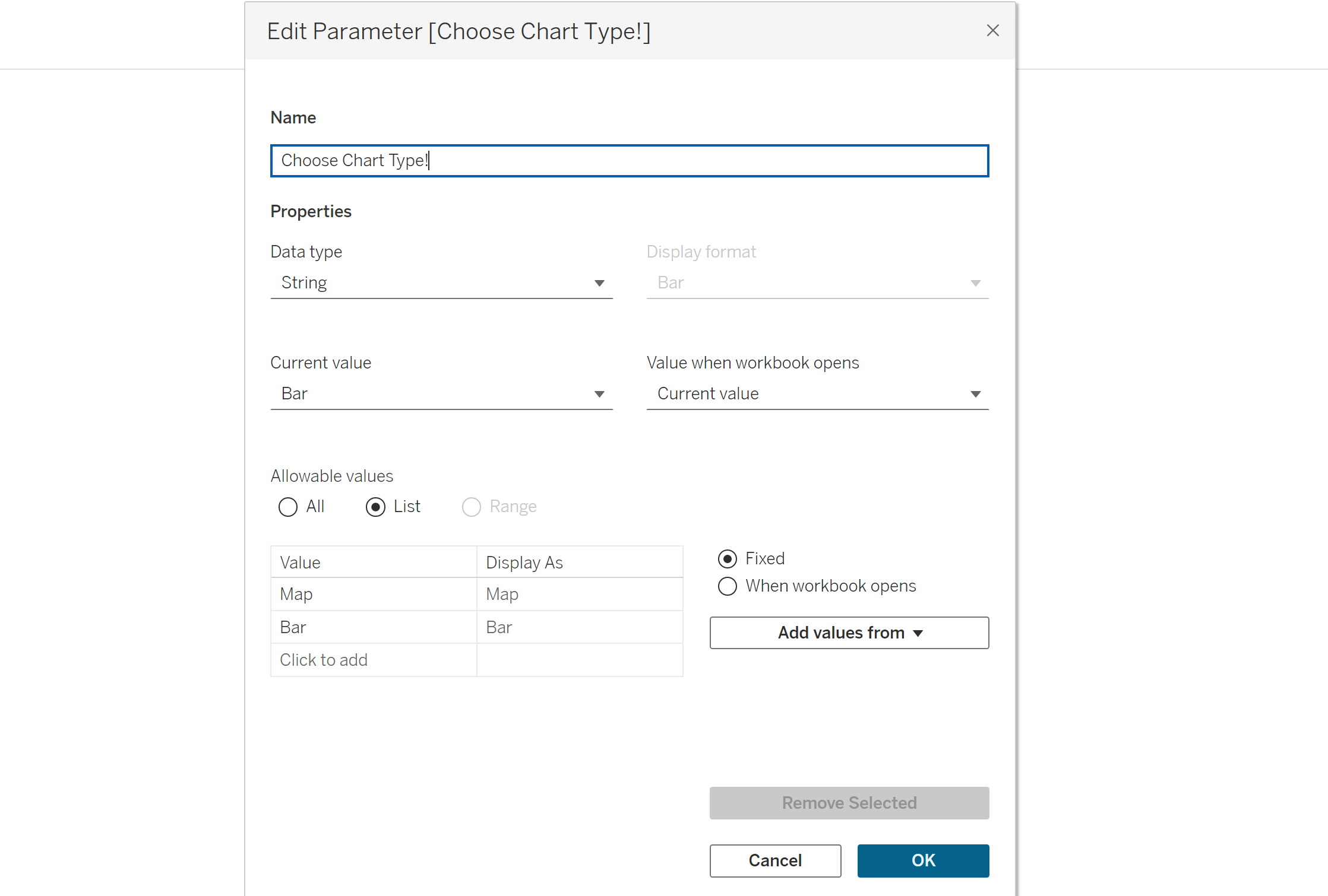
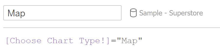
When creating a parameter, there is lots of flexibility in what to do - I've decided to create a string data type where the selectable values are either "Map" or "Bar" - but these names could be anything.
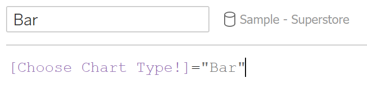
Step 3 - Making Calculated Fields to Link the Parameter
So Tableau understands that the parameter we have made corresponds to each graph, we are going to create two calculated fields (one for each graph). Here I'm naming them "Map" and "Bar", but these could be anything:
Step 4 - Dashboarding and Using Dynamic Zone Visibility (DSV)
Now all the groundwork has been laid out, we simply need to put it all together.
Create a new dashboard and drag a container onto it (I've done horizontal). Drag one of your two sheets onto the dashboard, and place the other sheet adjacent/below it.
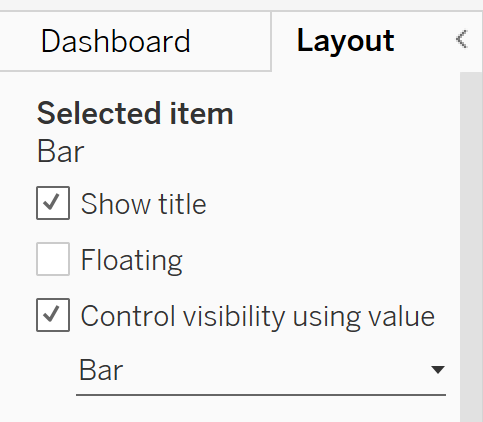
Select your map graph, go to the "Layout" pane on your left and select "Control Visibility Using Value" (this is Tableau's DSV function). Under the dropdown, you will see a list containing our previously made calculated fields - for this one, select your "Map" calculation. Follow the same steps for your bar chart but instead select the "Bar" calculation.
Step 5 - Adding your Parameter onto the Dashboard
In your dashboard pane, go to "Analysis", then hover your mouse over the "Parameter" section - this should display all the parameters you have made in the current workbook. Just select the parameter you've made and it will appear in the dashboard.
Now you can enjoy selecting your parameter values and seeing your chosen graph appear.
{For those interested, there is another way to show/hide sheets that doesn't use the DSV feature, but it means you have to hide your sheet titles and it does not sync up any colour legends to both graphs (meaning you will still have one colour legend for each graph, which then becomes NULL when that graph is hidden, and remains visible in the dash).}
H