Over the last few weeks during our Tableau training sessions at the Data School a number of Tableau functions have drawn my attention that make working with Tableau and producing charts so much easier, quicker and more efficient. I often wish I had known about these tips during my application process so I'm hoping this blog will help someone else who was in my shoes! Some may seem very basic but when you're just starting out with using Tableau, these actions may not seem so obvious at first.
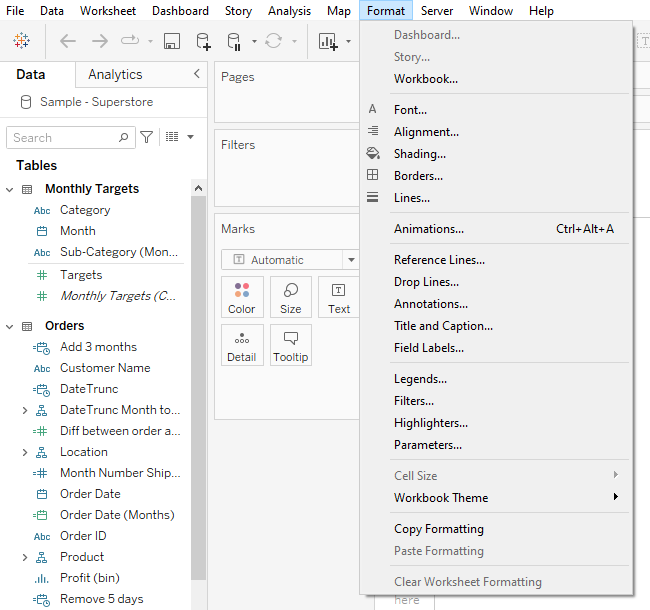
1. Formatting. When choosing shading, fonts, borders, lines, alignment etc., this can be done for the whole workbook and does not need to be done for each sheet individually. I remember removing the grid lines for each chart individually for each of the sheets (definitely wasted a lot of time..). This can be done for the entire workbook by selecting the Format option at the top of the screen as follows:
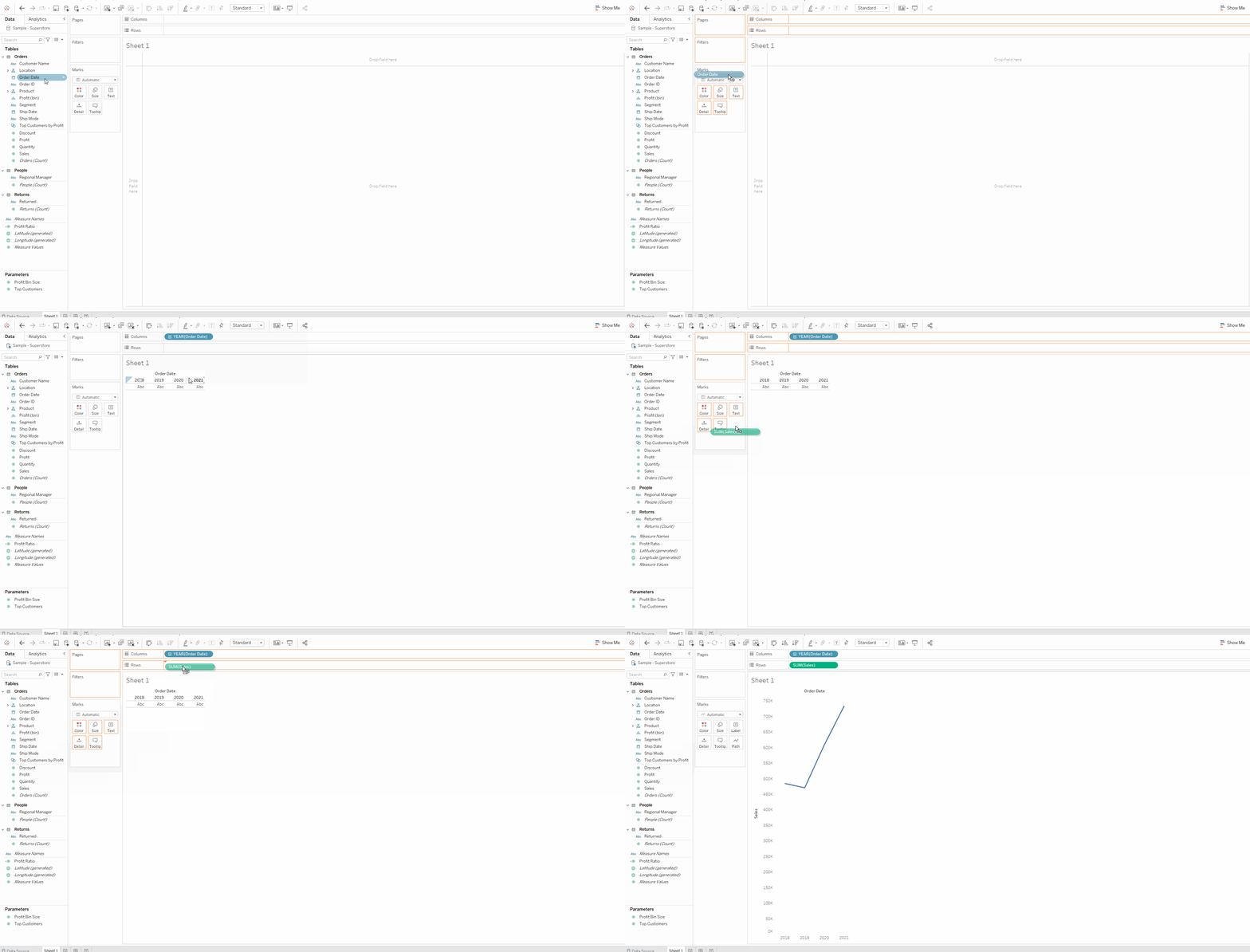
2. Allocating data fields to rows and columns. This can be done by dragging the field directly to the rows and columns pane OR this can be done by dragging a field directly onto the workspace to either the left hand side of the pane (for rows) or the top of the pane (for columns). I find the latter to be more efficient as the data is being placed directly where it is going to be visualized.
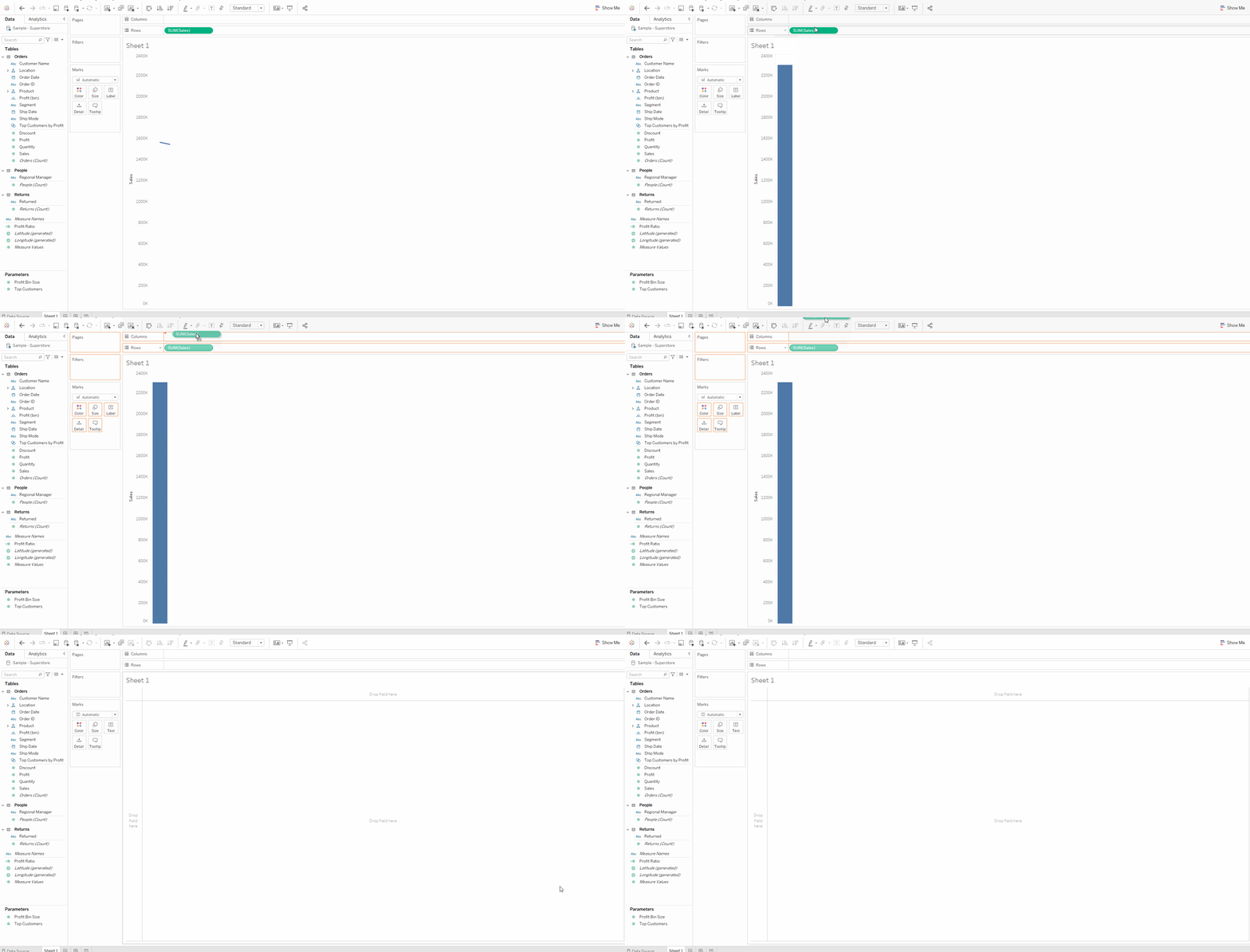
3. One of my favourite functions is being able to remove data fields from the rows or columns pane by simply dragging the field to the top of the screen. This is especially helpful when you are experimenting with relationships between data fields (not specifically knowing what relationships you want to visualize) and makes the process so much quicker than having to right click and remove the field from the row or column pane.
4. The difference between green and blue fields. Blue fields indicate a discrete field and green fields indicate a continuous field. In basic terms, continuous means “forming an unbroken whole, without interruption” and discrete means “individually separate and distinct.” Generally, continuous fields add axes to the view and discrete fields add headers to the view. It's important to note that discrete fields always come before continuous fields in the column or row pane as Tableau defaults to adding a header before an axis.
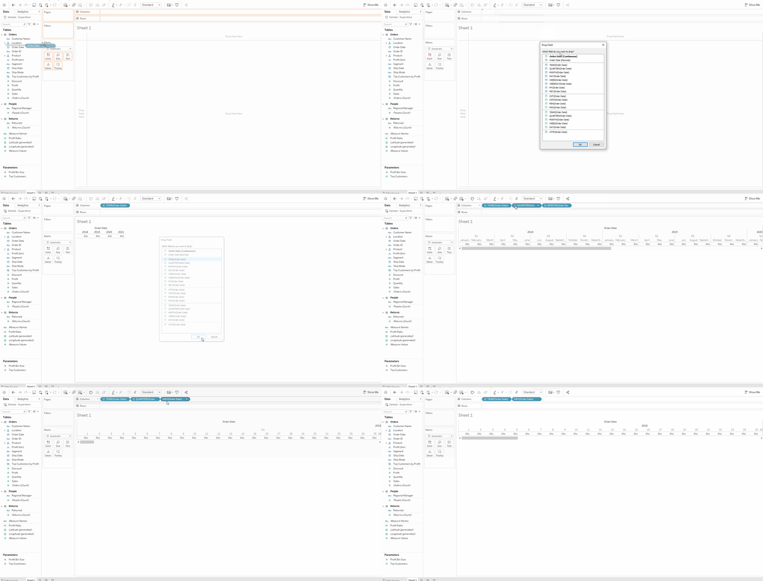
5. Hierarchy! For the order date in this example, there is a hierarchy from years -> quarters -> months -> days. If you have the years field on columns and you want to visualize the days as well as the years on columns, you can drilldown to the days using the plus (+) sign on the left hand side of the name. Once the days field has been reached, you can simply drag the quarter and months fields out of the pane as described in point 3. Combining this point with point 4, if you would like to have a specify a continuous order date instead of a discrete order date, you can right click drag the order date field to the rows or columns pane and when dropping, a dialogue window will open where you can select the type of date to be visualised.
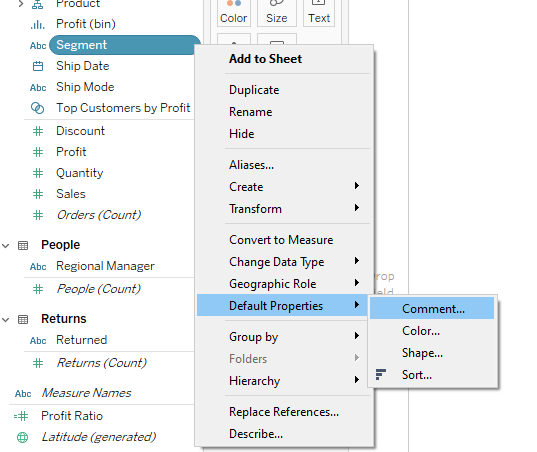
6. If you have data fields with names that you are unsure of or could be confused with another field, you can add a description to the field by adding a comment. This is done by right clicking on the field, selecting default properties and adding a comment. Now every time you hover over the field, the comment will show and all confusion will be avoided! One last way to add comments is for the whole sheet if you want to remember how or why you did something on that sheet. Select worksheet, show caption to add this description which will appear at the bottom of the page.
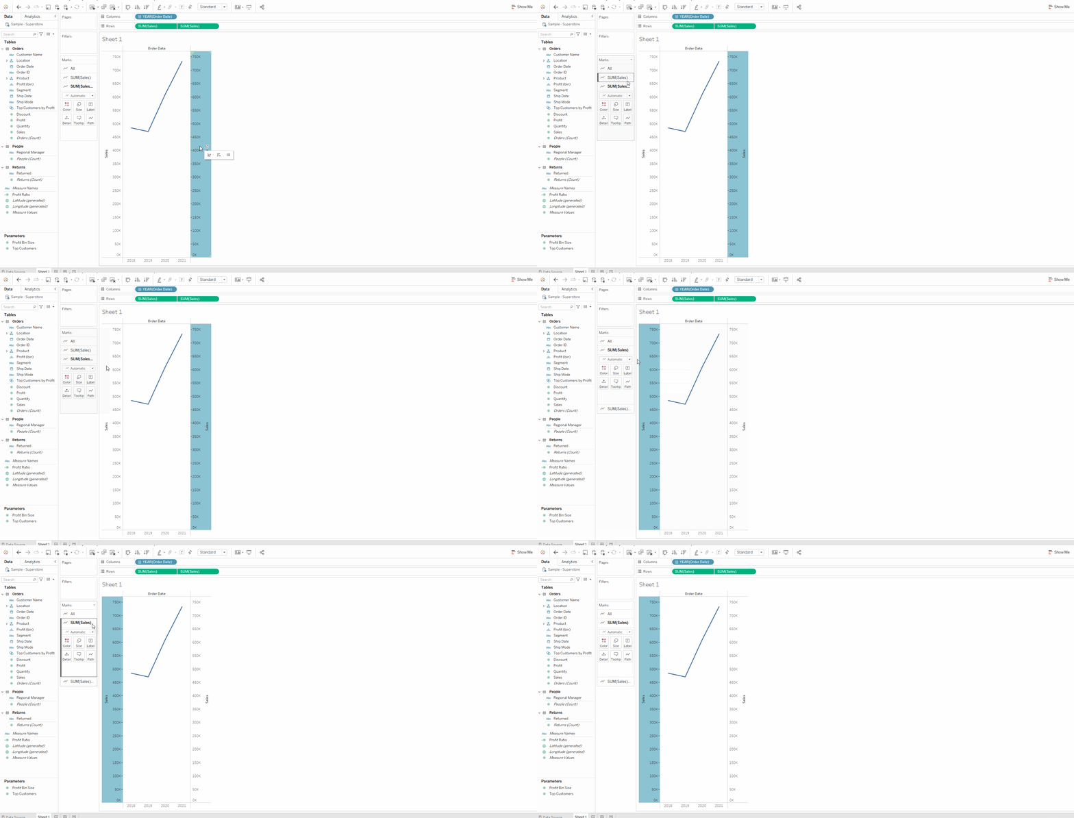
7. If you have duplicated a data field in your rows or columns pane and you have created a dual axis, it can become confusing to understand which field you are formatting in the marks card as the “(copy)” part of the name is not always visible. In order to determine which axis you are formatting, you can click on the axis on the chart to highlight which mark card relates to it.
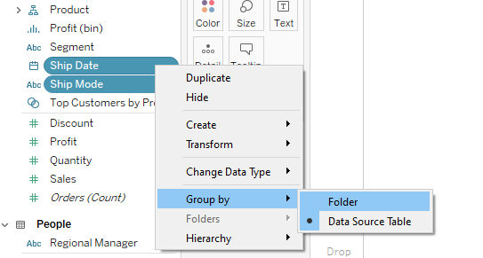
8. Organisation of your data fields. Say for example you are creating some calculated fields and parameters for a certain chart – it can become annoying when these new fields are not grouped together and you have to search or scroll down the data pane to find them individually. To avoid this and make your life more efficient and convenient, you can create a folder for these fields to be grouped into. To create the folder, select all fields to be organized, right click and select to group by folder.
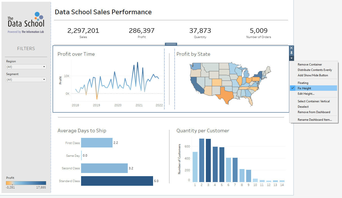
9. One of the most frustrating things is when you are adding sheets to a dashboard and the height of the charts keep changing as you increase the width or the size of the dashboard. The height of the graph can be fixed by selecting the blue (not grey) container and by using the dropdown arrow to select to fix (or edit if necessary) the height.
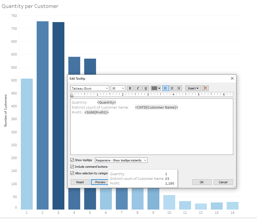
10. And last but not least, one tooltip trick. If while you are editing your tooltip and you want to see how the tooltip will come out with the formatting you have chosen or changed, you can see how the tooltip will appear by selecting the preview option at the bottom of the tooltip dialogue box. Another life savior in terms of time efficiency!
