Whilst working on an exercise with the Sample - Superstore data set, we had to create a dashboard with three different charts, one of them being a chart that had a calendar view.
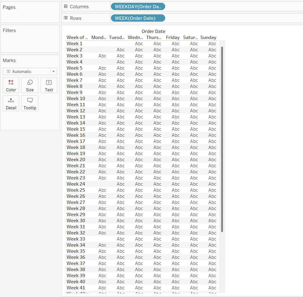
To create this chart, we will be working with Sales field and we need to have a Date field that Tableau recognises. We want to have weeks on one side and weekdays on the other side. To get the beginning of it, we need to Right-Click Drag the Order Date to rows, and choose Discrete Week from the drop down menu. For the columns, we need to Right-Click Drag the Order Date to columns and choose Discrete Weekday from the drop down menu. It should look like this.

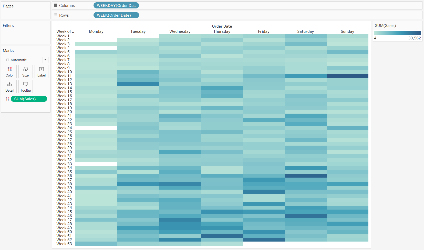
Then, we need to drag Sales to the colour part of the marks card and this should show us the colours on the chart. This will show us what days had the most sales in terms of colour intensity, i.e. the more intense the colour, the more sales they had.

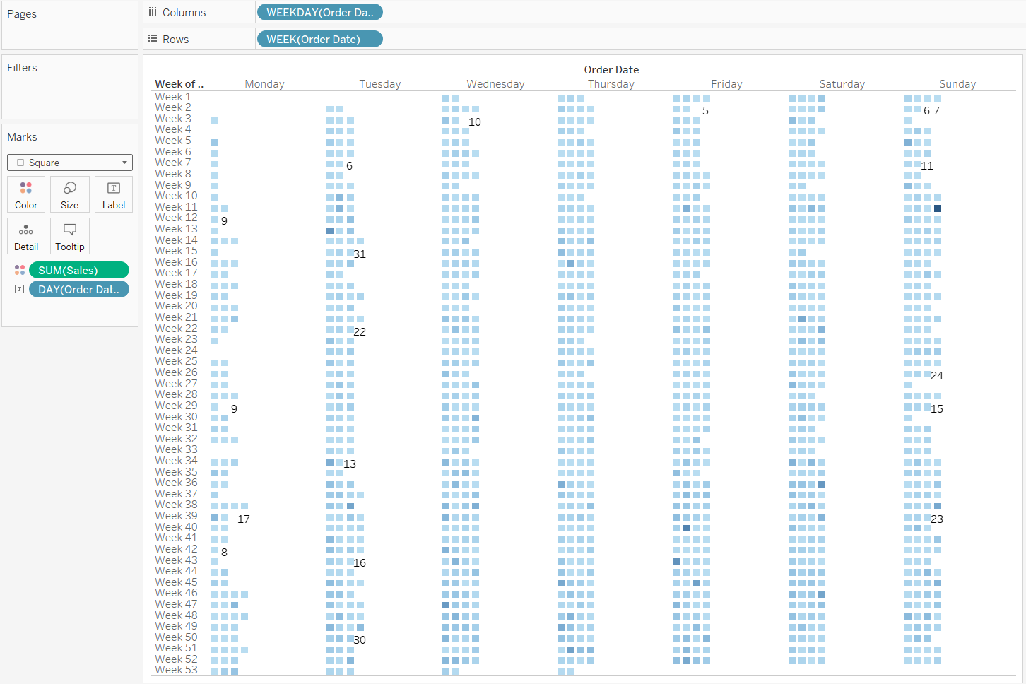
So, it is starting to look something like a calendar! After this, we can Right-Click Drag the Order Date to the label part of the marks card and choose Discrete Day. This will number up the days and place them onto the chart. Also, we need to make sure that the marks are set to square to keep in line with everything else that we have done.

This looks like we moved away from the actual calendar template but we are nearly there. We just need to add some filters to make the chart smaller and to read the correct year as this has all the years in the data set combined together.
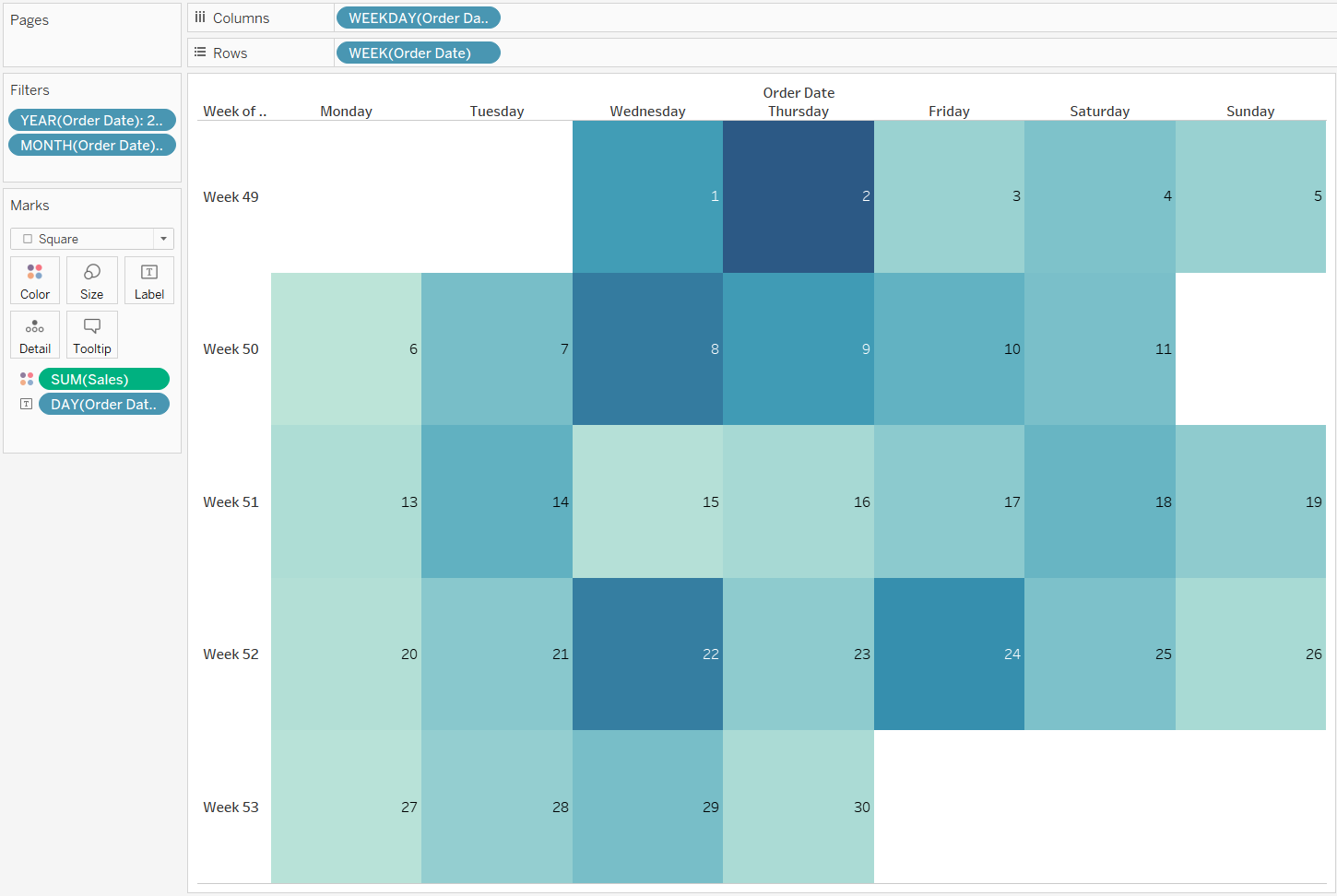
For one last step, we need to Right-Click Drag the Order Date into the filters card and choose Discrete Year, and filter it by the year of your choice (we picked 2021), and then Right-Click Drag the Order Date into the filters card and choose Discrete Month, and once again filter it by a month of your choice (we picked December). Once, this is done, your chart should look like this.

And voila! Here we have the sales of the December, 2021 as a heat map and in a calendar view like we wanted it to.
Hope this helps!
