


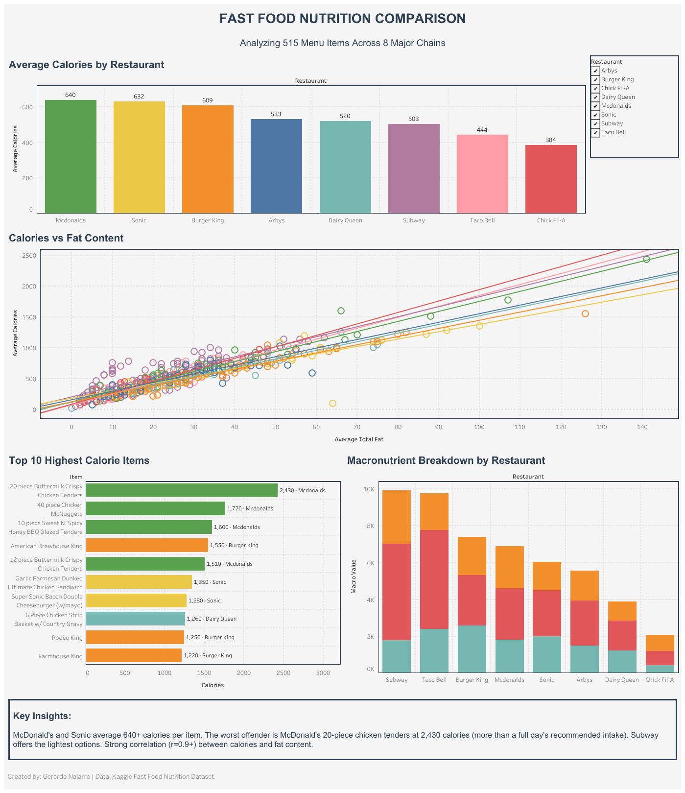
The first version of my Fast Food Nutrition Comparison dashboard looked finished. Bar chart, scatter plot with trend lines, a stacked macronutrient breakdown, a Top 10 highest-calorie-items list, a couple of filter actions tying it together. It looked like a dashboard, but it wasn't a good one.
Who I Built It For
Before touching the redesign, I made myself answer a question I skipped the first time: who is actually looking at this, and what are they trying to do?
I settled on someone standing in their car trying to pick a relatively healthier lunch spot. Not someone who wants a data dump. Someone who wants to compare a few restaurants fast and see which one won't wreck their day.
What Was Actually Wrong
Once I looked at it through that lens, the problems were easy to name.
The trend lines on the scatter plot were just noise. A regression line running through every restaurant's points didn't help anyone answer "is this place heavy or light," it just cluttered the chart.
The stacked macro bars hid the exact comparison I wanted to show. Carb%, Fat%, Protein% all mashed into one column per restaurant meant nobody could glance at it and see who was highest in fat. The stack worked against me.
Vertical bars were the wrong call for long restaurant and menu item names. Horizontal bars let the labels sit flat and are just easier to scan when you're ranking things, which is most of what this dashboard does.
Padding and spacing were an afterthought. Panels butted up against each other and nothing had room to breathe.
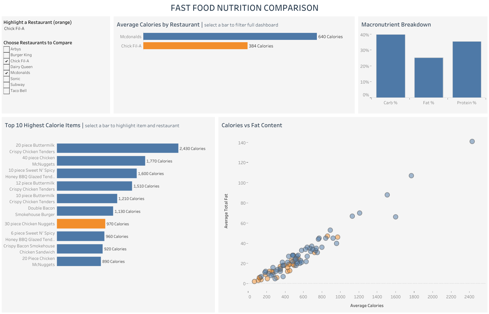
And the interactivity was broken. When I filtered to one restaurant, I expected the Top 10 chart to search the whole dataset and re-rank from there. Instead it was only re-ranking whatever had already survived an earlier filter, so the "top 10" wasn't really the top 10. Took a while to track down. The fix was setting the filter to Add to Context, so Tableau filters the data first, before anything else runs on top of it.
The Rebuild
Same core panels, different logic behind each one.
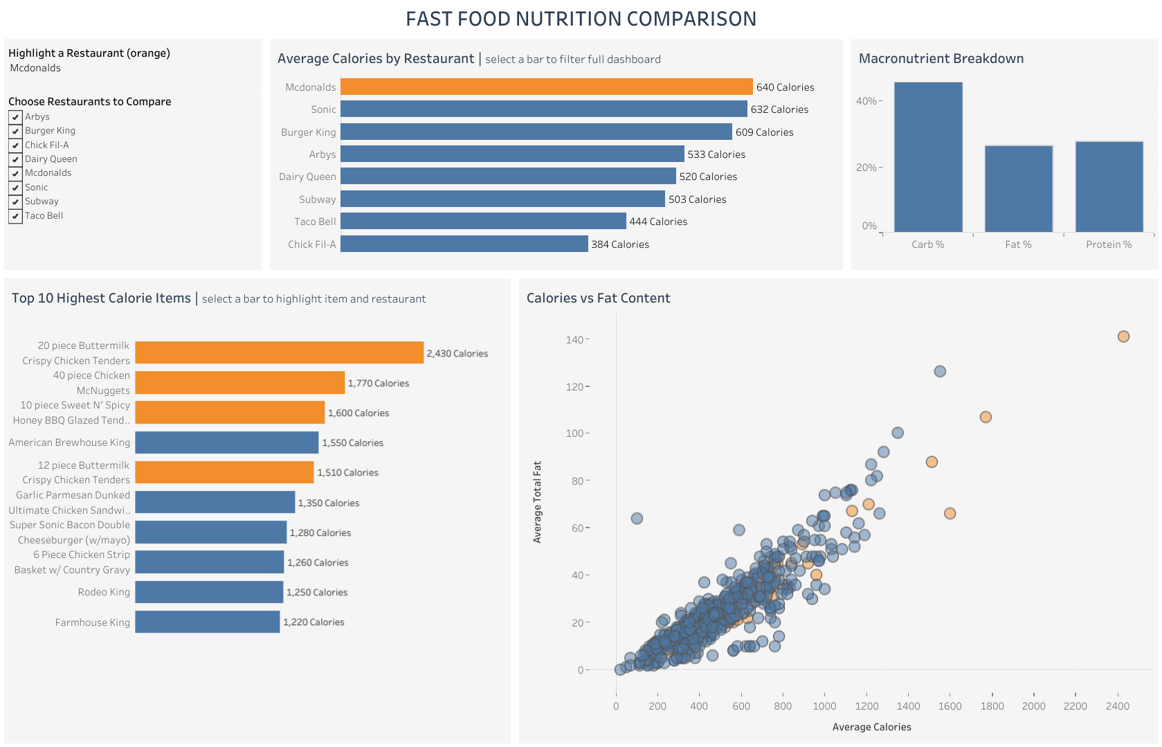
Average Calories by Restaurant is horizontal now, sorted, with a label telling people they can click a bar to filter everything else. Macronutrient Breakdown is separate bars instead of one stack, so the comparison people actually want is visible right away. Calories vs. Fat Content dropped the trend lines entirely, it's just the raw relationship now, with highlighting to show where a selected restaurant lands relative to everyone else. Top 10 Highest Calorie Items recalculates correctly against the full filtered set and highlights items belonging to whatever restaurant is selected. I also added a checkbox compare panel, since "McDonald's or Chick-Fil-A" is a more realistic question than looking at one restaurant alone.
The Actual Lesson
I've been here before. The tool was never the hard part. Planning is. The first version of this dashboard happened because I reached for chart types that existed, not ones that served the person looking at the screen. The second version started with someone in a parking lot trying to decide on lunch, and everything got measured against whether it actually helped that person decide faster.