


Today we were given the task of implementing the feedback that we've received from our last MakeoverMonday into our first version of the dashboard.
I was paired up with Hannah from DS50 UK and we gave each other feedback. She gave me some great ideas on how to improve my first version - thank you Hannah!
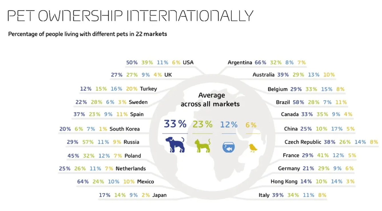
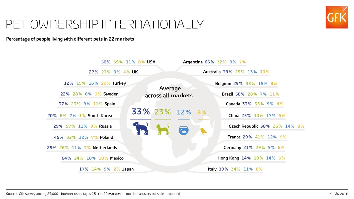
We started with the following visualisation from www.nielseniq.com:

We only had 90 minutes to rethink the visualisation and come up with something new. Not much time, which was quite challenging.You can find both of my newly created dashboards on Tableau Public:
Version No. 1:
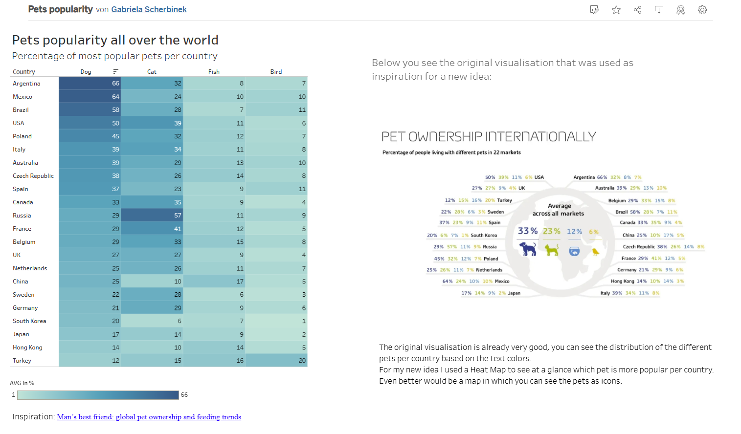
https://public.tableau.com/app/profile/gabriela.scherbinek/viz/Petspopularity/Dashboard1
Version No. 2:
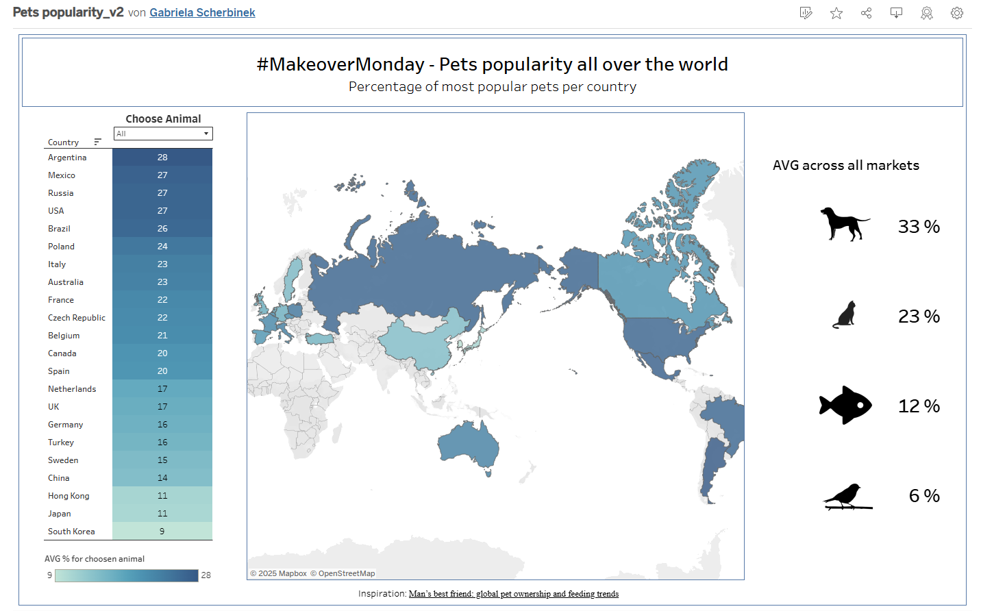
https://public.tableau.com/app/profile/gabriela.scherbinek/viz/Petspopularity_v2/Petspopularity
I like the second version better because it has a more appealing design and it´s easier to understand what´s going on.
Which one do you like better?