


I wanted to start this blog post with either the gif from Frozen where Anna wakes up realising it's coronation day with her hair everywhere, or the bit at the end of Legally Blonde when Elle Woods is doing the valedictorian speech saying 'We did it!' I'm not sure if either of those are allowed due to copyright (or whatever the legalese is for gifs, I'm sure Elle Woods would know) so instead you've got a mildly boring sign saying that we made it and a slightly off reference to Les Miserables in the blog title. Either way, we have successfully completed training as a cohort (Congratulations cohort of DS54 - we did it!) and this blog post will detail our last two days of training itself before we entered into the big wide world as graduates!
The Task
As this was a 2 day project, unlike the ones we'd had during the rest of the week where we received the data/task and presented that afternoon, expectations were greater and the task set was more significant. I'd like to think that we all rose to the occasion. You can find Serena's blog post with our instructions for the project here. The highlights go as follows:
'The group must create two complementary dashboards that together tell a clear and engaging story about English women’s football.
- One dashboard should provide a high-level view, setting context and highlighting key trends or patterns.
- The second dashboard should offer a more focused or detailed perspective, building on insights introduced in the first.
The topic and analytical direction are open-ended. Consultants may choose the angle that most interests them.'
Preparation
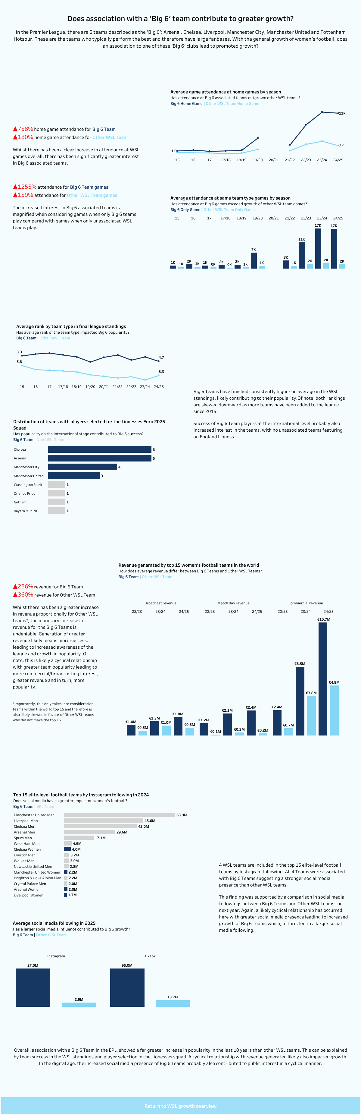
The preparation was the biggest part of this project (and probably should have been a fairly significant part of the others - whoops). For me, as soon as I saw this post I was fixated on the story part, perhaps to my own detriment. I knew that I wanted to focus on the growth of women's football in England but finding the more in depth story for the second dashboard was a little lost on me. I thought about looking at how a connection with a Premier League club affected growth and eventually narrowed that down to a 'Big 6' club instead. I wish I had a better explanation for narrowing it down to the top tier (WSL clubs) and the last ten years but there was really no reasoning behind that. Now I had a plan for the two dashboards, I needed to work out how I was going to explore the story.
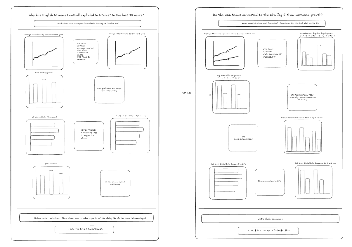
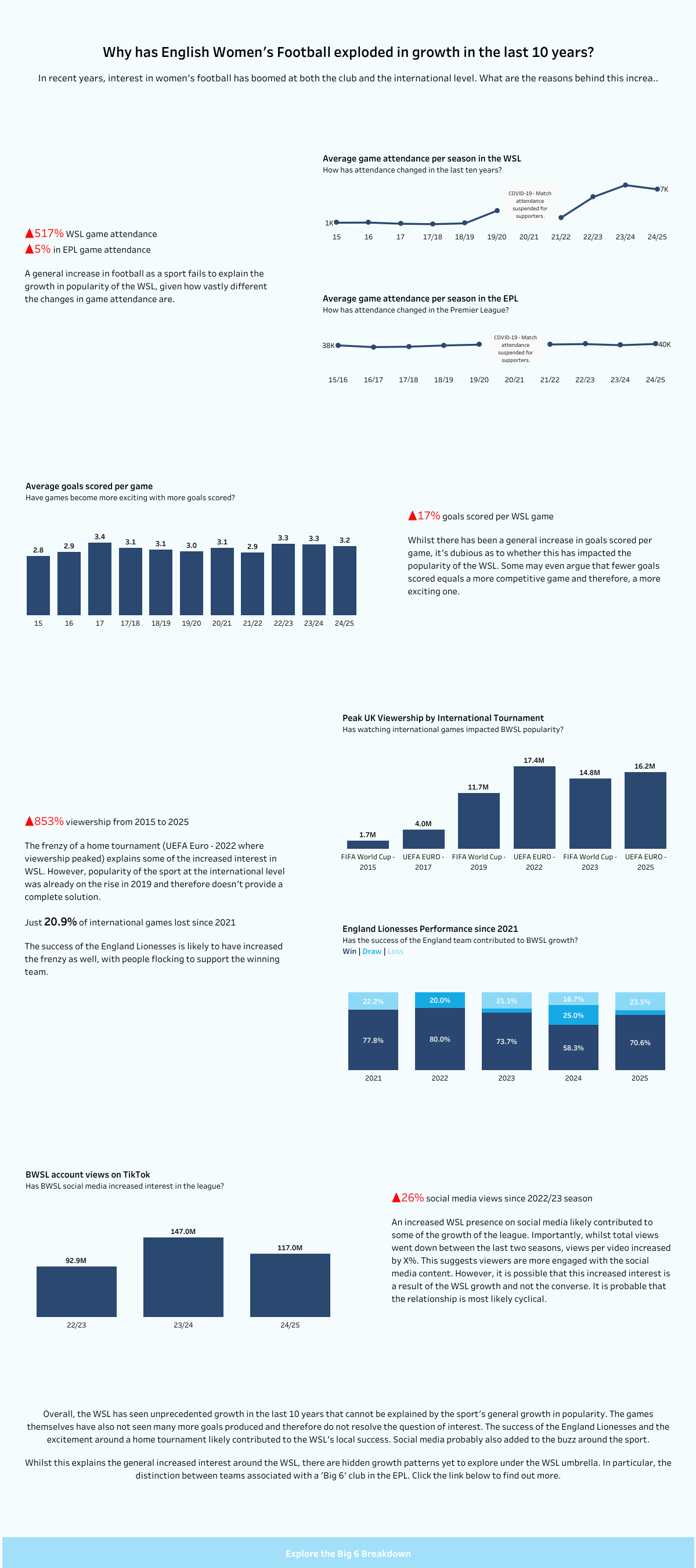
In the data that we had received, we had the team standings at the end of each season, the match data and appearances. I felt like the clearest indication of growth was attendance numbers and how they'd changed but that couldn't show the entirety of growth in women's football or it would have been a very short dashboard indeed. I also wanted to explore the why as well and so began a long trip down a google rabbit hole. I wanted to look at the social media aspect and televisation of women's football as I presumed this data would provide a clear indication of growth and although I didn't manage to find the perfect data, I managed to find some. Finding the right data and then sketching out my plans took me most of the first day (until about 4pm) which was a little nerve-wracking, but thankfully I shouldn't have worried too much. You can see my excalidraw sketch below after gathering all my data, which was a vast improvement on the very rough hand drawing I'd done in the morning. Following sketching and knowing that I wanted the themes to tie across from one dashboard to the other (e.g. I wanted social media data to be evident in both dashboards), I proceeded to find a little more data on international football. No rest for the data hungry!
Dashboarding
With all my data collected, I started some charting with low expectations for day 4 and what I'd be able to produce. Not to say I wasn't hopeful, I just knew things might take a little more time than the hour of the day that I had left so didn't want to feel like I was behind if I hadn't managed to get many charts done! My process is to get the charts done and then format after as to me, it's more important to have some work than for it to be pretty and not have much at all. The charting actually went more quickly than anticipated and I had a fair few charts by the time that I left on the Thursday evening, and my charts were completed by around 11 the following day (I can't really remember now but I'm pretty sure it was late morning time). I then plopped my dashboard 1 related charts into the first dashboard and got to formatting. After discussing briefly with Serena, she suggested this dashboard for inspiration for my story style. In my head, I'd really got into the explanatory rather than exploratory style for this dashboard as I wanted to show the user the insights rather than waiting for them to find the insights by fiddling around with filters etc themselves. It felt rather full circle after trying to do a story-style dashboard for my initial application - hopefully this dashboard was an improvement on that!
After formatting my charts in dashboard 1, I duplicated and used the same style template for dashboard 2 to ensure there was continuity between the dashboards. I then had to work on the actual story part and explaining it all. I feel like I might have gone a bit too heavy on the text but I still had some KPIs showing the insights so there we are. Some stories need words as well as charts - just look at some iron viz entries! There was a bit more formatting after that (don't look at the tooltips!) and then the time had come for the big presentation...
If you'd like to see the two dashboards I produced you can see the original images below, or go to my dashboards on Tableau Public where you can see the slightly updated versions which have the tiny additions that I didn't quite have time for in the two dashboard days (but they've not changed much as I wanted to keep them authentic!).
Reflections
- We've all come so far since day 1 of training. That might be obvious and as much as I know I know more than I did then, it's really satisfying to have been able to produce a piece of work in two days that would have taken me so much longer before and would have likely been to a lesser standard as well.
- Not all good dashboards need tons of interactivity. In my initial application, I wanted to wow with my parameter actions and drill down charts etc. and those are cool and trickier to do, don't get me wrong but often a simpler chart which highlights the insight you're trying to draw out is better if you're trying to tell a specific story.
- I've run out of reflections but I wanted to keep to the theme of 3 reflections per project. It feels apt to add another somewhat random reference as my final reflection of the week so here we go. The soundtrack to the end of training foe me is Take That's 'Never Forget'. If you don't know the song (How could you? I'm very disappointed), please go listen to it. If you do know the song, please go listen to it. I'm aware it's dated but it's one of the first things that has come to mind so I decided to share - it's not all data analytics in my blogs.
And there we go. The end of training. Wow. That's me signing off from my weekly training blogs but I'll still try to keep up with some fun tips and tricks that I discover as the learning never stops. All that's left to say really is until next time, happy dashboarding!