


If you're interested in sports analytics, chances are you've looked at podium finishes or at least top 3 results. Maybe you've wondered how to show this creatively or had the thought about creating a podium-style chart but not known how to go about it. Well, today's your day. In this blog, I'm going to take you through the steps to create a lovely podium illusion so you too can be a winner. I'm using a dataset on Formula 1 in 2025 (created after a bit of data prep!) but use whatever sports dataset you'd like. To be able to create a podium-style chart in this way, you will need something in your dataset that is ranking your players/teams and this will need to be in one field. Now, let's get to the start line!
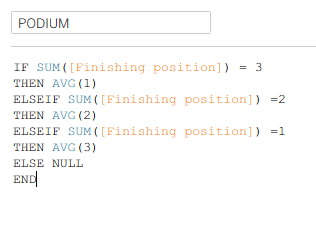
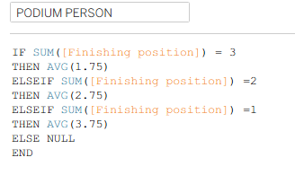
Step 1: Create your podium pedestals. To create the illusion of a podium, you need to have a dual axis with one axis for the podium blocks and one for your top 3 finishers. Start by writing the calculation below, inserting your category which shows the ranking of your player/team in place of 'finishing position'. This will give you the length of the blocks so the person in first place has the tallest podium block etc.
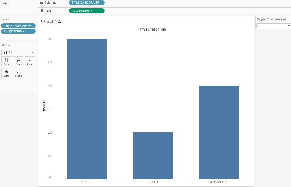
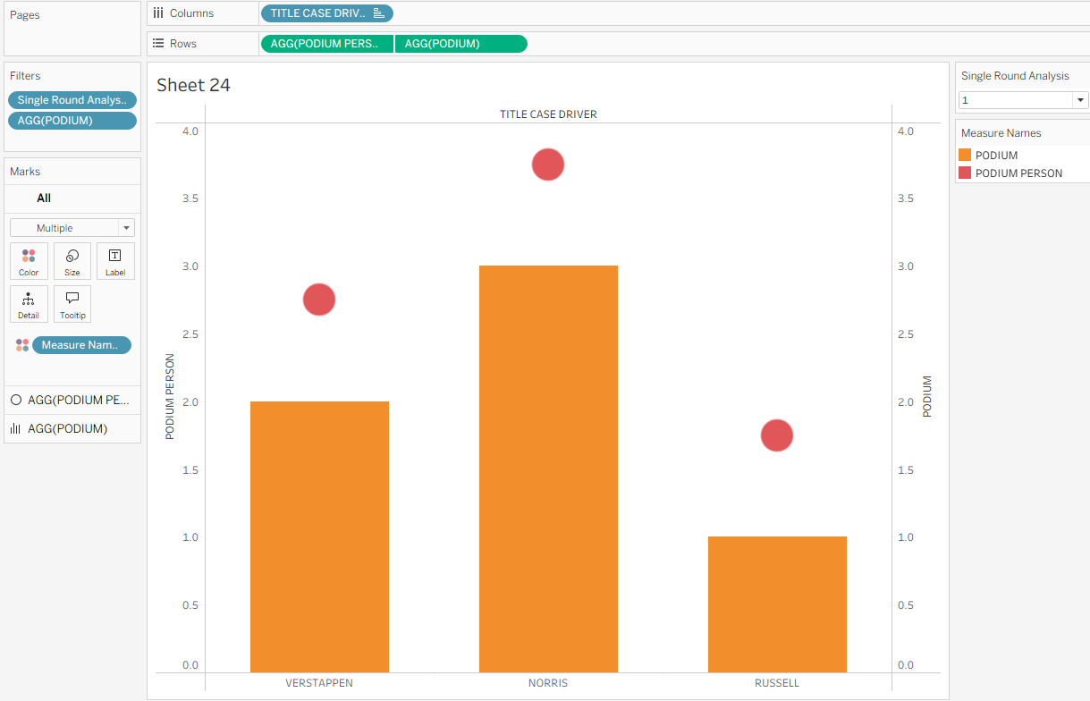
Step 2: Start creating your chart. So you could do this at the end after all your calculations are created but I personally think it's easier to see what you're doing and understand the reasoning behind your calculations by looking at it step by step. If you have multiple rounds you're looking across like me, begin by dragging your round field onto filters and selecting one round. Then drag your podium block calculation onto rows and your player/team (or in my case, driver) onto columns. Unless you only have top 3 finishers in your dataset, you'll need to filter for nulls. If it's still not looking quite right, check that your marks are set as bars and your podium calculation is set to continuous (green) in rows. It should look similar to what I have below.
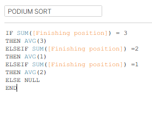
Step 3: Ordering your podium blocks. You can see the bare bones of your podium coming together now but if you want it to be truly representative of a real life podium, you'll recognise that the blocks are in the wrong order. You might have been lucky and coincidentally your blocks are in the right order, that'll be because of the alphabetical order of your columns dimension. It is highly unlikely that for all of your rounds this will be the case, so we need to fix the sort. Start by creating the calculation below which is essentially saying your 2nd place block needs to be on the left, 1st place in the middle and 3rd place on the right based on the ascending average values.
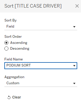
Then go to your column dimension (your team/player etc.) and right click > sort. You want to sort by field, choosing your 'podium sort' calculation and ascending. You should see your chart change in the background to the correct formatting.
Step 4: Adding your 1st, 2nd, 3rd place finishers on top of the podium. Currently your player/team can be found at the bottom of your podium blocks but you might want, as I did, to have them on top of the podium like they would be if standing on a podium in real life. You can add the name to label and align it at the top but again, it didn't fit my vision of the podium so some extra work began. This started with creating a new calculated field which fixed the position of the finisher against the podium they would be standing on. See the calculation below for an example of what to write. The exact values which will go into your averages can be slightly amended depending on the space that your podium will be taking up in your dashboard, thus impacting the spacing of the y axis on your chart and the gap between your podium block and your finisher.
Step 5: More of an extension of step 4 really as I didn't know what else to call it but it helps to break the chunks up a little. Add your new calculated field 'podium person' onto rows next to podium. Make sure that the field is continuous and set the mark to shape. Right click on your bottom y axis > dual axis. Then synchronise the axes by clicking on one of the axes again. It should be looking like my image below.
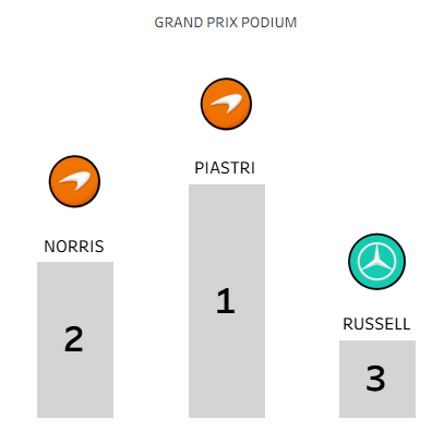
Step 6: Add the finishing touches. Firstly remove your measure names from colour and change the colour of the blocks to whatever you choose, I like a grey. I also added the 'finishing position' field to my label on the podium blocks to ensure that anyone viewing the chart was completely clear on what each block meant. Whilst your podium is starting to look like a real life podium now, you also need to make the circles on top identifiable to the player/team that they represent. You could do this by using colour, a flag or any other identifiable metric you choose, adding the team/player field onto shape and then customising from there. I also added the team/player field to label and aligned that bottom centre to make the finisher clearer.

And there you have it - a fun but creative way to visualise the top 3 finishers in a dataset using a podium style chart. I hope you enjoy using it in your visualisations as much as I enjoyed creating it. If you have two views of your podium like some Formula 1 rounds do with Grand Prix and Sprint races, I have also written a blog on how to toggle between two views based on this chart (although it's a general toggle based blog post that you could use for any chart with two viewpoints!). Finally, a massive thank you to our fantastic coach, Serena, who helped me work through how to get my vision of a podium chart from my brain into reality! Until next time, happy charting!