


Tonight we have a Meet and Greet at The Data School which allows prospective applicants to get a better understanding of what it's like here and how to apply, with a brief demo of Tableau too. If you're thinking about applying or in the middle of an application, I would definitely recommend attending as it will give you a great feel for the place as well as top tips to help you succeed!
Anyway, the reason why I've gone off on a segue about the Meet & Greet when you've come to this blog to find out about using unique category highlight colours is because this is the origin story for the blog. I often like to start a blog with an origin story to explain how I got to this point - kind of like how when you read a recipe blog, they always start with a long introduction before getting to the actual recipe part. Whilst I always skip that introduction, I hope you don't skip this one as it'll help you see where my line of thought began. Although at this point, it's probably quite likely if you were going to skip to the step-by-step section, you will have done so already. If you are still reading this part, thank you. You're my favourite blog reader!
I went off on a tangent again. I haven't written a blog like this in a while so I apologise for the rambling! The point I was originally trying to make was that a little over a year ago, I attended a Meet and Greet at The Data School. I had a bit of experience in Tableau at that point from rejected applications so I really wanted to make sure that if I was going to apply for a third time (does the first time even count if you didn't know there were more than bar and line charts and scatter plots in Tableau?), that my visualisation would be stunning so third time could be the charm! Spoiler alert: the visualisation was not stunning (it was half decent but I can definitely make much better things now) and I still made it into the Data School despite not achieving everything I had envisioned.
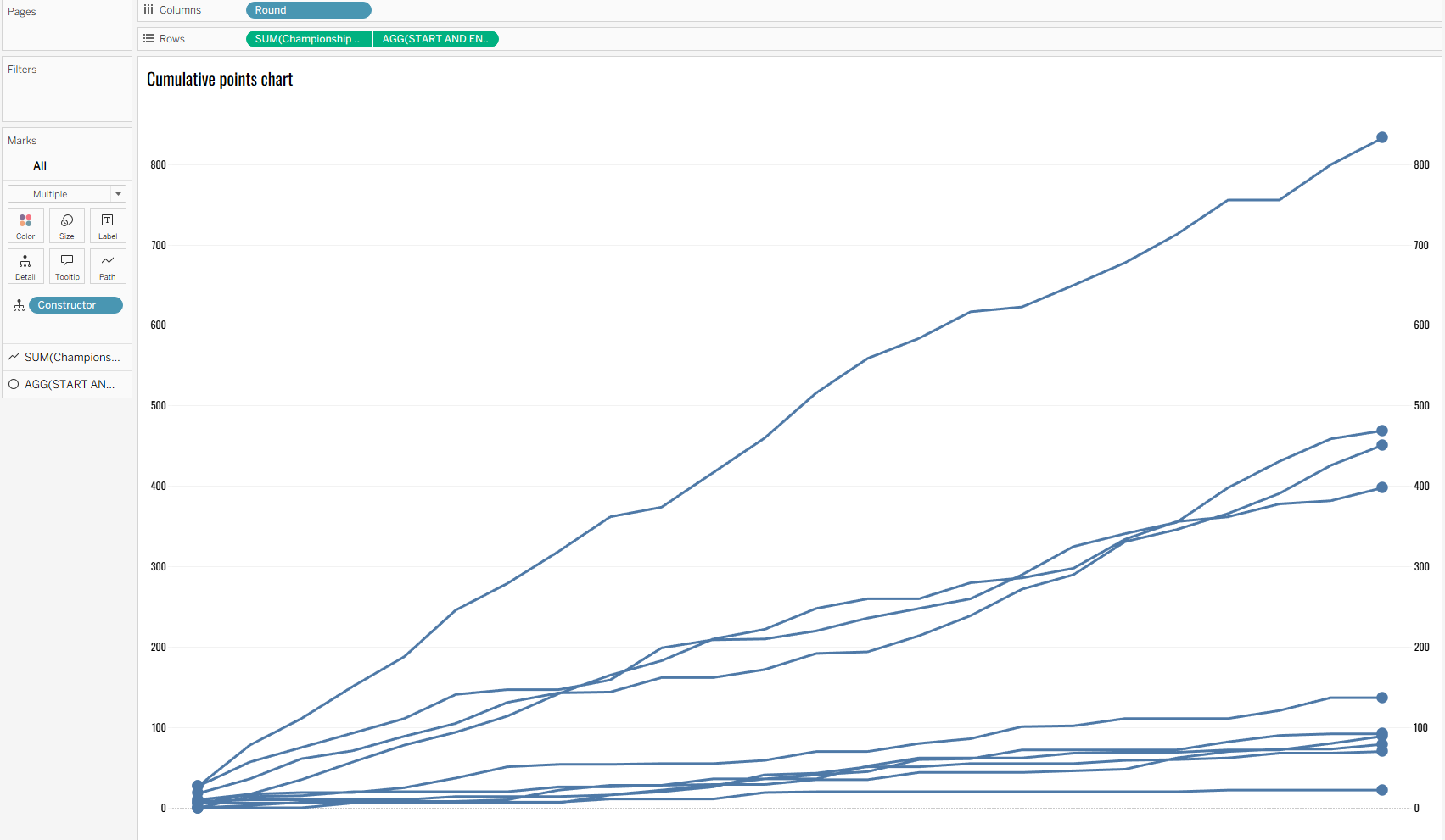
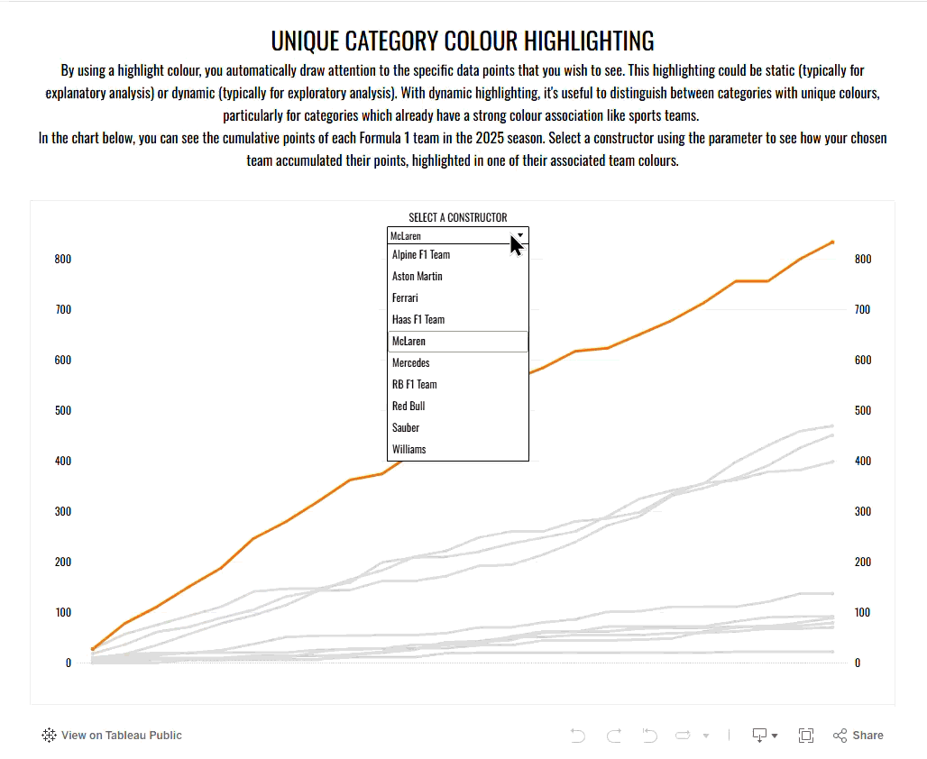
One of my ideas for creating something I hoped would be stunning was using unique highlight colours for each category selected. In my example, I was looking at the Formula 1 season and wanted to highlight the different constructors with unique colours as I didn't want to use a single colour in case it got confused with a specific constructor. If I used orange (or papaya!) as the consistent highlight colour with the rest in grey, I felt that would indicate McLaren even if I wasn't highlighting McLaren at the time. So, when I asked a DSer my question about how to do this at the Meet & Greet and they didn't think it was possible (probably because of my poorly worded question - you can probably tell by now that I use a lot of words to make a short point!), I went home satisfied that I finally had a concrete answer that I couldn't find online but also a little disappointed that my vision wouldn't be able to come to life.
Fast forward to today with my original question long forgotten, I thought back to my Meet and Greet experience and remembered the vision I had once had. With my honed Tableau skillset, I felt sure that it would be possible to create these unique highlight colours. I wasn't sure of how to do it but I played around in Tableau and quickly discovered (it was much simpler than novice Francesca realised) that dreams can come true. And now I get to share my knowledge with you: so here's how to create unique highlight colours in Tableau.
Just to note, this technique works best with categories which already have a strong colour association, such as sports teams, as the audience will be more familiar and more likely to naturally assume what the colour represents too. That's not to say you can't use it with other categories but the technique is most effective with pre-associated categories.
Step 1: Create your chart(s).
I'm using a line chart for this demonstration which I've added a dual axis to to highlight the start and end points of the chart but you can use any chart(s) that you choose. I can't really think of any charts at the moment that wouldn't work with this highlight action.
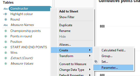
Step 2: Create your category parameter.
You can do this simply by going to your chosen category and clicking the carrot on the right hand side. Then going to create and selecting parameter.
In the pop-up window, you can choose the aliases you want to be displayed and which category is shown when the workbook opens.
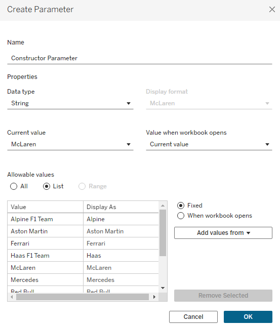
You can do fun things with your parameter like creating special selectors and things like that (I've covered that in this blog on fictional fruit sales), but today we're just sticking with the basics in that regard.
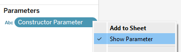
Show your parameter in your window so you know which category has been selected.
At the moment, when you change your parameter nothing happens. That's because it's not on the marks card. But you can't create your highlight action by directly adding the parameter to the marks card because you're not really telling Tableau what you mean. So what do you do next?
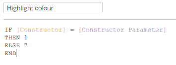
Step 3: Create a calculated field associated with your parameter.
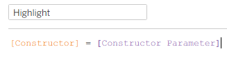
In the calculated field, you want to create a binary result where if a category value is equal to your category parameter value then you get one value returned and if they're not equal, you get a different value returned. You could use a Boolean parameter which is preferable due to processing power but I didn't when I was originally creating this and I honestly can't be bothered to go back through and choose the specific colours for each constructor again. You should ideally use the Boolean though and add the sort like I show below.
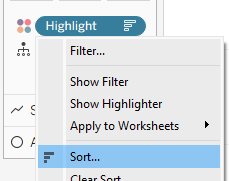
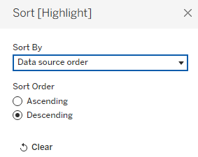
Add your highlight calculated field to colour on the marks card. If you're doing the Boolean method, you need to sort your colours so that the 'True' option which is the category being highlighted shows on top of (as in laid over) any other options.
So now we have the chosen category differentiated from the other categories. Use your category parameter to check that the highlighted category changes when you change your parameter value. But how do you get it so that the colour is specific to the category? Now this is the special sauce. The pièce de résistance. The grand finale that you've been waiting for.
Step 4: Adding the category-specific highlight colouring.
To make the highlighting colour specific, you eventually need to create a dual colour legend. As you can't easily drag two different fields onto colour, we have to find a hacky way around. We do this by first adding our category to size and then clicking the little size icon on the left and changing that to colour.
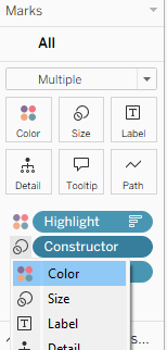
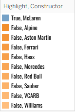
You should now have something similar to the legend below with your true/false field first and your category field second. You can now start editing the colour legend.
Step 5: Amend the category colours in the legend.
Make all of your false category options a grey and then change the currently chosen 'true' category to whichever colour that it is associated with.
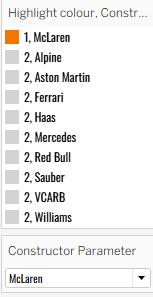
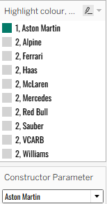
Once you've done that for one category, you'll need to change the category chosen in the parameter. All of your previous false categories will be the same grey but you'll need to add in your new 'true' colour association and the newly false category (in my previous example, this is changing McLaren from the chosen category) as the same grey.
You'll have to go through each category individually to assign the unique colours which is a bit of a faff so hopefully you have fewer categories than me! Still, I think it's very much worth it as it adds that extra level to your dashboard.
Try the trick out yourself on my Tableau Public here!
I hope you've enjoyed learning this little highlight trick. I certainly had fun going back to my Tableau roots and seeing how far I've come in the last year or so. Hopefully you'll be able to add this trick into your next dashboard to help you create your pièce de résistance. Until next time, happy highlighting!