


Ever been creating a visualisation and thought, both of these charts would be great at showing what I want to visualise but both of them have drawbacks that the other could solve? You don't want to include them both because that would be redundant and an inefficient use of space on your dashboard but you still can't get over the fact that one offers a fantastic overview of your data whilst the other provides a closer insight into different points. Well, what if I told you that you could have both? Yes, you can have your cake and eat it too (cake in this analogy being both charts and eating it being maximising space efficiency - yes, I realise the analogy was rather far-fetched). Once you've recovered from your shock, I hear you ask 'How could this be possible?' The answer to that is sadly not magic, but using parameter actions to create a dynamic chart selector for your user to choose between. I'll take you through how to implement dynamic zone visibility in this blog post so grab a dataset (I'm using the classic sample superstore dataset), open up Tableau Desktop and follow along.
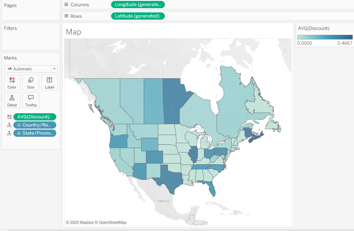
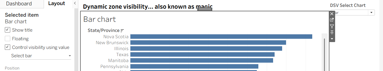
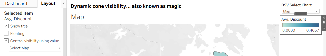
Step 1: Create your charts. In this instance, I am creating example charts so they are not the prettiest but they do the job. I've created a bar chart and a map with average discount as the measure and state/province as my dimension.

Step 2: Dashboard them. Once you've created all of your charts, prepare your dashboard. Ensure that the two charts that you want to switch between are in the same container.

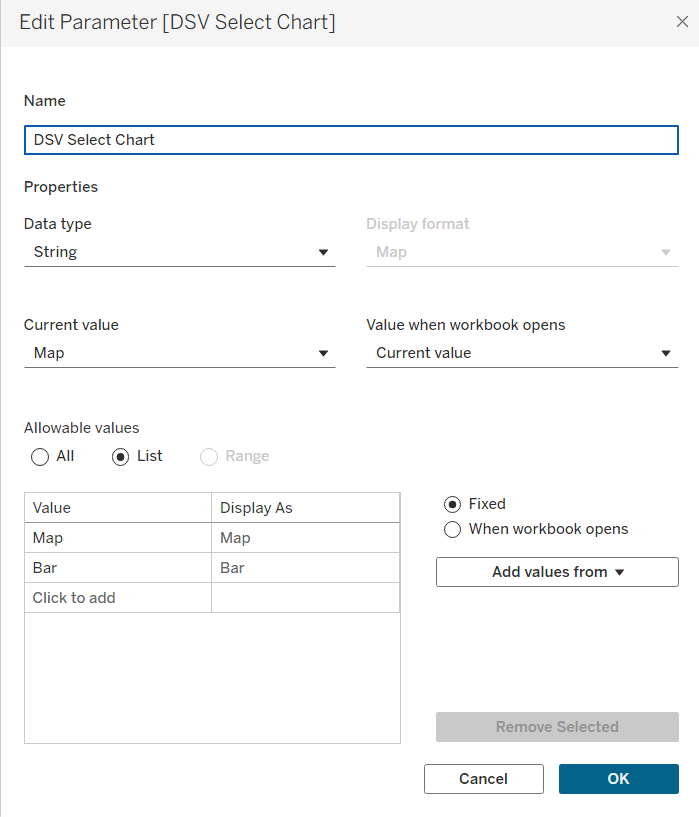
Step 3: Create your parameter. This parameter will act as your chart selector so add the appropriate names for whatever you're showing. Fill out the rest of the parameter as I've completed in the screenshot below.
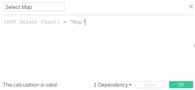
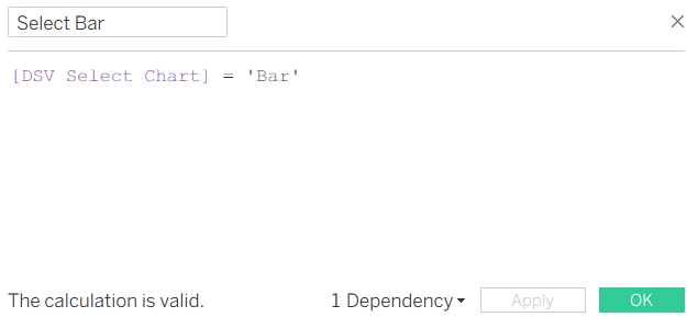
Step 4: Create your measures. These measures will link your parameter to your charts. The calculations behind these are fairly simple and the logic should become clear as we get further into their application. You'll need one measure for each chart. Make sure that what's in your speech marks is exactly the same as the parameter or it won't work (e.g. capitalisation, no extra spaces etc.)
Step 5: Create the dynamic zone visibility. Return to your dashboard and select show parameter from the drop down in the corner of one of your charts. Then on that chart, go to the layout pane and choose control visibility using value. Choose the appropriate value for both charts and magically one will disappear. You can then use your parameter to switch between views.
But what's the logic behind all of this? How do these measures know which one is a bar chart and which one is a map? Well, technically they don't know which one is which. Essentially, when you created your measures, you created two true or false statements where you only show the true values. By assigning the visibility of your charts to one of these measures, you assign each chart that true value. When you select that value in the parameter, it is true so the chart is shown and when a different value is selected in the parameter, it is false so the chart is not visible. So if you flipped your values around by accident, assigning your map to be visible on the select bar measure, then that would explain why selecting bar in your parameter would show your map instead.
Why can't I just use a chart selector though? Do I need to use the control visibility using value section? Chart selectors are good and might seem on the surface to offer the same options but they don't allow for different titles on your charts - you need to include a separate text box or your chart title will still be present when you choose the other chart. There are also drawbacks when it comes to formatting the container whilst you can make different choices for your charts when you use dynamic zone visibility.
Step 6: Any optional additions. You can also add dynamic zone visibility to your colour legends if they're only appropriate for one of the charts. Simply follow the same process, using the visibility value of whichever chart you'd like to pair the legend with. My recommendation here is to have your colour legend beneath your parameter so that the parameter doesn't move around in the container when the colour legend disappears.
Step 7: Make it pretty!
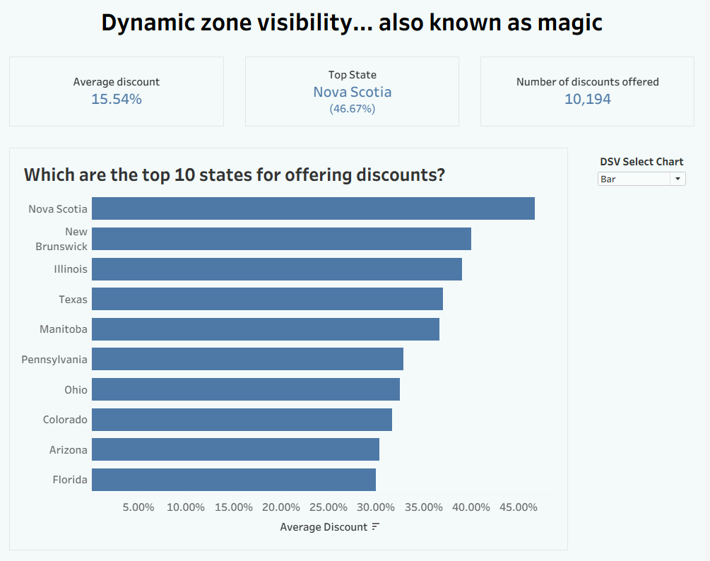
And there you have it, a beautiful chart selector offering you space efficiency and maximising the information you present. Could it be magic? Take That once asked. I think dynamic zone visibility might be just about the closest to magic you'll get in the world of data visualisation... at least until I find a new cool trick that you can do! I hope this how-to guide has helped you learn something new or perhaps understand where something might have been going wrong. For now, onwards to week 7!