


When selecting a category using a parameter, there are so many things that you can do to modify a chart such as filtering or changing colour. In this blog post, I'll explain how you can move your chosen category to the top of your chart like I have done in the feature image, along with some other little bonus tips like adding circles to demonstrate your chosen category. I'm using the dataset from this Makeover Monday which you're welcome to follow along with or use a different dataset to create your own chart. So without further ado, let's get cracking!
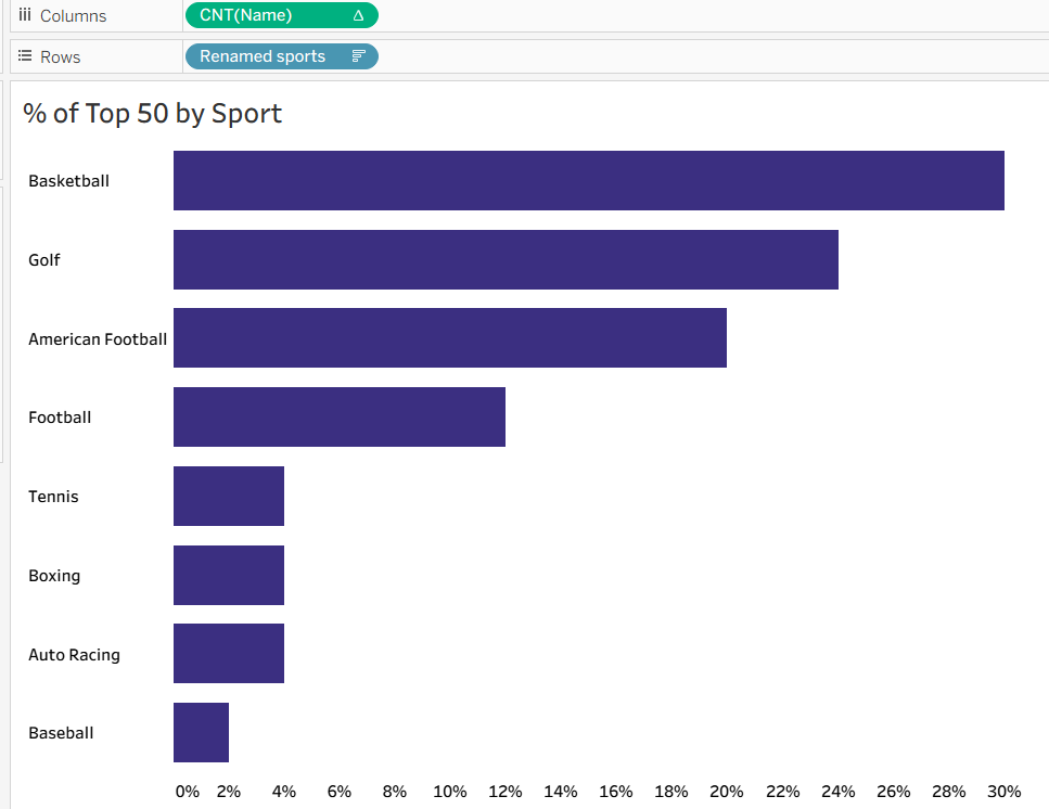
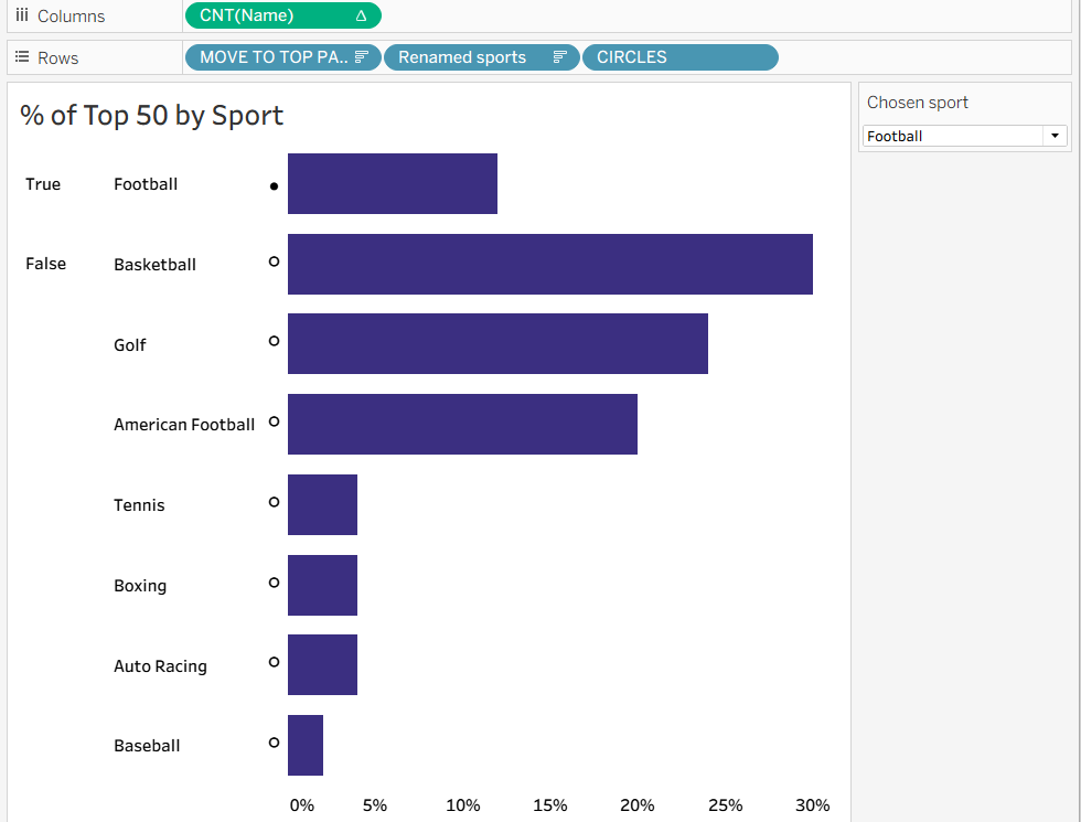
Step 1: Create the basic chart. For this simple bar chart, I dragged sports (or in my case, renamed sports because I just couldn't stand for calling football 'soccer'!) onto the rows shelf and count of name onto columns. I then did a quick table calculation from the drop down, opting for percent of total.
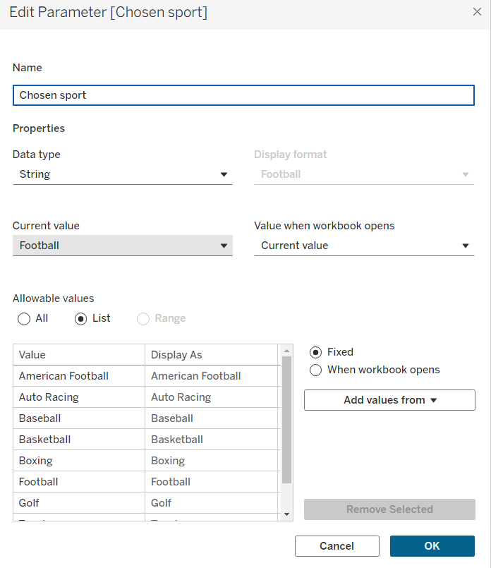
Step 2: Create your parameter. You want your chosen category (for me in this case, it was renamed sports) as your parameter. You can add these values quickly using the bottom right drop down (Add values from...). Your data type should be a string and your allowable values should be a list.
Step 3: Create your move to top measure. Simply copy out the calculation below in the format parameter = category. This is dependent on what you have named your field/parameter and what dataset you are using.
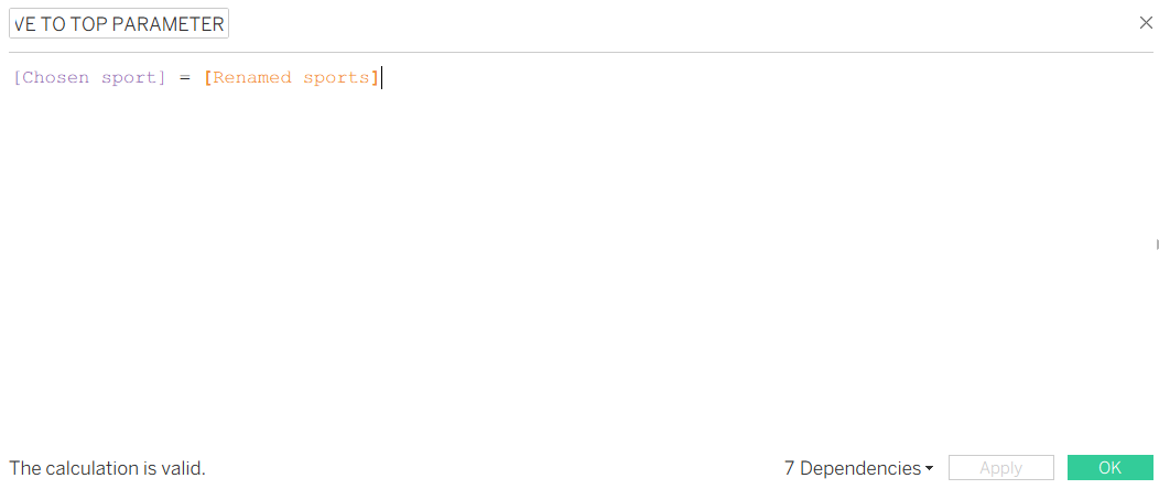
The calculation is a boolean which means that it will return only true or false values. Therefore, when your parameter is the same as a specific category, it will return true for that category and false for all the rest. If you add the measure onto your rows shelf, you will be able to see this. If your true is at the bottom, edit your sort of the move to top pill to descending.
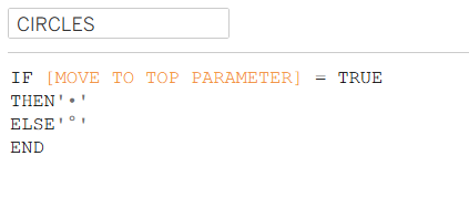
Step 4: Create your circles measure. Copy out the calculation below using your move to top measure (I have called this move to top parameter to note to myself that it's connected with the parameter but might not have been the wisest for a blog! Still, you can tell it's a field as it's orange, not purple like parameters are in calculated fields). The hardest part about this calculated field is trying to find a good circle. If you're struggling, you can always use triangles or another shape. Just as long as it makes it clear which category has been selected (and Tableau can read it), you can use whatever you like.
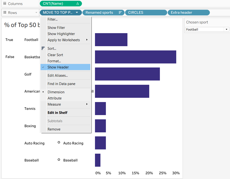
When you add this to your rows shelf, you will come across the issue that your circles will only show for the top true/false value unless you put it at the end of the shelf. But then it doesn't look as effective as it does on the left of your categories, like in the feature image. You'll need to create a new field to fix that.
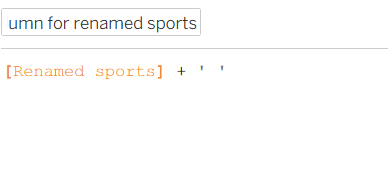
Step 5: Creating a new category header. You can create this new category header in several ways. For me, I just added a space to the end of the new column but you could use all upper case characters or whatever you would like to differentiate the two headers. In fact, after thinking this through during this blog post, I've realised that you could even use the duplicated field. So long as you've got an extra field that you can add to the end of your rows shelf, you can choose what you'd like! Below was my original calculated field if you wish to follow along there.
Step 6: Hide the extra headers. To format the chart without the True/False etc, you'll need to deselect show header in the dropdown of your move to top measure and your original category field. This will leave you with just your circles and your extra header field showing in the chart.
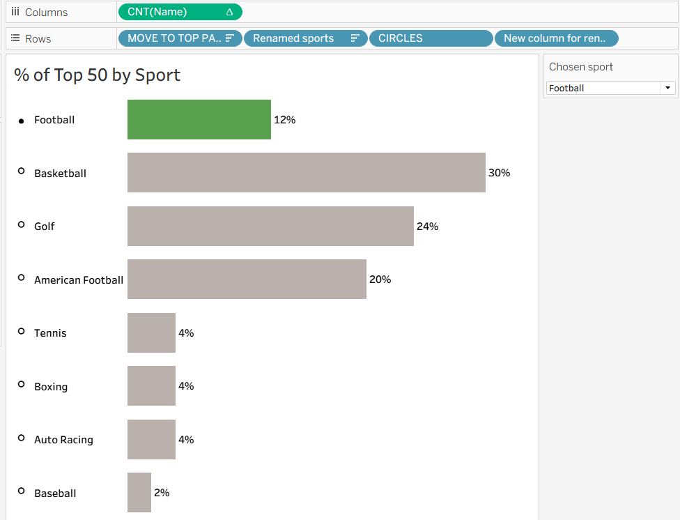
Step 7: Make it pretty! If you've read any of my other blogs so far, you'll probably have noticed that this is often my final step and justifiably so as most things are easier to understand when the formatting is clear. Looking pretty only helps the case by making it more eye-catching. Add labels, colour, hide axes, whatever you see fit to draw out the insight in your chart the best. You can see my final product below.
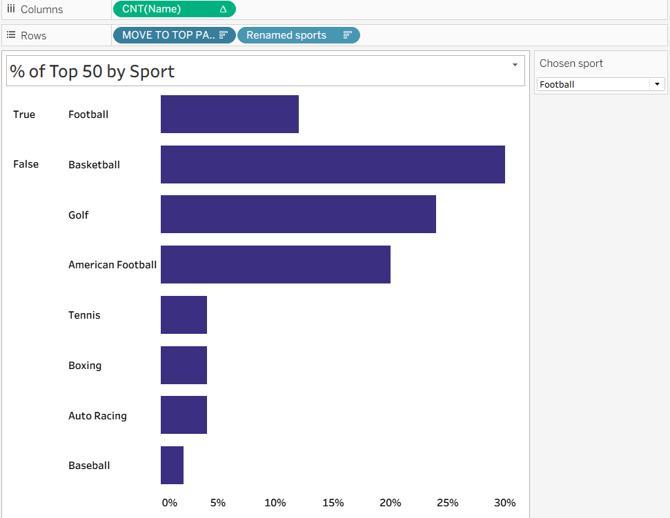
N.B. The pill at the end of the rows shelf differs from the previous screenshot for no particular reason other than me recreating the demo slightly differently. They mean the same thing so don't panic that they're different and that I might have done an extra step in the meantime - I haven't. I've only changed things in the formatting, not the architecture of the chart!
So there you have it - a dynamic chart which can even more clearly highlight your selected category than a regular parameter. I hope you've learnt something new and found this helpful. For now from me, onwards to week 11!