


As I reflect on our first day of Dashboard Week, I feel honestly a little underwhelmed. It's kind of like Christmas in my view (except it's data Christmas) where the build up to it all feels bigger than the day itself. In this case, the data preparation and building the dashboard today at least, was more fulfilling than the presentation itself. I think that's because this was not a piece of work that I was especially proud to show off. I knew it wasn't absolutely horrific but I'd had a vision going into the day and that wasn't what I was able to create in the timeframe. Some lessons to be learned there for the rest of the week to do with scoping and, in turn, managing expectations. Anyway, let's go through the day itself!
Data preparation
We were given a link to the Transport for London Bike Point API and a few instructions that you can find here as our starting point. Initially, I was a little apprehensive about working out how to use an API without the guidance of a coach after leaving a refresher session last week more confused than I had been going into it! However, I was pleasantly surprised and after figuring out how to actually get the API into Alteryx, I was away. Things went fairly smoothly and by half nine, I had a cleaned dataset containing the information that I felt was important to answer the questions that Serena had set us, alongside some additional bits as well.
Chart Preparation
Before starting to prepare charts to go into my dashboard, I sketched things out briefly to work out what I wanted to show and how. As Serena had been quite clear in the questions that needed to be answered, I had a good foundation in what to show. Then I considered a couple of additional points that I felt would be of interest to the user as well, such as prioritising a nearby location over a location with more bikes should they choose to do so. After re-familiarising myself with spatial calculations in Tableau, I got stuck in. Everything again went fairly smoothly after that, bar a few minor hiccups like using the wrong calculated field in a calculation by accident. Nothing too crazy to note!
Dashboarding
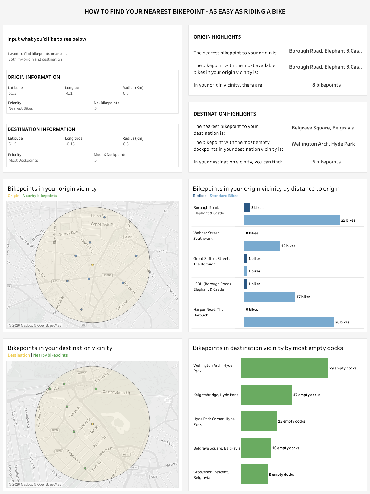
This was the biggest part of my day because of my vision with dynamic zone visibility. I wanted to ensure that if a user was only looking at the origin or the destination, not both, then they could only see charts and information related to that. This meant many dynamic zone visibility calculations and parameters because other charts were also controlled using parameters too. Having just counted, it meant that I ended up with 14 parameters and many additional calculated fields, mainly because I wanted this dashboard to be truly tailored to the user experience. Now I reconsider this, perhaps I went a step too far and should have focused a little more on the consulting side and more clearly demonstrating the answers for the user. Still, after some formatting I ended up with a dashboard that only a few months ago, I wouldn't have been able to create anything anywhere close to in such a short timeframe. It's satisfying to see the progress that we've made! If you're interested in seeing what I created, here's the link to my dashboard on my Tableau Public. Depending on when you're reading this, I might have made changes to it so below you can also see a snapshot of the original.
Lessons Learned
- As mentioned before, improve scoping! Just because I had many ideas on what I could do to make this the best dashboard possible, it didn't mean I had the time to do them unfortunately. So instead of feeling underwhelmed by not meeting these expectations, I need to reframe and think of how far I've come in such a short space of time. I also need to not set those expectations so high!
- Be more of a consultant. Think about what the user wants from the dashboard and what could help them get there, rather than simply answering the questions set by Serena.
- Be brave. Now is the time to try something different. Maybe I should have focused less on ensuring everything looked pretty and focused more on doing the things that would stand out. Like, for example, I wanted to create a subsidiary dashboard that would tell the user their latitude and longitude for their desired location. That would have been better than going down my slight rabbit hole of dynamic zone visibility now that I reflect on it.
I'm sure there are many other things that I could have and possibly should have done differently, and there are definitely aspects already that I will be working on in my own time. But for our first day of the week, I think it sets a good standard and if everything else I produce for the rest of the week is at a similar level, I think that's a testament to the growth I've achieved in the last four months.