


During my application to the Data School, I thought I had learnt a lot about Tableau and of course, that itself is true. Compared to my original pre-Tableau self, I was far more knowledgeable than I realised I might become just from playing around with the software, a lot of googling and searching the Tableau community forums (perhaps the plural fora would be more correct but then I think it would be too confusing!) to answer my niggling questions, and creating several visualisations. Still, there were a number of things that I've learnt in the last week alone that would have saved me so much time. I am therefore imparting these on you to hopefully teach you at least one thing and save you some precious time as well.
- Inputting measures
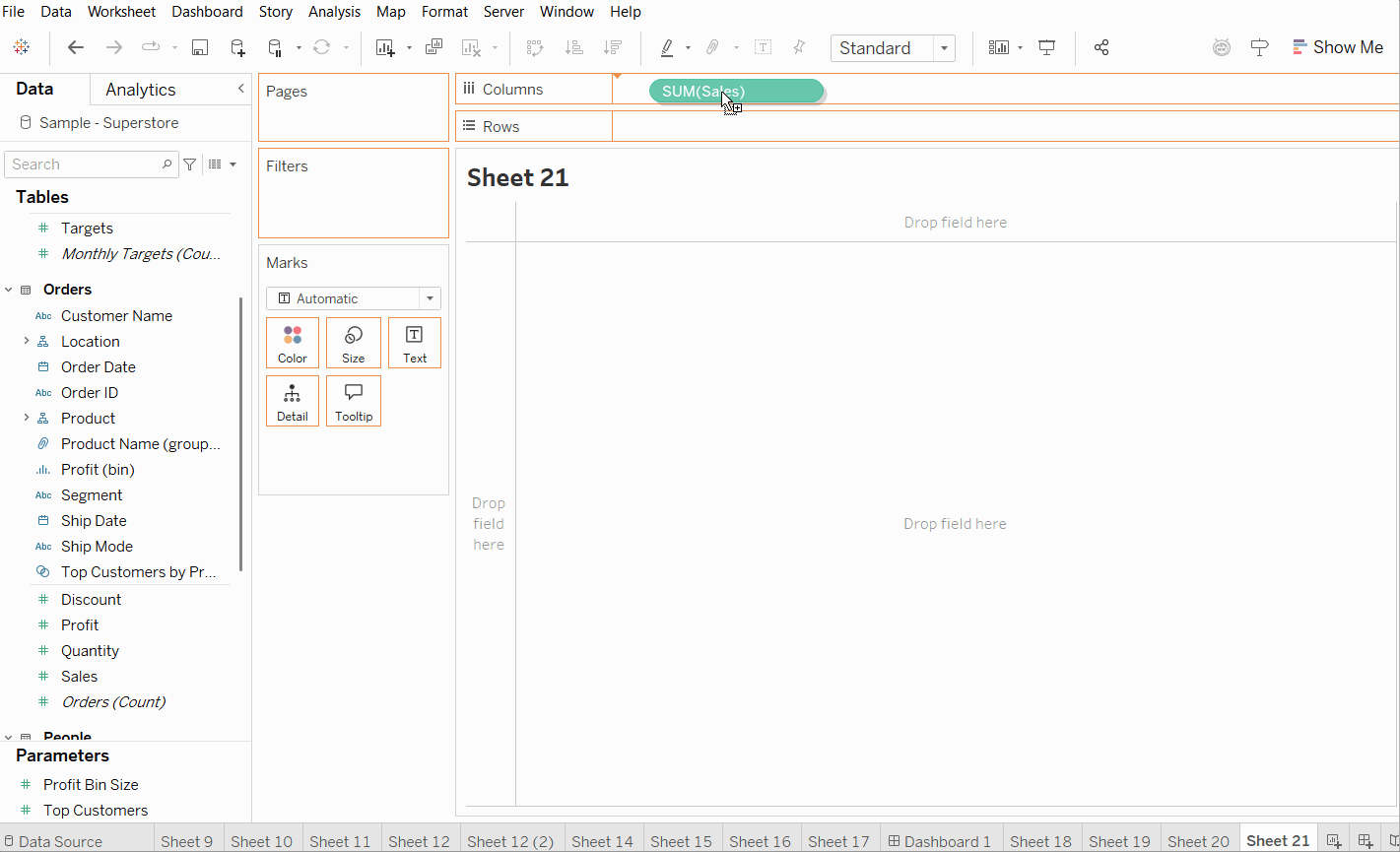
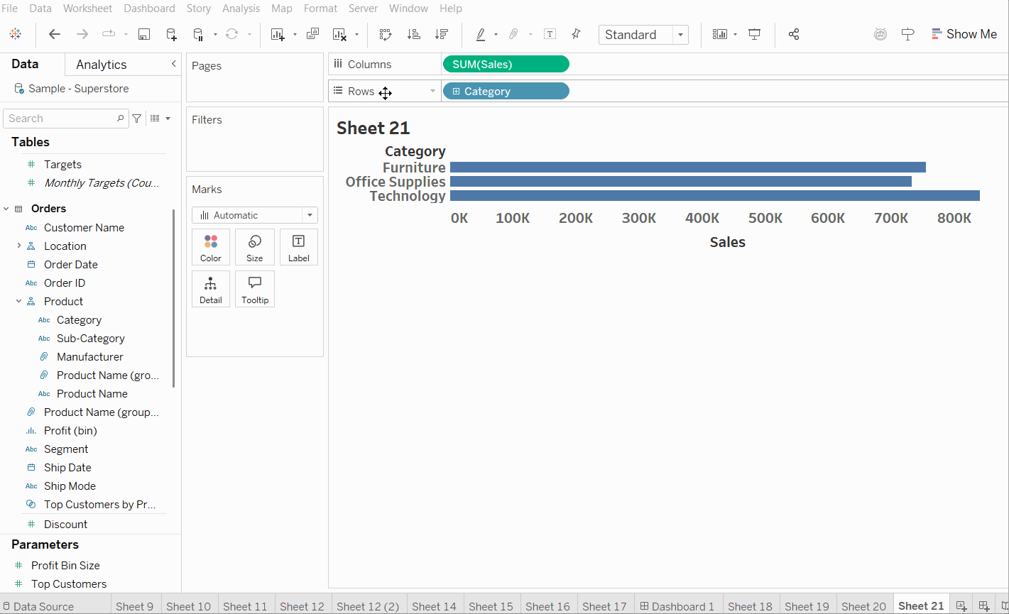
When dragging measures/dimensions into the columns/rows, right click before dragging. When it lands you will automatically be able to select the part/aggregation that you'd like.
- The rows bar can be moved
It might make more sense to you (it might not but it does to me at least) to move the rows bar under the marks card so that you can see more clearly which measures/dimensions are going where as the new rows bar will be next to where the axis is. All you have to do is drag and drop.
- Make a calculations folder
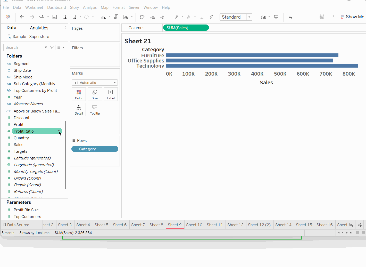
When you create a calculated field, it will slot back into the data pane alphabetically lost for all of eternity unless you have the eyes of an owl to see the tiny equals sign or the memory of an elephant to remember what random thing you called it (additional tip: name your calculations logically so you know what they do). Rather than lose it, you can create a folder and add all of your calculated fields to it so they are more easily accessible, visible and memorable.
- Colour coding worksheets
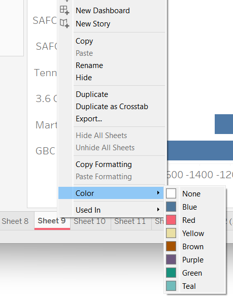
You can add colours to your worksheet tabs by right clicking your chosen worksheet and selecting colour. There are many reasons this might be helpful. For example, you could record your progress by colouring sheets red, amber and green based on whether they're not started, in progress or ready to be dashboarded (I may have made up that word but it should definitely be verbed. There were once brave/lazy souls who used zoom and google as verbs for the first time too).
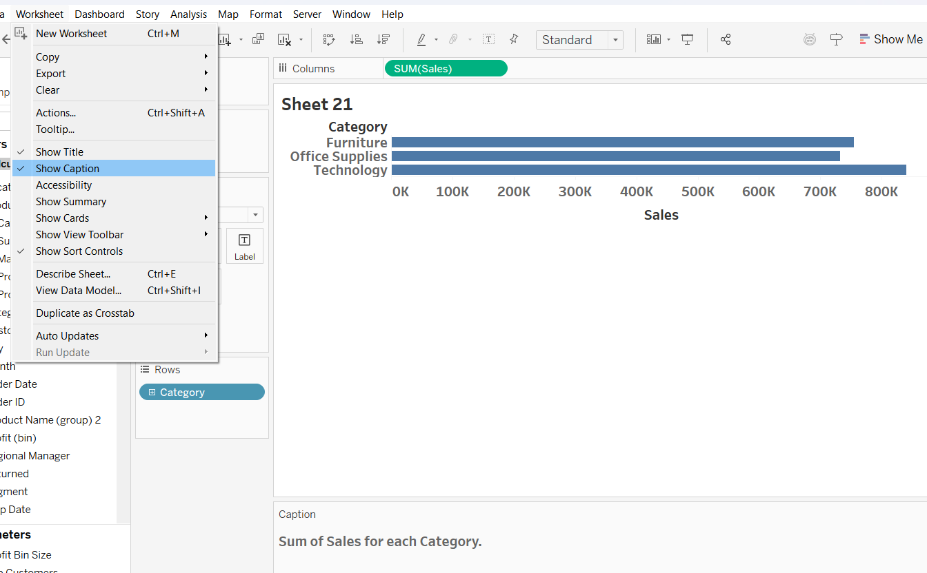
- Captioning your worksheets
This is another tip which is more of a self-help tip rather than something that will impact your dashboard at a wider level. You can add notes to your worksheet via a caption so that you know what you were doing if you take a break and come back to it. It could also be used as a planning tool if you wanted to note to yourself the ideas you have for that worksheet. Honestly, you can use it for whatever helps you the most. Just head to worksheet and select show caption, double clicking on the box at the bottom of the worksheet to edit. The caption won't show when you add your worksheet to your dashboard so as mentioned, this is more to help yourself (or anyone else using your workbook) than to help your dashboard user.
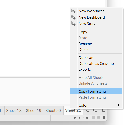
- Copying formatting across worksheets
The amount of time I have spent on ensuring that I've eliminated all the gridlines on my charts is far too long but that doesn't have to be you - or me any longer! You can copy the formatting of your favourite worksheet (right click on the worksheet tab and select copy formatting) and paste it into the new one (right click on the new worksheet tab and select paste formatting), even if your chart is already made. This doesn't transfer fonts across from axes unfortunately and will actually reset them if you have made any changes so make sure you copy the formatting for the pane (e.g. gridlines, zero lines, worksheet background) before you make any axes changes or wait for tip number 7.
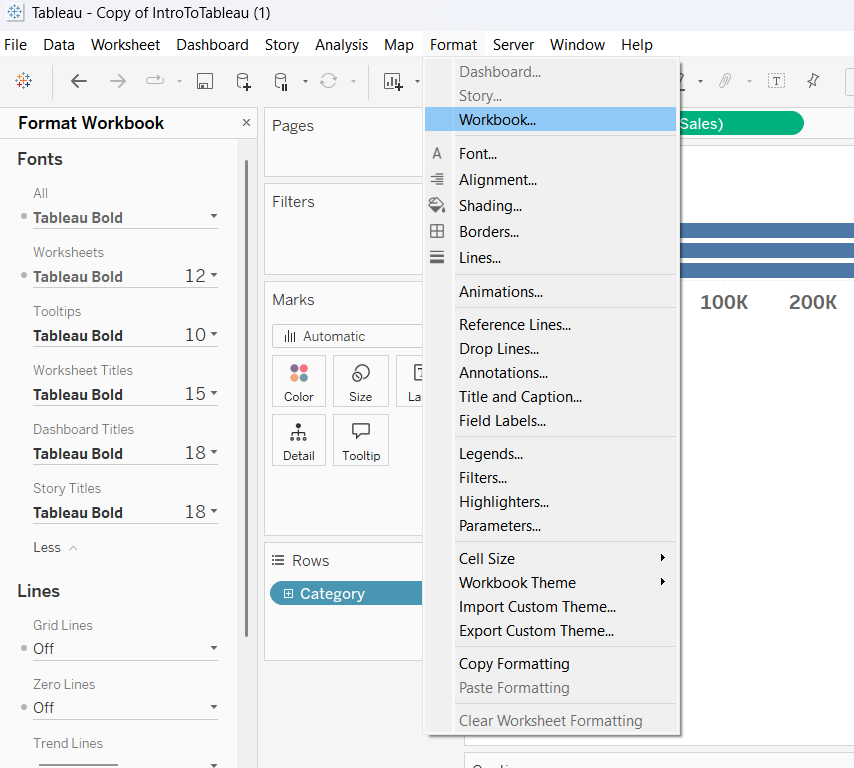
- Formatting across the workbook
You can unify the formatting for your workbook in just one place! At least in terms of fonts and lines. You can achieve this by simply selecting format in the toolbar and then selecting workbook in the dropdown. The options of what you can format will then pop up in the left hand pane. What a game changer.
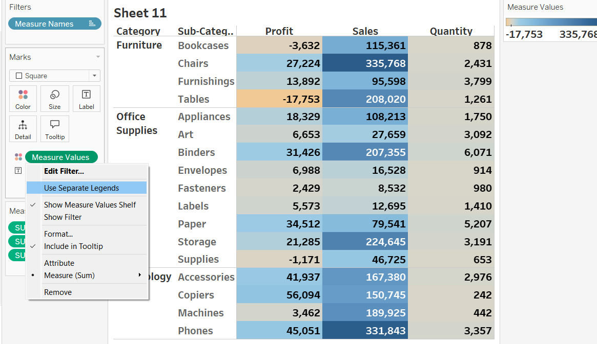
- Separating colour legends
It's possible to create different colour legends for your measures (typically continuous as discrete could get messy) by simply right clicking your measure for colour in the marks pane and selecting separate legends. As I mentioned, it's important to take this tip with a degree of caution because adding too much colour can cause overload and be more of a hindrance than a help.
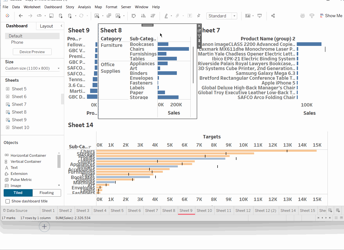
- Selecting containers
Moving onto dashboarding! If you've done your homework, you will know by now that everything goes in containers. Whilst applying, once I had built my dashboard, I used to select the container that I wanted by going through the layout pane which is fine but more work. There is actually an easy way to go up the container hierarchy. Simply double click on the grey bar at the top of your worksheet and the container it is in will automatically be selected. You can double click that blue bar again to get the next container up in the hierarchy (the one your current container is inside). It's like Russian dolls so you can keep going until you get to the outermost container but you can't switch to a different branch of the hierarchy or go the other way from outermost to innermost container.
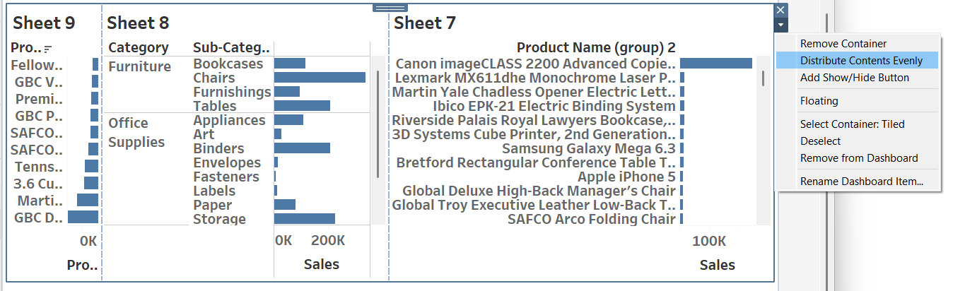
- Distributing evenly
Unless you're committing crimes in Tableau by making everything floating, you can use this sneaky trick to make the items in your container the same width or height (depending on which container you're using) automatically. The days of manually dragging and re-dragging to make sure everything aligns and looks pretty are over! You can find the function either by right clicking on the blue bar at the top of your container or by clicking the arrow in the right hand corner of the container. In both cases, select the distribute contents evenly function and the container will divide the space equally based on the number of worksheets/containers you have in there.
Hopefully some of these tips will save you some time whilst you're working in Tableau! There will likely be many more tricks that you learn as you get more familiar with the software so I'd recommend taking that time to explore the niches which can make your life easier. For now, onwards to week 3!