


Today's dashboard challenge was to design an exceptional KPI dashboard. The dataset we were given was about rent prices in San Francisco.
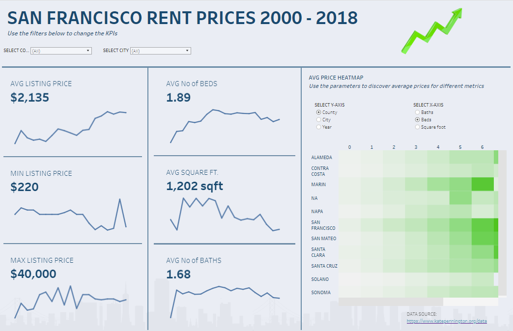
I set out to build an exploratory dashboard with meaningful KPIs, giving the users quick insights to the important summaries of the data. Using a dataset that had 19 years of data, I thought it would be useful to include time series insight into my dashboard.
I hoped my intended user would be able to find quick summaries of house rentals when selecting different neighbourhoods and counties. While being able to see how different metrics of the house rentals have changed over time.
Key implementations
- KPIs displaying different metrics found within the data relating to each rental listing
- Sparklines accompanying the KPIs showing the trend of this metric over the 19 year period
- Tooltips included which acted as an extra level of detail, displayed the metric trend of each year on a monthly basis
- Filters that allowed users to select on City and/or County
- A parameterized heatmap which contained measures on the x-axis and dimensions on the y-axis. The average rent price was included on the colour marks card to give the gradient effect.
- The parameters used a single select option where users could interchange different combinations of x and y axis.
Improvements
- My KPIs were relatively simple, I could included some more calculations within the KPI to show a year on year comparison etc.
- The heatmap parameter was in entire view which squished all values onto an axis, making each metric unable to read
- Creating a bin for the Square foot metric to incorporate in the parameter proved too difficult in the time frame provided
- More instructions could have been provided to properly navigate the dashboard, specifically the tooltips