


We're nearing the end of dashboard week and training. One of our petitions during training was to do more work with Power BI, so that's exactly what we got today. For dashboard week day 4 we had to build a KPI or executive dashboard using Power BI.
HOW I APPROACHED THE CHALLENGE
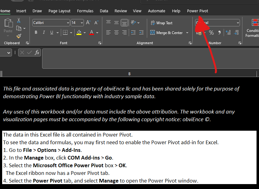
I started off by planning out my time. The first thing I did was look for KPI dashboards to see what they were composed of and what they looked like. From here I wrote down some elements I liked, dived into the data and sketched what I wanted the outcome to look like. I opened it from the provided website and when it opened I had to go on settings for the CON add in, to get the PowerPoint pivot box
After this was done I uploaded to my Power BI workspace and then started bringing my sketch to life.
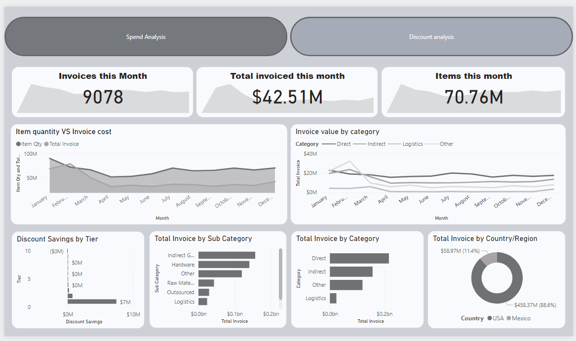
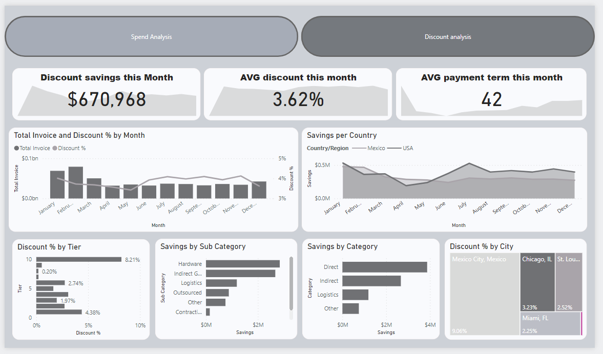
THE OUTCOME
NEXT STEPS
Something I spent a while trying to do was create a slider to chose what currency you wanted to view the dashboard in. I thought this would be a great addition as the company operates in both Mexico and the Us, so depending on what currency the employee felt more comfortable with they could switch to accommodate to their needs.
However, As I started doing it I realized it would take a while and Id have to do it more every single currency filed, so with the time limit in mind I had to leave the idea aside and carry on with the general analysis. This would however be a great feature to implement for the future not only for this dashboard but for future project to come in Power BI.