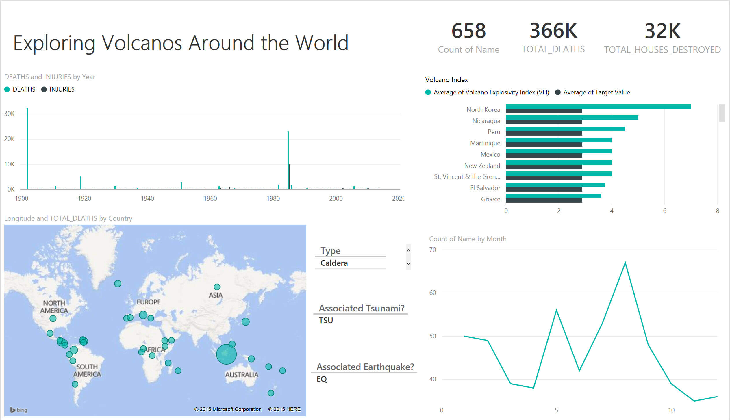
This week at The Data School, we’re looking at Power BI and Qliksense to learn more about other offerings in the BI market. Some got the short end of the straw it seems, Qlik, based on some of the reviews from the other data schoolers. I wouldn’t say that about Power BI though. Without going into building calculations, I built the dashboard above in probably 30-45 minutes. If you get pivot tables, there’s not much to it.
Here are some of the Pros:
Fluid and responsive experience out of the gate – One of my favorite experiences with Power BI is the automatic filters. Once I click on a mark in one of the sheets, it automatically filters the other sheets. Also because the Power BI UI experience starts at the dashboard and building worksheets within the dashboard, we start exploring between various views faster than with Tableau. To me, that was the most mind blowing aspect of Tableau. In PowerBI, its delivered much faster.
Clean look and feel – I will get into how I feel about the locked down design aspect of PowerBI later in the post, but it is so nice to know that at least your vizzes will always be to a certain standard. I suppose its the same deal in Tableau – but since we’ve been looking at Trebuchet MS for 4 months, it starts to look a bit worn.
More Logical – Depends on how much you like the logical/intuitive aspect of working with BI tools. One of my greatest hurdles with Tableau was that it was too intuitive so it wasn’t the easiest to understand ‘how it thinks’. To me it makes 100% logical sense that in order to filter or sort, we sort on measures and write out the logic for sorting to be put on the filter shelf. Similar deal to Tableau but I liked the more ‘under the hood’ experience.
Cons:
Lack of customization – Its crazy to me that we’re only limited to the x charts in PowerBI. I found this message to only be a tad ‘hands off’ approach and off putting.
Calculations – I’ve seriously spent 2 hours trying to figure out how to write this rankx function. I will share half my halloween loot for anyone who can help me filter to the top 10. Way too long to figure out and I’m sure its not because its difficult, but rather there’s no community to explain it to you in plain english. Instead, it was the traditional Microsoft experience where the help centre is labyrinth rather than any sort of assistance.
Thank goodness for the Tableau Brain Trust that is the Zen Masters and all the superfans in the world on the Tableau Community Forums.
Overall, I think the tool is going to be amazing for bringing visualization to the masses. Its approachable, easy for the most part. Not quite sure if it’s a competitior in the world of self service because it puts up a barrier for those who want to learn. I think it will grow the pie and appetite for those seeking to visualize their data, but not necessarily do so for the business analyst.
That’s kind of the amazing part of Tableau – the support network of those who genuinely love the product. Say what you will about the technology, if you don’t get invovled with the community, you’ve only got a tool that makes charts just like everyone else. Tapping into the community is why Tableau lives in the top right quadrant year after year.


