


Today was our first day of dashboard week! The focus today was on accessibility. I focused on designing a dashboard for people with dyslexia (a learning disability that affects reading and writing) and dyscalculia (which affects the understanding of numbers).
When designing for these cognitive needs, the goal is to reduce clutter and ensure all text is as legible as possible. Here are my top six tips for building an accessible dashboard:
Tip 1
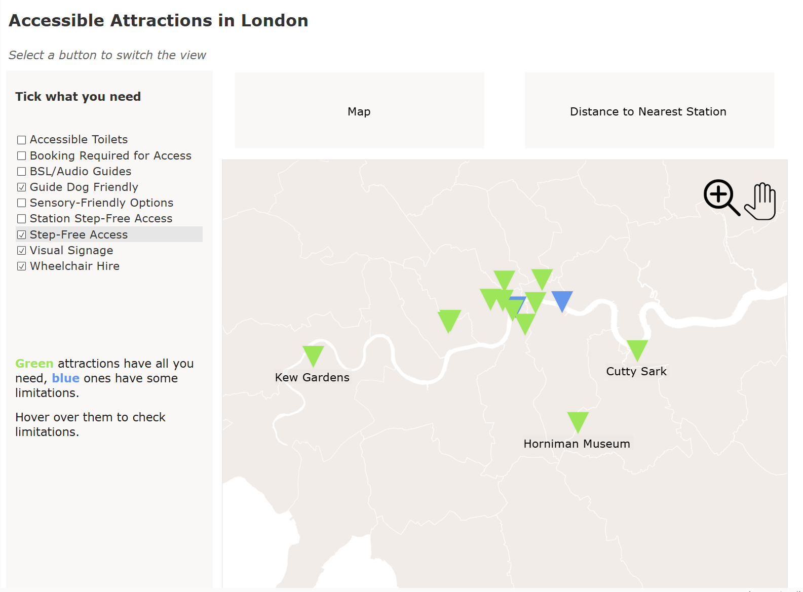
Use a generous amount of padding to allow the charts and text to have some breathing room.
Tip 2
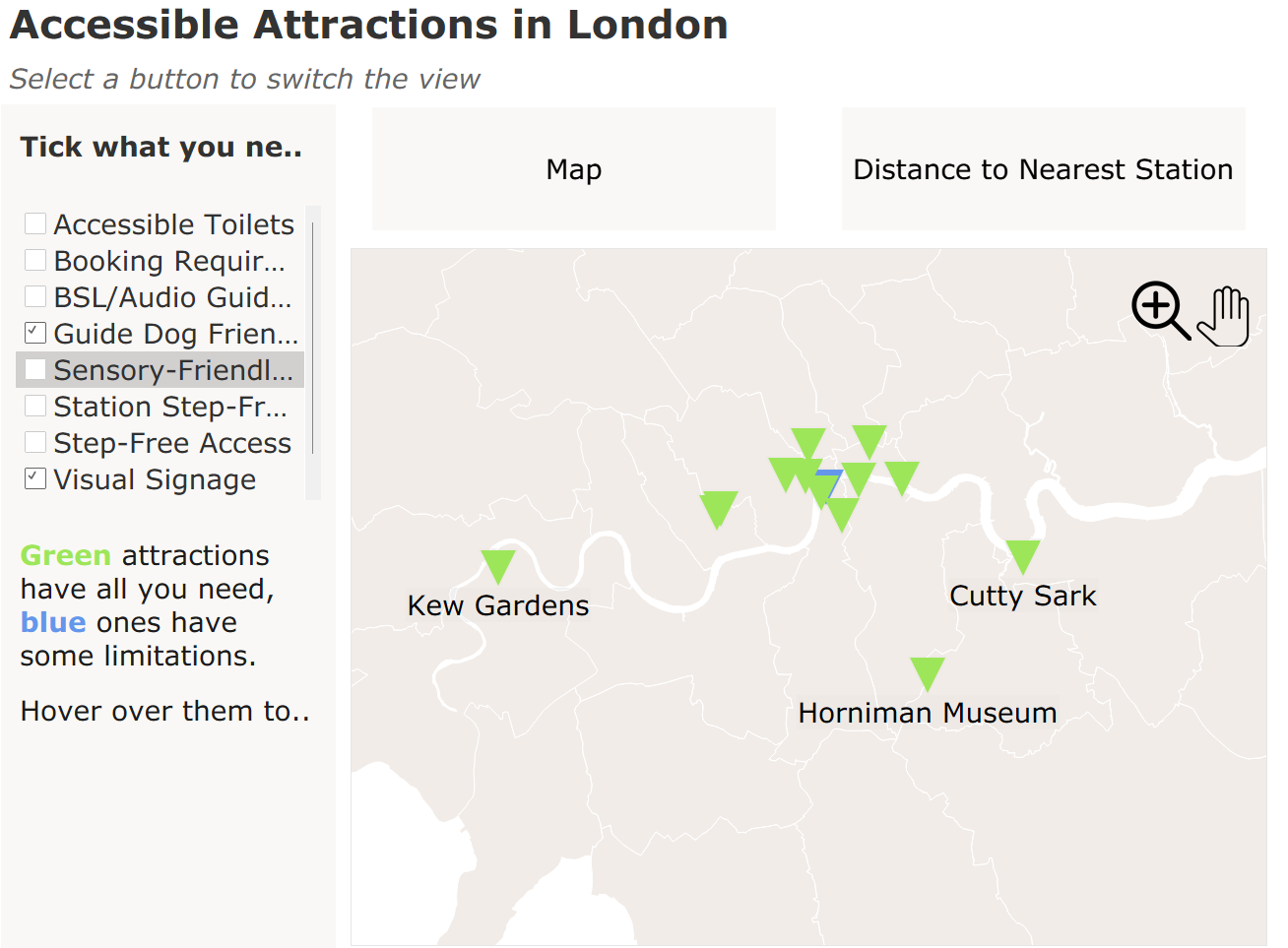
Use a minimum font size 12.
Tableau's default font size is 9 which is usually way too small anyway, especially once you publish to Tableau Public. Even if the font seems too big on Tableau desktop (words being truncated etc), but I recommend publishing the dashboard to see how it looks, because often times the words will fit in the given space.
Tip 3
Use neutral background colors paired with dark text. This reduces visual stress, making it much easier for someone with dyslexia to parse the words. However, when it comes to colour it's best to avoid using too many as this can become confusing very quickly. At the same time, avoid combinations of red and green for colour blindness.
Tip 4
Use icons when possible. Even if coupled with words, these can simply make it quicker for someone with dyslexia to process the word or what you are trying to say. This applies for the general public too, but is especially important for people with reading disabilities.
Tip 5
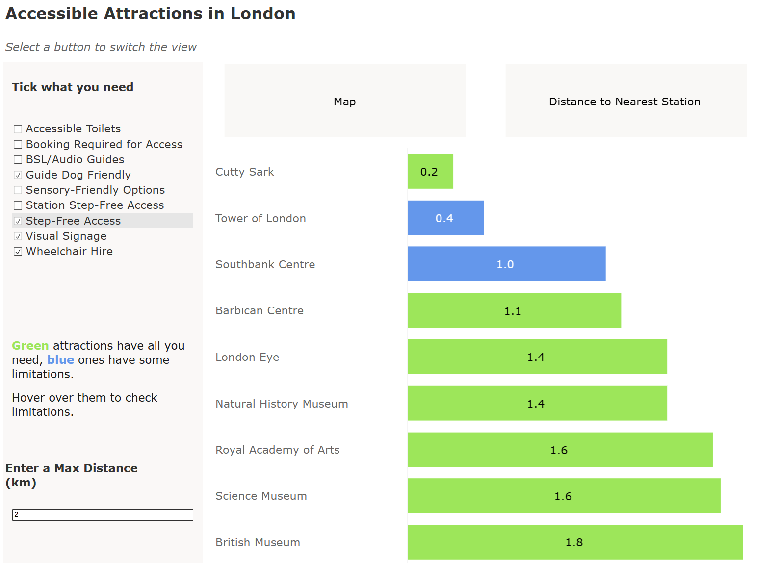
Avoid relying on numbers to express insight. People with dyscalculia will not be able to process that information as well and will gain much less insight. Lean more heavily on pre-attentive attributes such as length, colour and ranking. If you do need to display numbers, do it alongside another indicator of quantity.
Tip 6
Use plain English. Avoid long words with repeated letters and complicated spelling. Write more like how you might speak.
It's important to consider the users of your dashboard and ideally make it as accessible as possible. At the end of the day, our job is to help people gain insight, and the more accessible the design, the more people you can help.