


Brief
For our final day of Dashboard Week we were tasked with transforming Goodreads datasets story-driven infographic using Tableau. Moving away from standard business dashboards, we had to focus more on narrative flow, simplicity and graphic design.
Data Preparation
I wanted to create a network graph to show the relationship between genres. The biggest part of the data preparation was creating a JSON file. This was done so that I could use this website https://www.ladataviz.com/tools/advviz/network to generate coordinates for each node.
Sketches
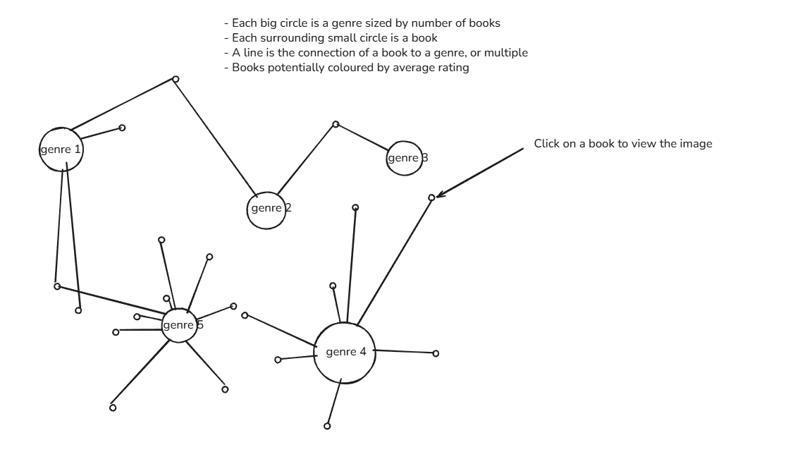
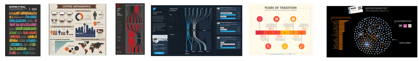
My sketch focused heavily on that one chart and I could have done with thinking more about the design element as well as fully grasping what makes an infographic different from other types of dashboards. I did, however, create a mood board which gave me an idea of what style I should aim for.
Final Dashboard
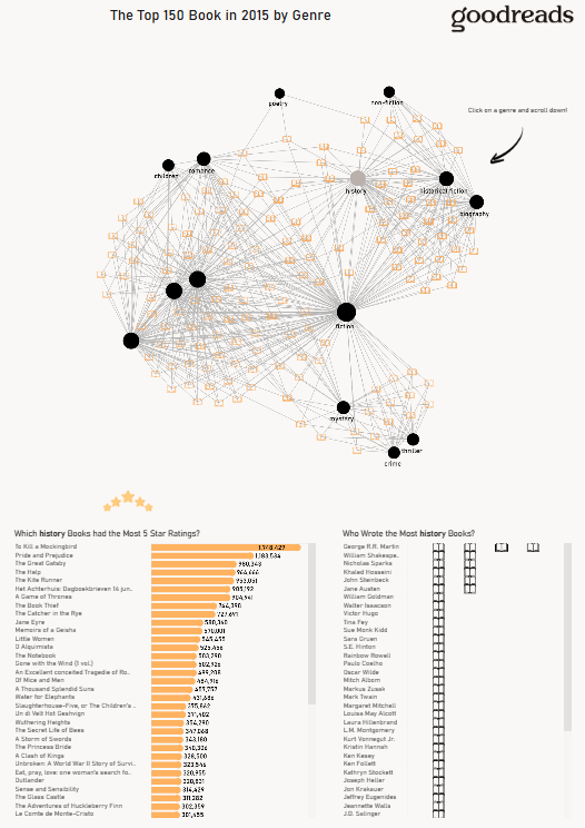
I managed to get the network graph to work, but it left me little time to work on the design and story of the the other charts infographic, which has been my key takeaway from today.