


The Brief
For Dashboard Week Day 2 we were tasked with analysing historical ETF (Exchange Traded Fund) performance on the London Stock Exchange using Power BI. We had to transform thousands of individual tables into a high-performance business dashboard that delivers sharp, investor-grade insights.
Data Preparation
The first challenge was to union together over 4000 tables. Turns out that's much easier to do in PowerBI than I thought it would be. When getting the data, simply select Folder as your input and navigate to the parent folder that contains all the data. You'll then get the option to combine them which will union them all together which was exactly what I wanted.
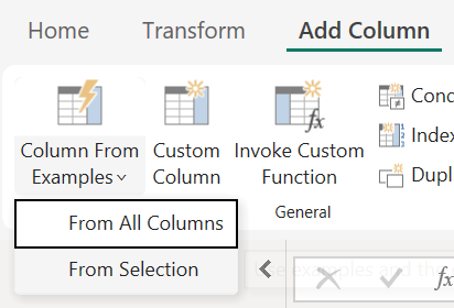
With that done, I removed some unnecessary columns and fixed up the date field. At first it was a string type with the form YYYYMMDD. To fix this, I used PowerBI's Column From Examples option where you can enter the expected date form and it will fill in the rest. A very useful feature!
Sketches
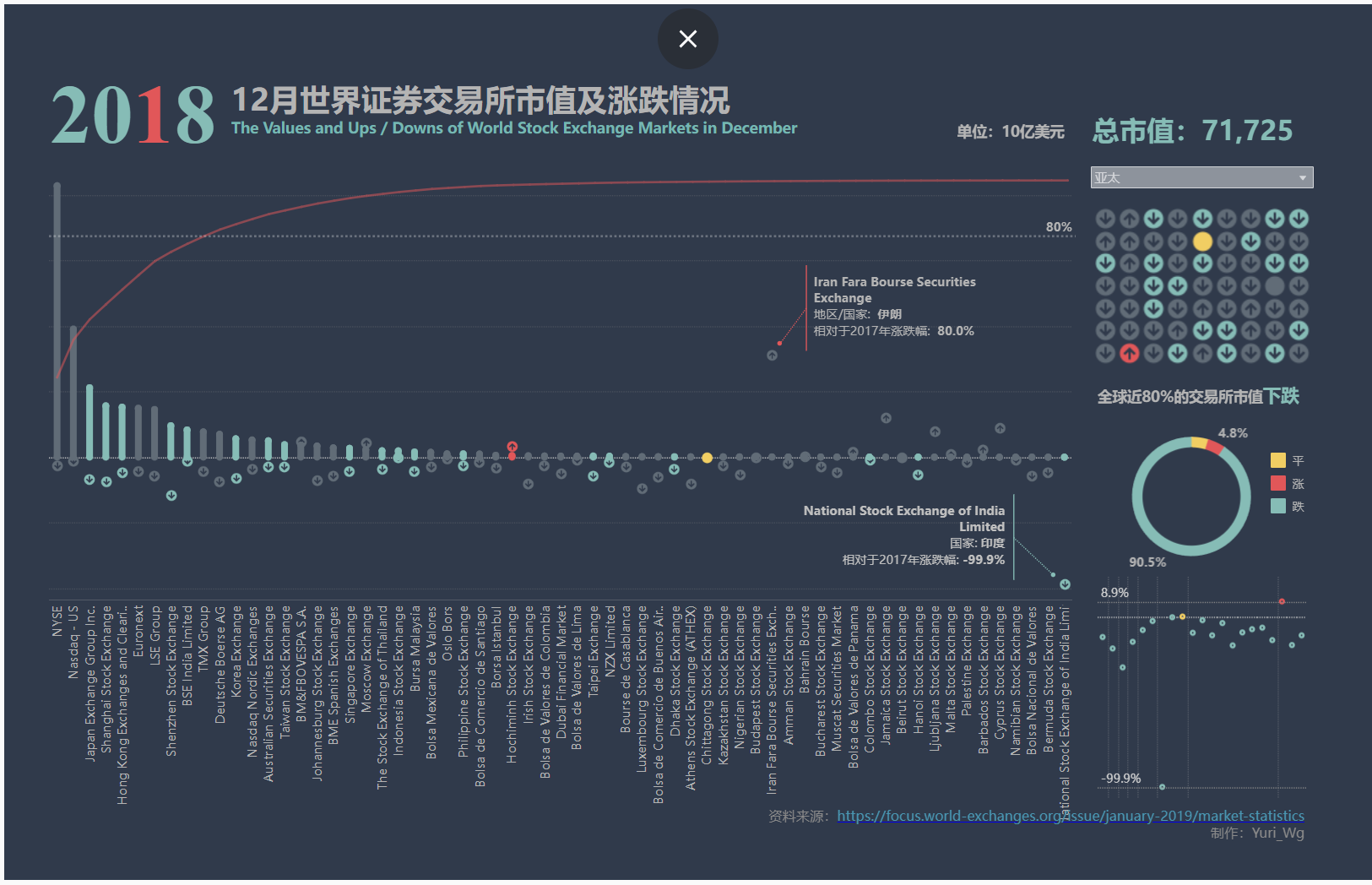
Next, I had to think about what a user might want to gain from this dashboard. This was the most challenging part for me because I have no stock market knowledge so all the metrics mean very little to me. After searching for some definitions of the key metrics, I went to Tableau Public to find inspiration. I found a couple dashboards in Chinese which caught my eye and I had a deeper look at the chart types they used and the style of the dashboard. The one below was my favourite so I took a lot of inspiration (I can't read Chinese but Gemini helped).
My sketches ended up being quite rushed and unfinished (see below), but they helped guide my ideas.
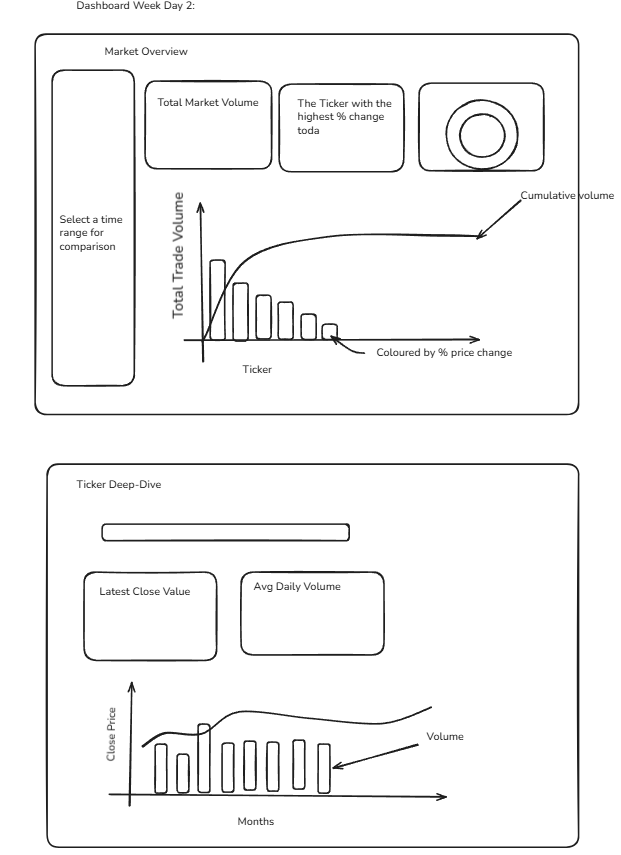
I have a tendency of finishing my sketches too early and jumping straight into building, but I have found before that when I really think through sketching, the building goes so much smoother so this is something I'll try to focus on for the rest of the week.
Final Dashboard
My final dashboard had two pages, one for the market overview and the other for the ticker drill down.
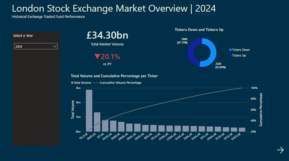
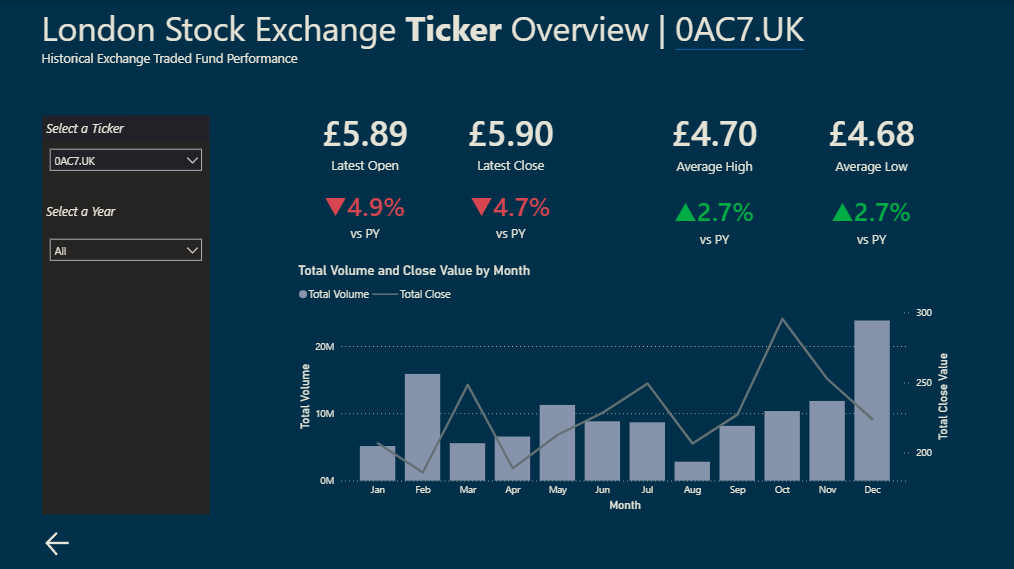
There's definitely more that can be added, such as slices on the left hand side and some info buttons to explain metrics.