This week is the final week of our training and this also means it’s Dashboard Week (some people also call it ‘Hell Week’). I can’t believe it’s almost been four months since I started and how much I improved myself since then. But let’s not get too sentimental (yet) as this blog post is to explain the task we were given and how we dealt with it.
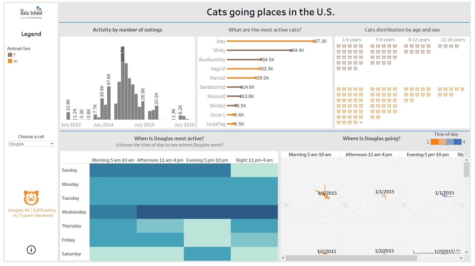
As the title says, today’s task was to do an analysis or infographic based on data from CatTracker.Org. I decided to go for an analysis of the U.S. dataset. After reading through the documentation and understanding the dataset, I started with the visualizations. My idea was to build a dashboard that shows an overview of the dataset but also gives the option to dive deeper into the data. In the end, this is what I came up with:

Challenges I dealt with:
I spent too much time building the map and trying to figure out how to calculate the distance between outings. Then I also spent quite some time calculating the duration of the outings only to give up and change my viz in the end because I was not sure if my calculation was correct (see tips for improvement). I wouldn’t say I felt stressed because of the time deadline but I feel I could’ve shown more on my dashboard.
Tips for Improvement:
o Prepare more for the presentation (don’t do it on the spot)
o Ask (on Convo) when you’re not sure
o Spend more time formatting your dashboard to make it look more tidy and clean
