


And onto the final day of training!
The brief was to use Goodreads data to create an infographic dashboard leaning closer to data journalism than standard business analysis.
Data Preparation
Before designing, I had to see what fields I was working with.
The data required some restructuring: converting dates and splitting genre - a comma-separated fields into multiple rows.
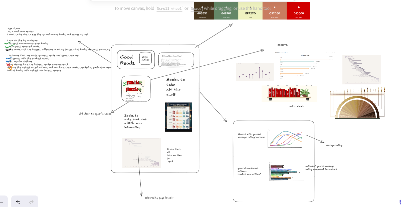
Planning and Design
Once I had a clear narrative in mind, I mapped out my initial sketch using Excalidraw.
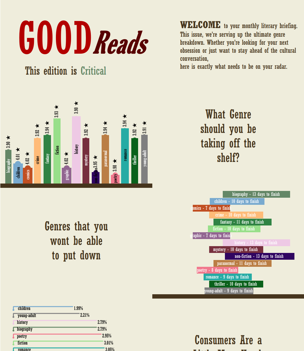
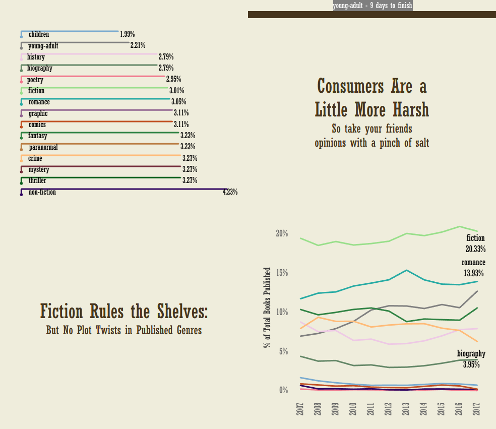
Building the Dashboard and Telling the Story
Once the data and custom assets were imported into Tableau, I experimented with different chart types to build a compelling narrative.
This is where I think I should have gone for simpler charts as trying to build complex charts took up a lot of time. I eventually decided to stick to simpler charts and make them resemble bar charts.
Final Thoughts
The experience I’ve gained throughout my training really culminated here, making this my favorite task and the best dashboard I’ve created all week.
This project officially brings my training at The Information Lab to a close. I am incredibly excited to begin my first placement as a Data Analytics Consultant!