


The day:
The first day of dashboard was kicked off with a presentation on accessibility which was a real eye-opener. We learnt about how aspects of our daily lives have been altered or cater to people with different needs and most go unnoticed!
Moving on from this we covered some of the ways some one with accessibility needs may navigate through BI tools. Some tools we covered were Text-to-Speech and using keyboard navigation to go through dashboards.
Then we were given an option to choose from 4 briefs to build a dashboard with accessibility in mind.
My brief:
Screen Reader-Compatible Public Infrastructure Map
Scenario:
A summary dashboard using the new dataset, with filtering by key features like toilets, lifts, and walking distance from attractions.
Demonstrate how a user can use a screen reader or keyboard navigation can move through all dashboard components and understand key takeaways.
Plan:
After scanning through the data I jumped on to excalidraw to sketch my dashboard.
This is what I started with:
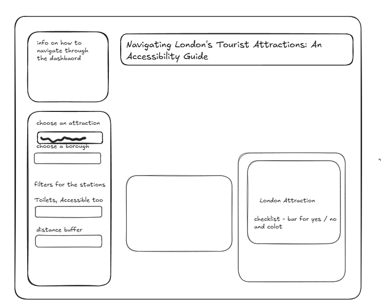
Admittedly it is not that detailed because I did rush into tableau to start building once I felt confident enough to carry on.
However, while building the charts I felt that the user would find it a little difficult to actually navigate through the dashboard and it wasn't addressed the user story properly.
So I went back to my plan and changed it to the below:
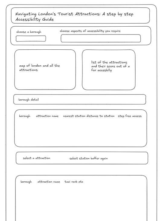
I felt this layout would address the user needs more, a step by step guide is much easier to follow if you have accessibility needs and if you're new to London.
Dashboard:
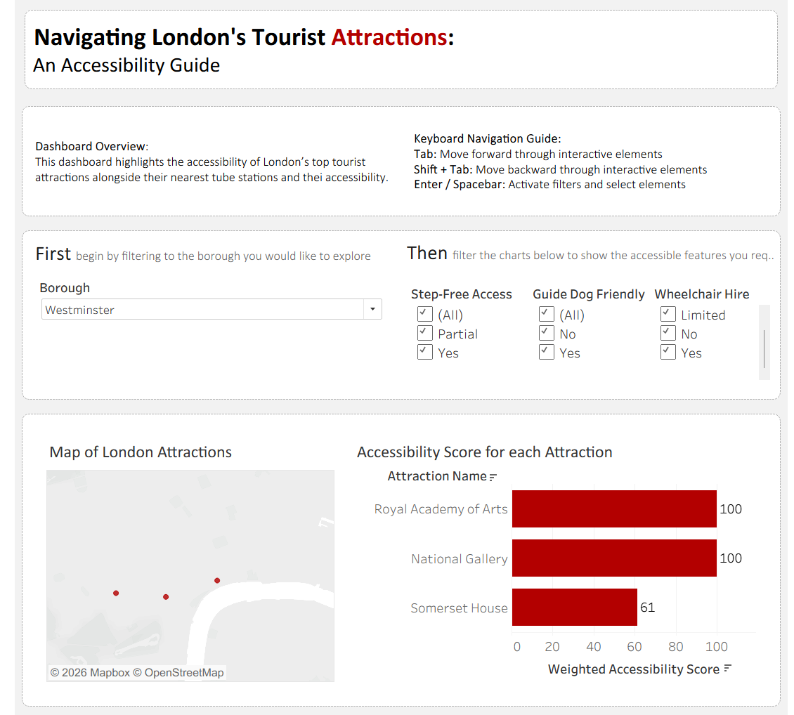
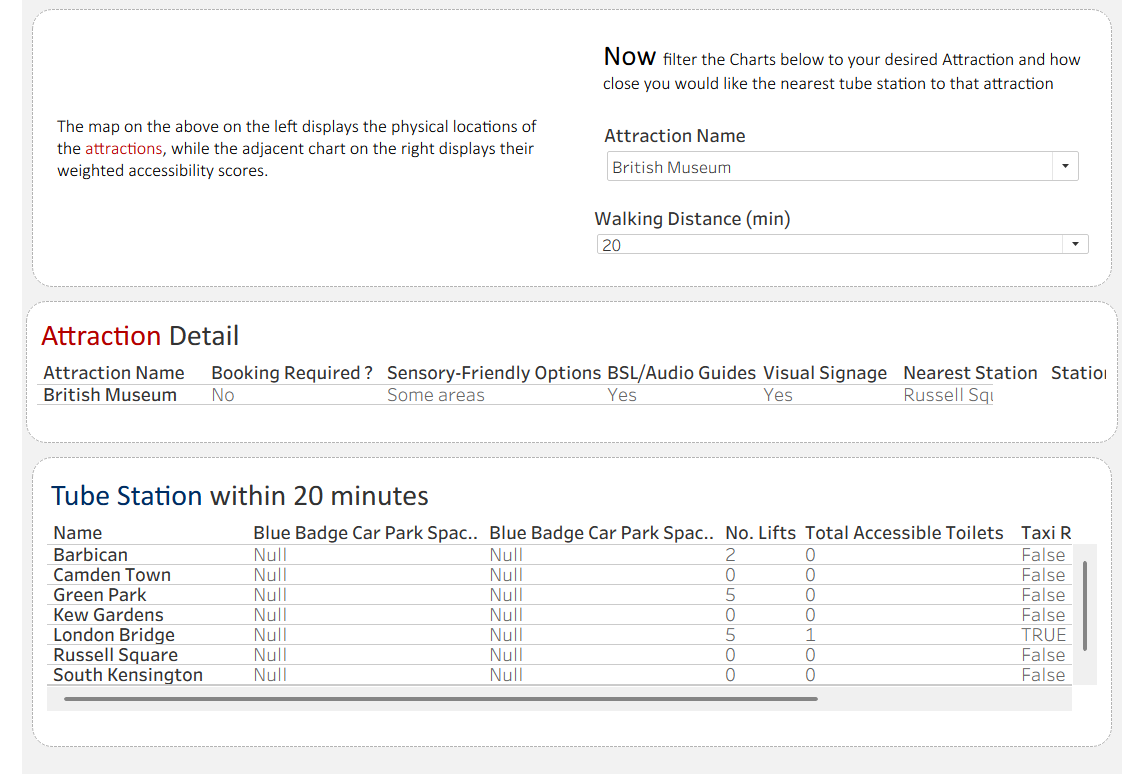
One Thing I Learnt:
When using the Text-to-Speech tool, the AI will auto generate a description for the chart but this is not always a great description.
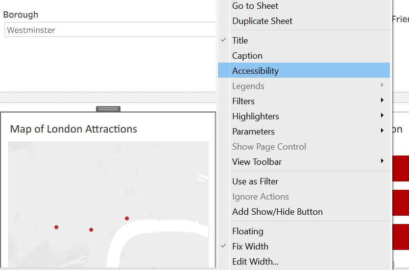
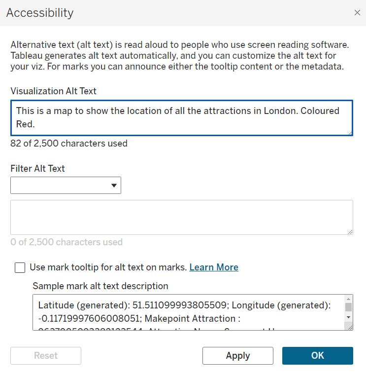
If you follow the steps above you can change what the Text-to-Speech tool will say when reading to the user.
This is important to consider as I'm sure a user would prefer listening to more of a human touch on the description.
Feedback:
- When using the keyboard navigation the order in which the charts are selected should be changed.
- The style of the dashboard was good as helpful for people to follow along and break things down for them easily as well.
- Be careful when weighting the Accessibility in the attractions as the weightings may not be universal
Personal Reflections:
Today was really fun, I had learnt a lot not just about accessibility in Tableau but also in the real world.
Pivoting my brain to a user story which is different from the typical stakeholder was challenging but it was nice having to look at things from a completely different lense.