


Last Friday, I created my first KPI dashboard at the Data School. Our cohort of eight was divided into pairs and each pair was given the same dataset to individually design a KPI dashboard. The datasets were diverse; there was data for Customer Service, HR Analytics, IT Help Desk, and SEO (Search Engine Optimization) Analytics. As suggested by the title of this blog post, I was assigned the IT Help Desk dataset.
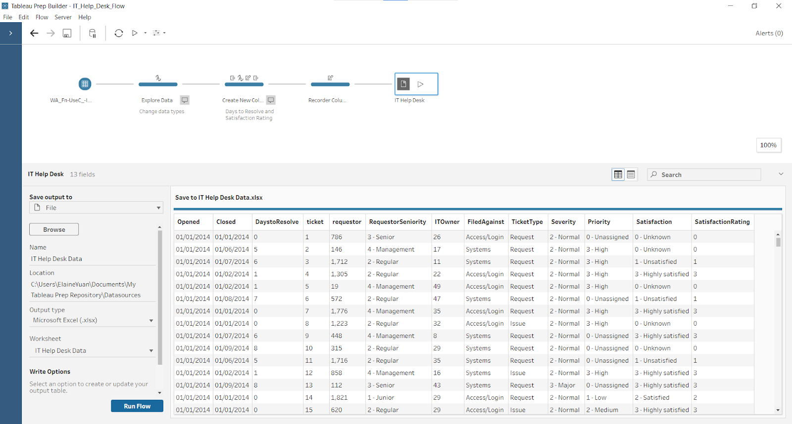
When I received the data, I reviewed it in Excel. Each row was a help desk ticket record and columns included open date, close date, priority, severity, satisfaction, etc. I wanted my KPI dashboard to showcase the average time difference between the open and close dates, as well as the average satisfaction rating. Therefore, I started in Tableau Prep and designed two new columns, Days To Resolve and Satisfaction Rating.
With this new data, I moved into Tableau Desktop. I had a sketch of what I wanted to create, but as I continued to work, I deviated from my plan.

After five hours of dashboard design, I presented this at the end of the day.
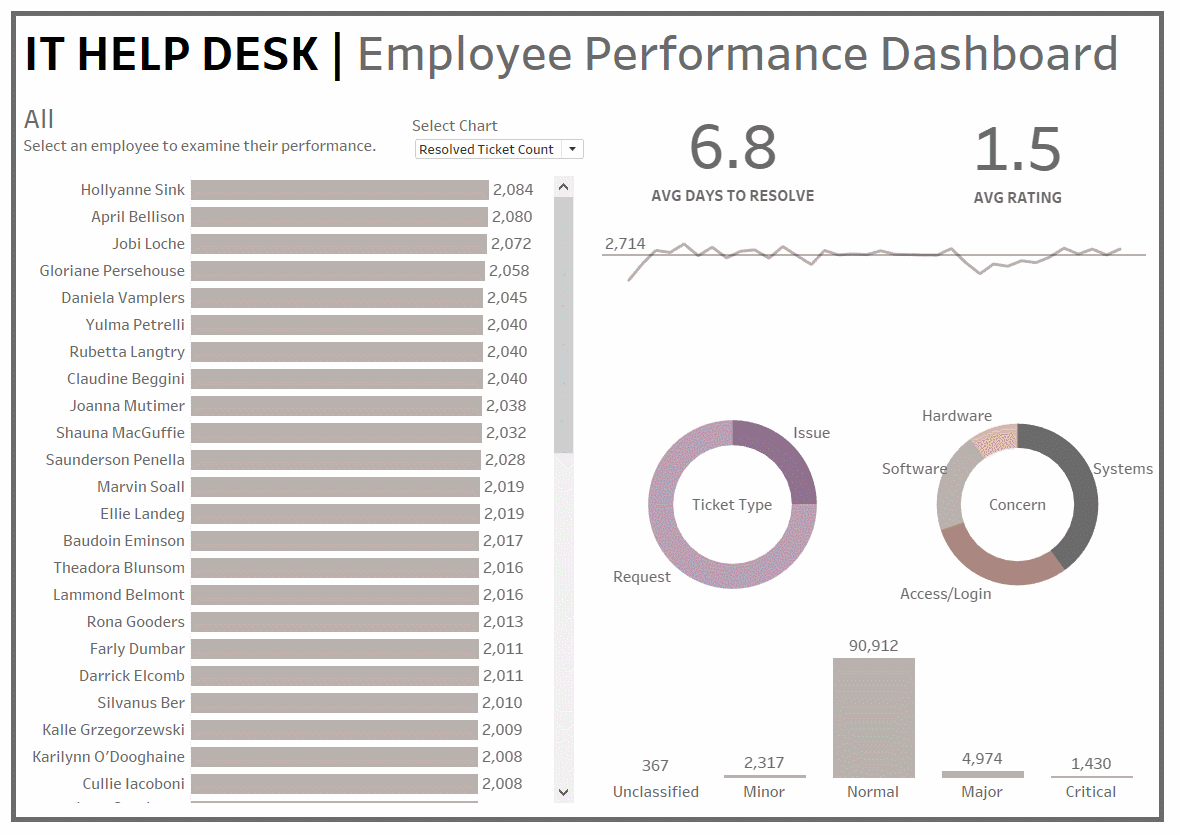
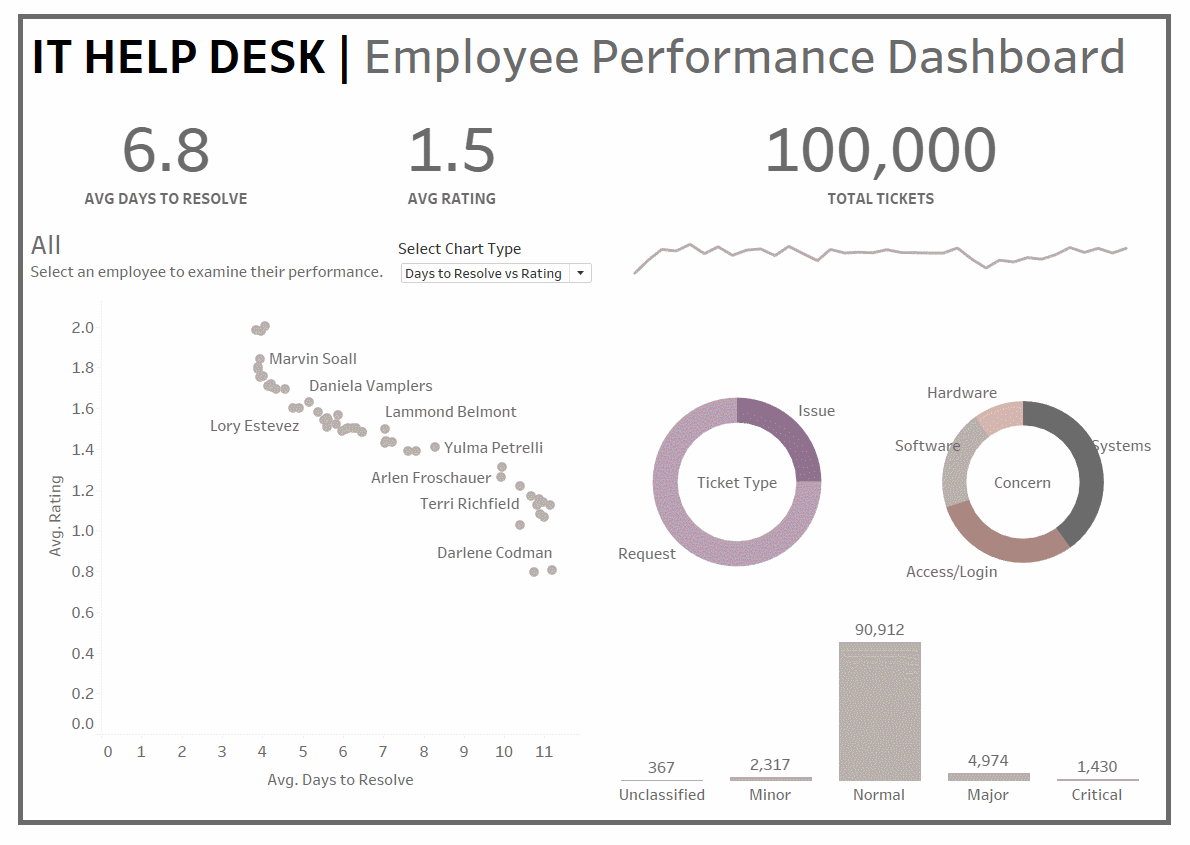
After feedback from the great Sam Shurmer, a consultant at the Information Lab, I improved my dashboard by creating more white space and prioritizing the big picture understanding of the data.
Coming from a full-time data analytics bootcamp, I was very familiar with weekly Friday projects and their associated stress. Even though this was a challenge, it was a fun one - I got to create a data product from a given dataset! I know this is only the beginning of my development at the Data School and there is a LOT more to learn. I cannot wait to see how my dashboards and technical prowess improve in the future.