


1) Understand your data- Knowing what your data represents will help determine the types of charts which you will be able to create.
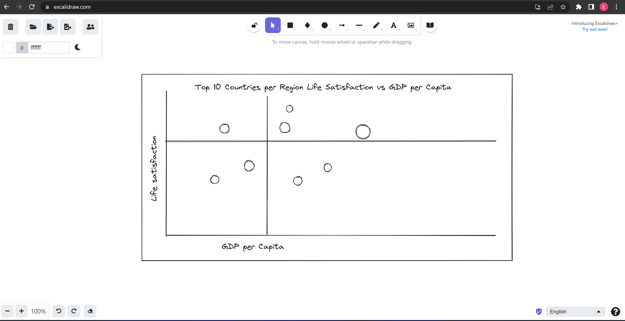
2) Plan your charts- As with any task it can be helpful to plan out what you want to do and how you can do it, with data visualisation it is no different. Drawing a rough sketch of what you want your charts to look like on a piece of paper or using software such as "Excalidraw"; provides your client with a risk free demonstration of the dashboard and you can make amendments to the design and function before spending resources creating it on Tableau.
3) Choosing the correct chart type- With so many different types of charts that you can create, it may seem overwhelming when trying to chose which ones you want to create. Presenting your data in the correct
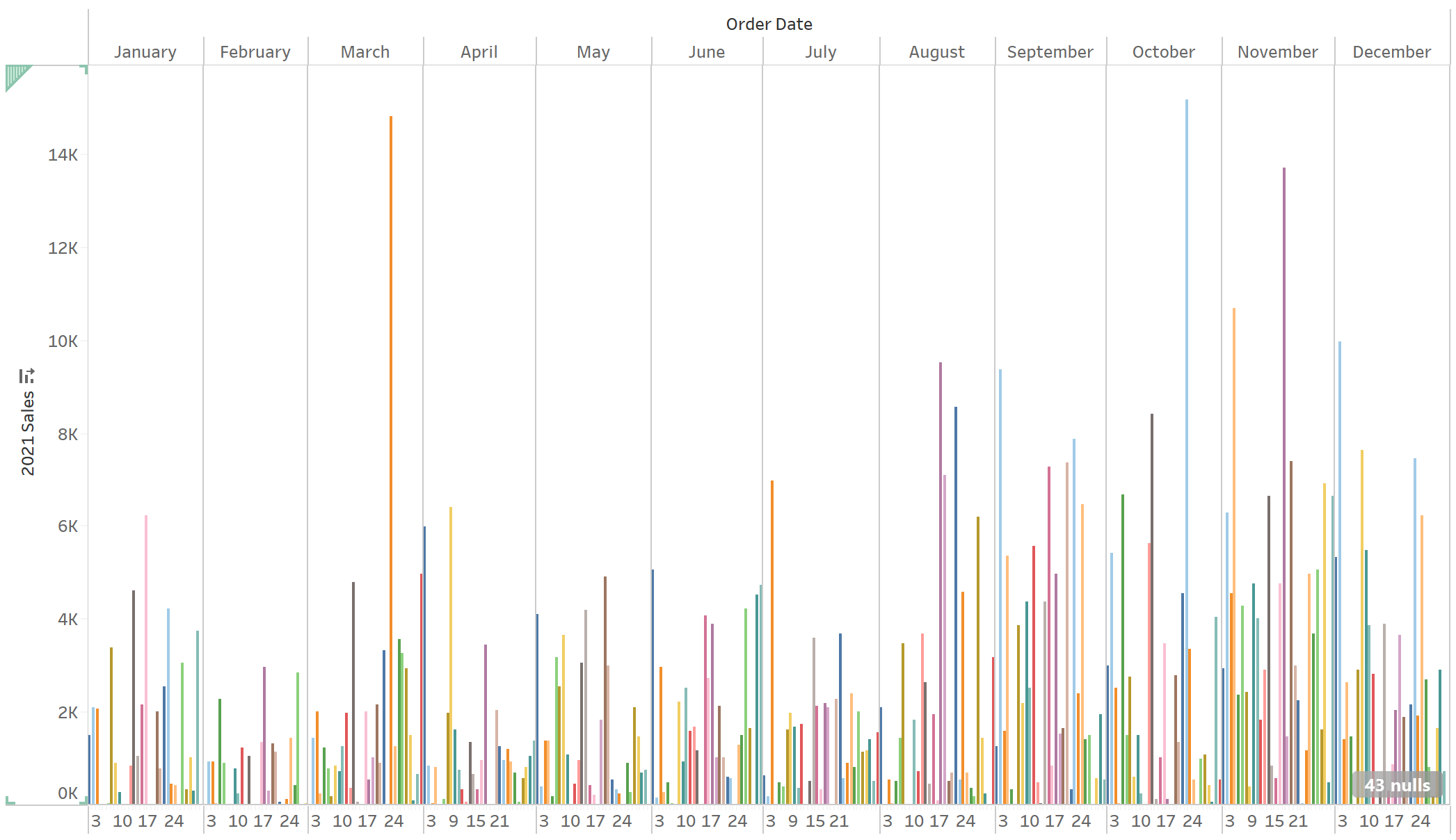
4) Don't overload your charts- When making charts, the focus should be on providing a concise representation of the data you want to see and present. Presenting a chart with 100's of field, all individually coloured is likely to become confusing and redundant as you try to interpret what is going on in the chart.
5) Formatting- Even with small datasets and charts it can be easy to make your charts hard to read. Generally speaking, less colour is better but using colour can be helpful in making specific values of interest, more obvious. It is also important that when using colours on charts that the theme throughout remains consistent, for example; try not to use a colour which signifies profit but then also use the same colour in another chart where it mean loss. This could confuse people and makes the Viz look more complicated than it needs to be.