Day 3 of Dashboard Week was relatively broad in options. We could select a NASA API of our choice and make a Dashboard from the data in either Tableau, PowerBI or Alteryx with app configurations that returned rendered reports and interactive charts.
I spent about 10-20 minutes deciding which API to call, although lots seemed interesting I was unsure what I tangibly wanted to deliver at the end of the day. Greater clarity here might have helped me decide on an API.
Ultimately I opted for the EONET data on natural events. Trying to put into practice some of my own reflections in blogs within training I committed to documenting my API call flow in Alteryx:
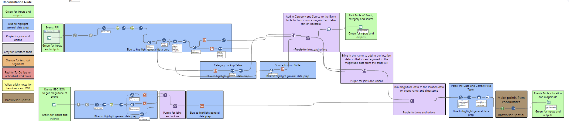
I think this was a worthy use of time and resources as I think I could hand the flow over to a colleague and they could grasp what I am trying to achieve.
I picked the Natural Events API because I was heavily tempted with trying to produce an Alteryx reporting app where a user could select an event type and time period and get a report on the information. My decisions throughout the morning were made with that deliverable in mind.
Ultimately, I am not sure I called the API correctly as I got a limited pool of data back. I read through the documentation fairly thoroughly. I checked for pagination and tried to call the API filtered on specific categories but to no avail. I am a bit disapointed that I did not get the full extent of data I wanted, but am happy for two reasons - my flow is documented well enough to return and try and amend the flow to get the full range of results. Additionally, my final deliverable should also be scalable to more data - rather than scope down to what I did have I shifted to a proof of concept approach that can hopefully be made better with more data.
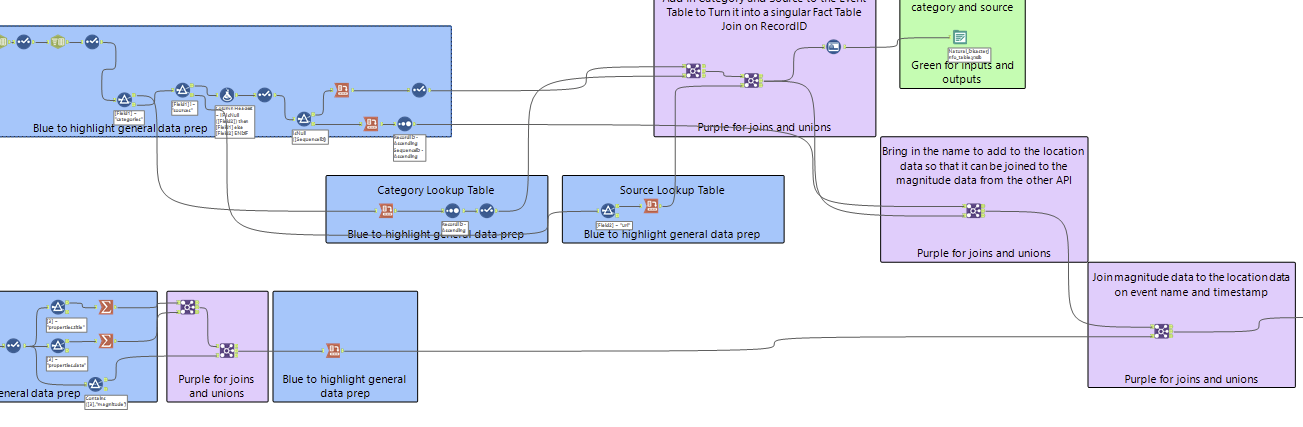
The one additional challenge I did in the data collection stage is make a second API call to flesh out the dashboard with more information. I called the geoJSON events API that contained magnitude of the event (the standard events call did not contain this information). I got some good practice at manipulating data to a stage where I could do a multi-condition join on date and event to combine my snapshot info for the location of the event with magnitude information.
Consequently I had reached the stage where a decision needed to be made, the Alteryx App seemed less logical given the state of my data at the stage I was at, I also was struggling a bit with creatively utilizing the data I had. I decided the best bet I had for delivering something was to abandon the beginning of my Alteryx App:
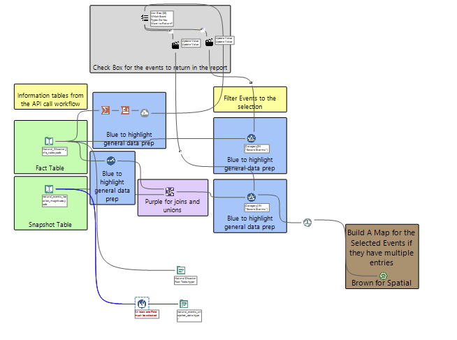
The app was getting complicated as some events were static points whilst others were polylines meaning that if I wanted to geographically report the information I would likely need to set up a detour or logic to process the two data types differently before rendering a chart. I foresaw the final deliverable being rather limited so pivoted to sketching a Tableau dashboard (themed around data quality).
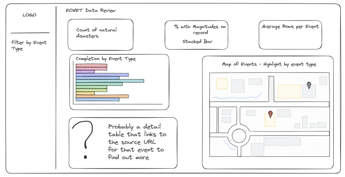
Making the dashboard was fairly straightforward and should scale to updated data. I like that the sketch has a strong use-case motivation. The map should reveal if data for particular events is concentrated in particular areas (some of this would be logical e.g. Ring of Fire Volcanoes, others maybe less so; wildfires in Australia missing perhaps). The KPIs should give executives a headline sense of the size of their data, where additional information might be lacking and the granularity of snapshots. A detail table offers the opportunity to link back to the source information. While the completion by category can reveal if an event type is not being captured correctly.
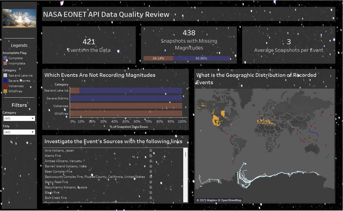
The dashboard came together decently I would say. I am not convinced by the background, but I have never used an image in the background before so it felt like something worth trying. I think the chart types deliver on their expected value - but need more data. Filter and highlight actions that I added over about 15 minutes improve the usability of the dashboard.
Overall, I would score today's dashboard effort a 6. The dashbioard is not bad for how long was spent on it. Likewise the Alteryx work was well documented and not foundational level. In the time, I think I dealt with the challenge of having to adjust on the fly but I think not being able to stick to a plan hindered my output compared to previous days.