So you have a nice classy bar chart, but want to reach that next level of interactivity whereby a user can select a bar, and have it separate out into its component parts for further insights...
For example, in a recent personal project I wanted my user to be able to select an energy production technology such as wind power, and have it split into offshore and onshore power:

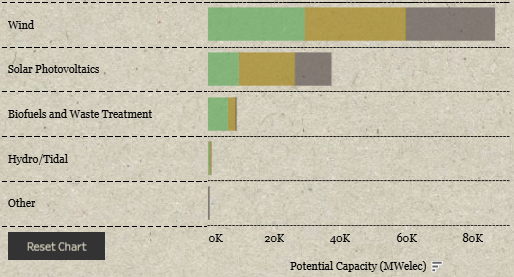
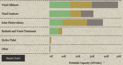
We can achieve this using PARAMETER ACTIONS, and in this blog I will walk you through an example with the sample superstore dataset.
STEP 1: create your bar chart
Just drag Sales to columns, and Category to rows.
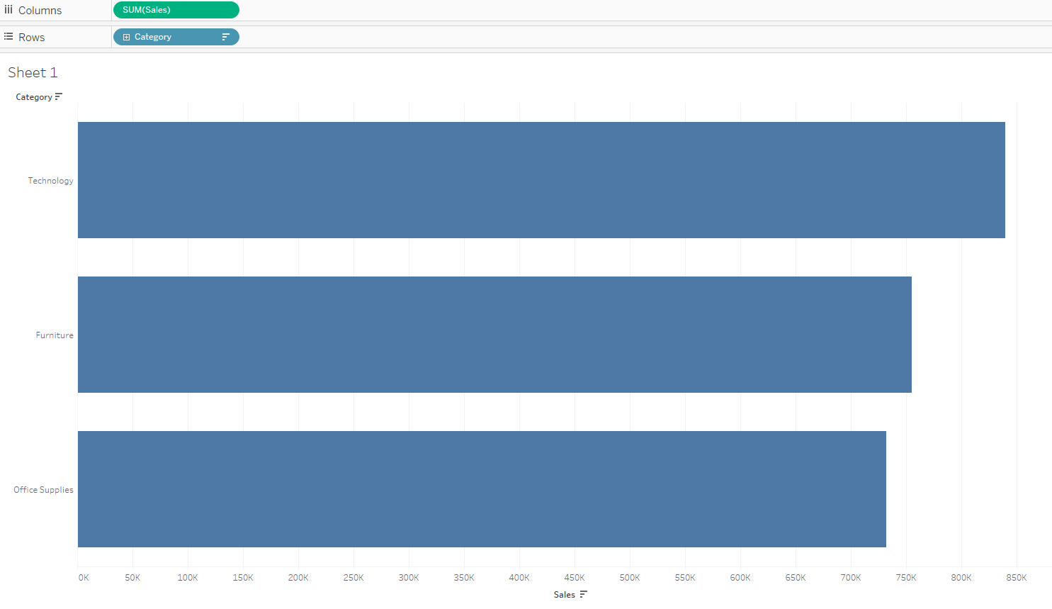
We would like to be able to select one of these bars and have it split into sub-category.
STEP 2: Create your parameter
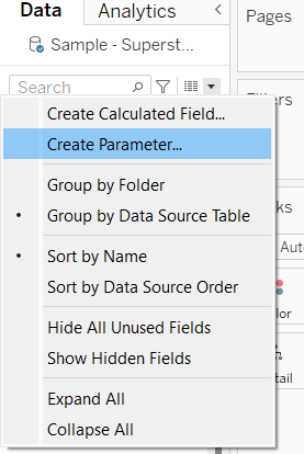
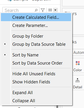
Select create parameter, found in this dropdown above the data pane.
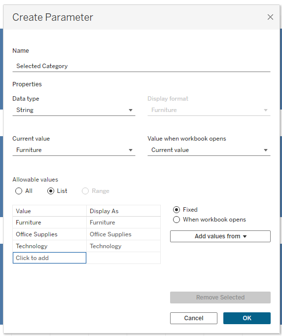
I have called mine 'Selected Category'. Change the data type to 'string', so it can take text values, change allowable values to 'list', and lastly click on the 'Add Values from' button and select 'Category'. All of this will create a parameter allowing a user to select one of these 3 categories from a list.
Your parameter will now exist at the bottom left of your screen. Select it and click 'Show Parameter'
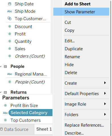
You'll notice it pops up to the top right hand corner of your visualisation, you can change which Category it has selected, but nothing happens... yet.
Step 3: Create your dynamic calculated field
For this interactivity, we need to create a calculated field, one that updates depending on what our 'Selected Category' parameter has selected. It will simply display category, unless that is the category selected, in which case it will display sub-category.
Select 'Create Calculated Field' just above where you found create parameter.
Name it 'Sub-Category Drill Down' and write the following 'IF statement':
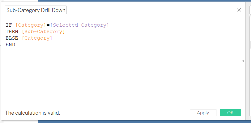
Select 'OK', and drag your new 'Sub-Category Drill Down' onto the view, to the right of Category.
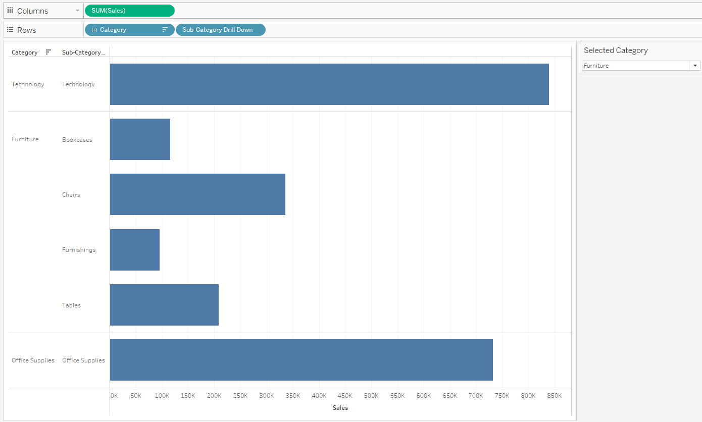
Now we are getting somewhere! Have a go changing the selected category with the parameter and see the view change. We are almost done. The last step is to replace the parameter select box with the ability to simply select a bar.
Step 4: Create Parameter Action
Select Worksheet, and then Actions from the top left of the view:
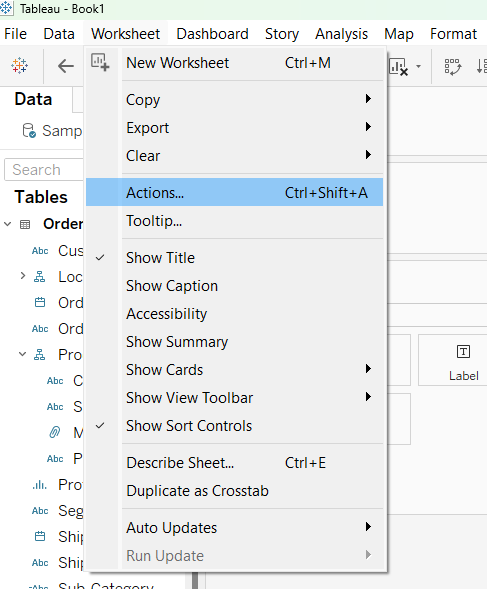
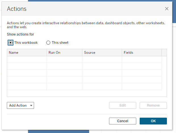
Select 'Add Action' and then 'Change Parameter'.
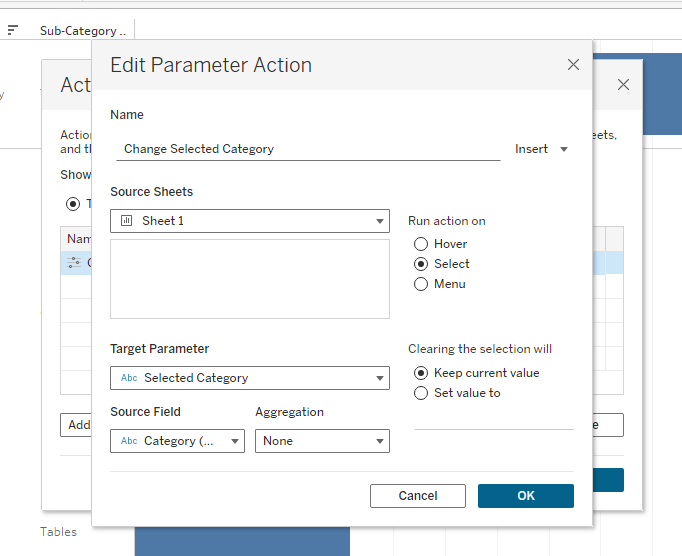
I have named my action 'Change Selected Category'. Have your current worksheet be the source sheet, have the action run on 'select'. Change Target Parameter to the one you created ('Selected Category' in my case). Change the source field to Category. Now when you select a category on your chart, your parameter will change, in turn changing your dynamic calculated field, and finally your chart drill down will change! Select OK.
If all has gone well you should now have your drill down visualisation! As a bit of clean up I would right click on the category field to the left of the chart and deselect 'Show Header', just so that information is not doubled.
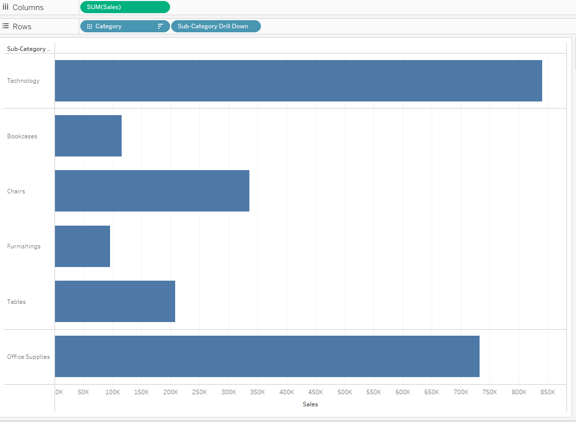
There it is, an interactive, user friendly, drill down bar chart! The next step would be to add a reset button allowing you to undo the drill down. For that follow along my following blog: How to add a reset button to your drill down bar chart.
Cheers!
