Control charts are great for showing a statistical analysis of change over time. They contain a plot over time, a mean average line, a lower limit line, and an upper limit line with the limit lines commonly representing a number of standard deviations.
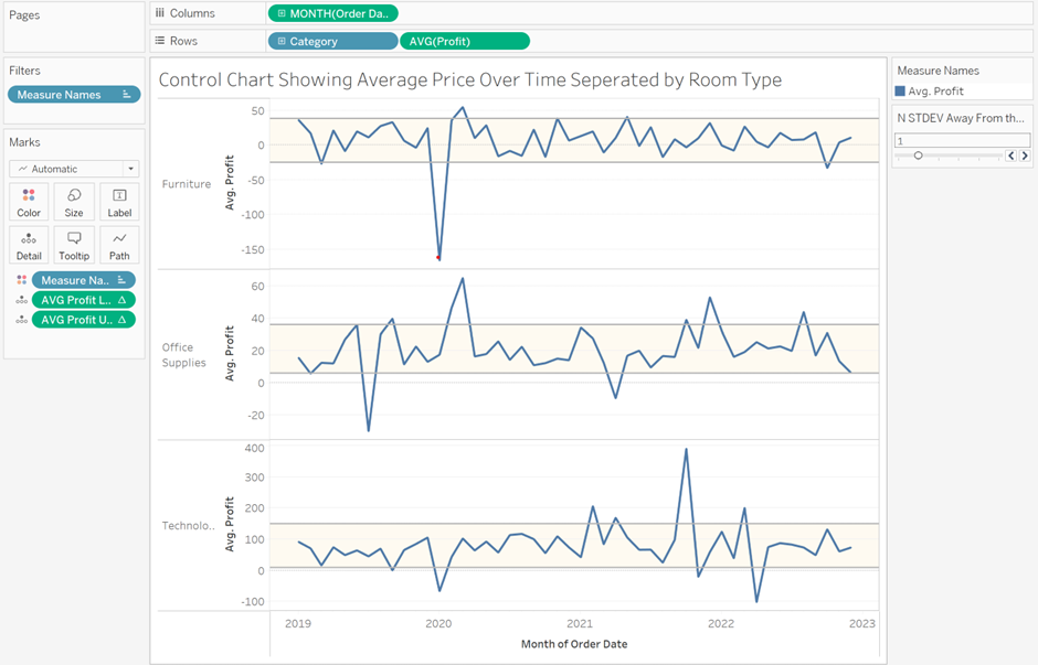
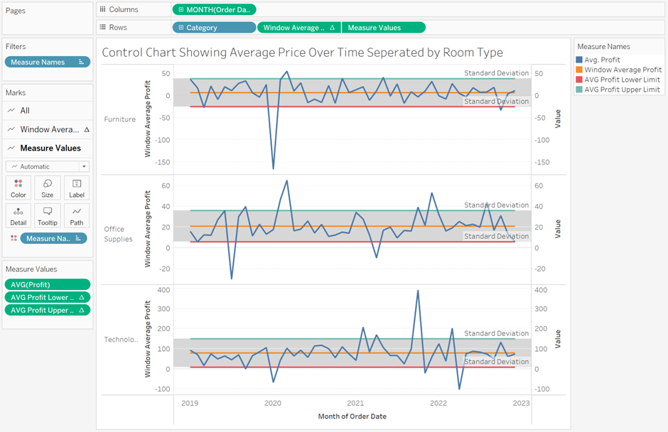
The plot below has been created using the Superstore dataset and shows an average profit over time for each category of products. The lower and upper limit lines represent a number of standard deviations which can be adjusted by the user.
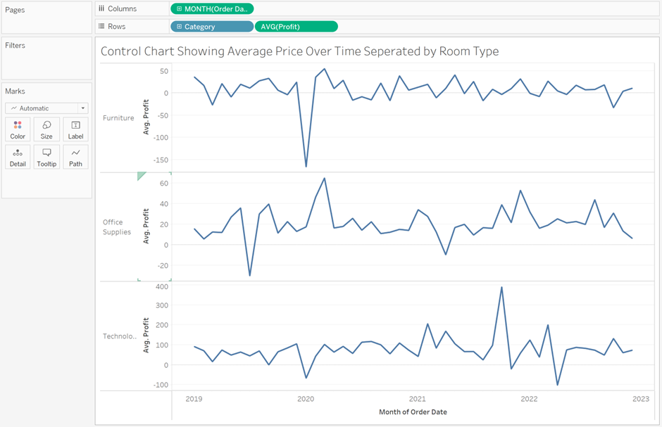
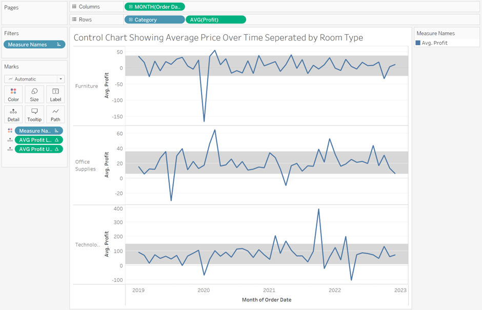
Firstly, start by putting Category and Average Profit on rows and Order Date truncated in continuous months on columns. Right-click the y-axis and make each axis independent so that the scale of each is unique to that spread of data.
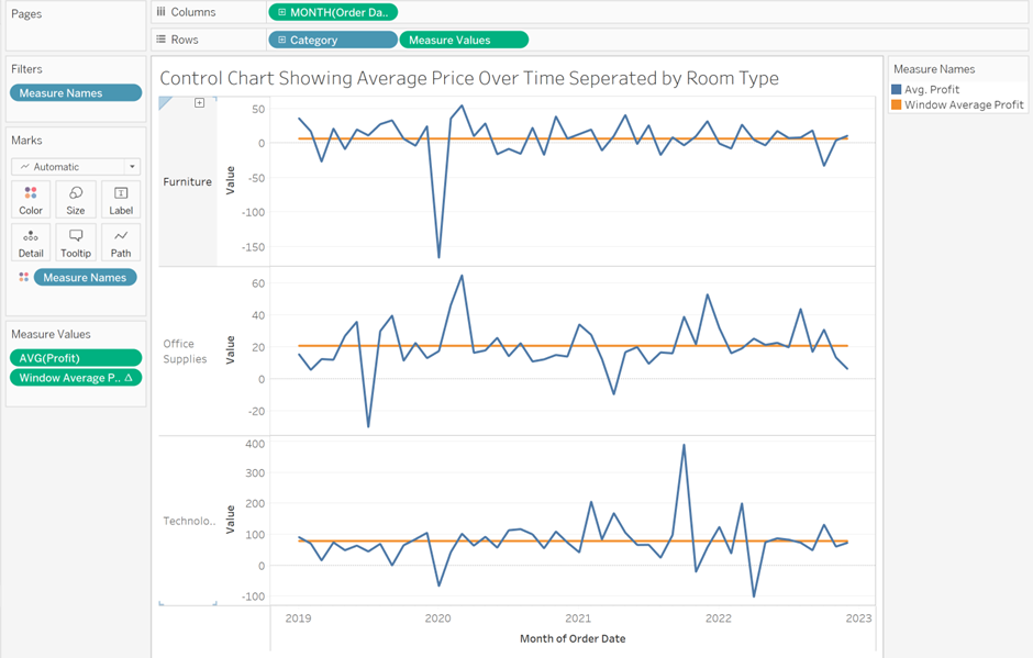
Now let's create an average line for each category. Each category in the view represents an individual window therefore we want to create the following calculated field using the aggregated measure we already have on rows:
Window Average Profit: WINDOW_AVG(AVG([Profit]))
Place this calculated field on the y-axis and Measure Names will be added to the Marks Card with the average Profit and calculated field on Measure Values. An individual average line should now be present on each chart.
We now need to create a calculated field to give us one standard deviation for each category. To do this we again use a window calculation as follows:
Window STDEV Average Profit: WINDOW_STDEV(AVG([Profit]))
One standard deviation represents the profit difference from the mean above and below that contains 68% of the data. Therefore for our upper limit line, we want the window average plus the window standard deviation and for our lower limit the window average minus the window standard deviation. To create these we need two calculated fields with the following formula:
AVG Profit Lower Limit: [Window Average Profit]-[Window STDEV Average Profit]
AVG Profit Upper Limit: [Window Average Profit]+[Window STDEV Average Profit]
Add the AVG Profit Lower Limit and AVG Profit Upper Limit onto Measure Values and move the Windows Average Profit onto rows inbetween Category and Measure Values. Make the Measure Values on Rows a dual axis and right-click the y-axis to make each axis independent. You now have a plot over time with lines for the mean, lower limit, and upper limit of one standard deviation. In order to check that these limits are correct go to the Analytics Pane and drag a Distribution Band onto the Measure Values Pane and change the Value to -1,1 Standard Deviation. The upper and lower limits you created should match those of the Distribution Band.
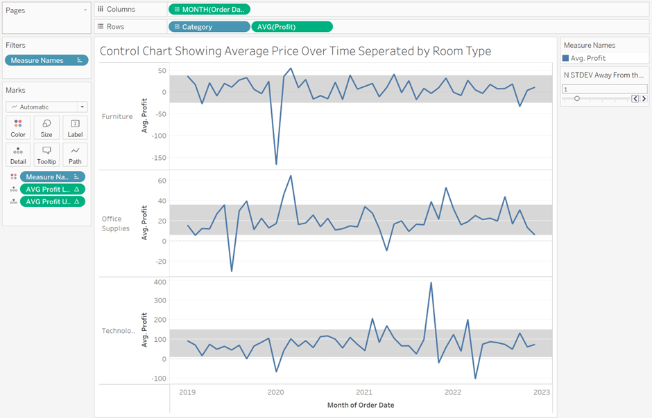
In order to create a limit band move AVG(Profit) from Measure Values onto rows and remove Measure Values from Rows. Add the AVG Profit Lower Limit and AVG Profit Upper Limit Calculations onto detail and drag a Reference Band from the Analytics Pane onto the AVG Profit Pane. Select the Band From Value as the AVG Profit Lower Limit and the Band To Value as the AVG Profit Upper Band.
Finally, to make this Reference Band dynamic create a parameter as follows as show the parameter on your view:
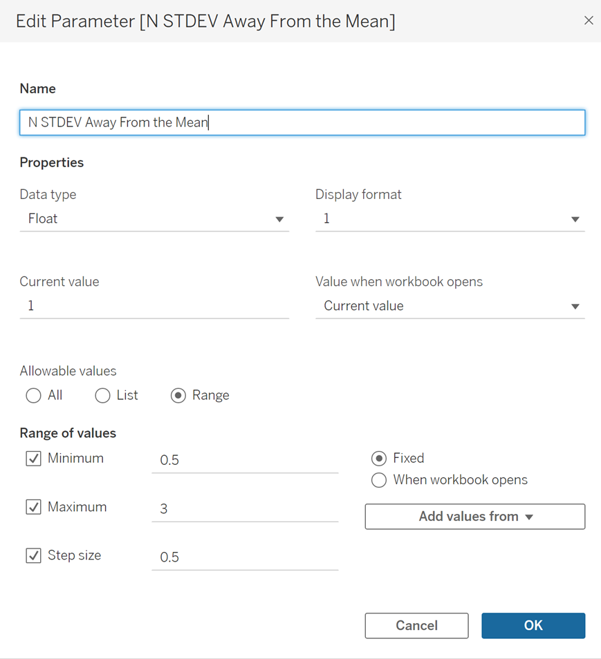
Open the AVG Profit Lower Limit Parameter and edit as below:
[Window Average Profit]
-
([N STDEV Away From the Mean]*[Window STDEV Average Profit])
Open the AVG Profit Upper Limit Parameter and edit as below:
[Window Average Profit]
+
([N STDEV Away From the Mean]*[Window STDEV Average Profit])
The user can now adjust the parameter to change the number of standard deviations away from the mean that the limits correspond to as image at the start of the blog. By selecting either the upper or limit on the Reference Band, right-clicking and selecting edit you can change the colour of the band and the width/colour of the limit lines.