


Creating dynamically changing charts is a valuable way to allow a user to have a greater degree of control over a dashboard, allowing them to choose what dimension and measures they can use. This is done by creating a parameter to select what you want to show. This example will be a simple Top Sneaker Brands Bar chart, where the measure can be change via a parameter.
Let's say we want to see the Top Shoe Brands broken down by different measures, such as Revenue, Quantity Sold, Quantity Manufactured, but on a single chart. For this, we need to create a parameter. Selecting Create Parameter brings up the following menu:
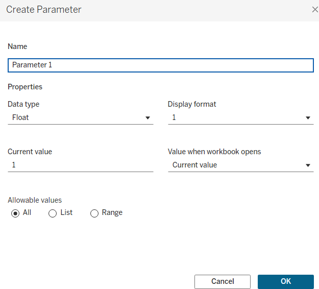
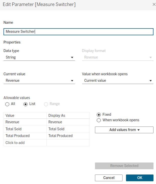
There are many options here, but in this case we want to choose a String data type. Then, selecting the List option from Allowable Values, and renaming it to something memorable, such as "Measure Switcher". A window will appear at the bottom where you can assign your values. In this case, the fields we want to display are Revenue, Quantity Sold, Quantity Manufactured, and so these values are entered in the space provided, and the OK option can be selected, where the parameter is setup as shown below.
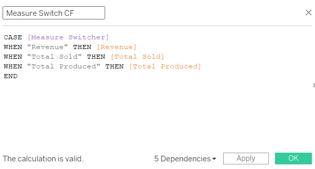
Now that Tableau has the parameter, it is still not sure of what to do with this. The next step is to instruct how the parameter will be used, by creating a calculated field. You can right click on your parameter and select
Create > Calculated Field. In the calculated field, this is where you define what value in the Parameter relates to which Measure. Using the CASE function (with the measure spelt the same way the parameter is), and the structure of CASE [Parameter name] WHEN 'Measure value' THEN [Measure name], we can achieve this.
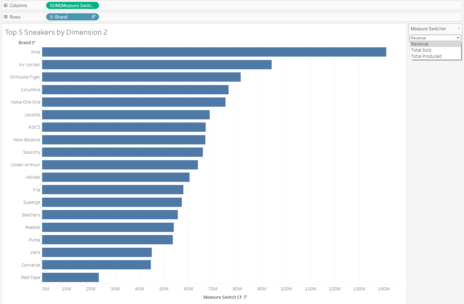
The final step is to add the Parameter to the dashboard. Right click on the Parameter and select "Show Parameter". Make sure you put in the new calculated fields in place of the original measure on your chart. You now have multiple charts in one!
Below is an example of the Top Sneaker Brands, according to the parameters we have set out. As the dropdown shows, different measures can be selected.
Hopefully this helps you create some interesting charts!