


This week proved to be a jam-packed week, juggling a second client project with the same client as our first, while learning some useful techniques in Tableau and Alteryx.
In Alteryx, we learnt about RegEx (Regular Expressions), which is a sequence of characters that specifies a search pattern in text and is used for finding, removing, or replacing parts of a string. It is a universal tool (albeit with different flavours of it) in different software that brings versatility other search tools do not possess. The trick is being vague enough to capture what you want and specific enough to not capture what you don’t want captured. Specifically in Alteryx, there are the _CountMatches, _Replace, and _Match functions of RegEx that can be performed in the Formula Tool. There is also the RegEx Tool in Alteryx, which has the options of Replace, Tokenize, Parse, and Match.
We covered some more advanced techniques, such as using $1 or \1 to refer to the first capture group in order to nest formulae or parse multiple fields in one tool. In addition, we covered how to create a capture group, replacement and non-replacement of different groups, non-capturing groups, and how RegEx can be used to extract different parts from a website by reading the HTML code (due to the tags created).
The Tableau session focused on two topics. The first was Time KPIs, learning the calculations and logic behind creating intuitive comparisons between different periods in time. This will certainly prove valuable going forward, as many client dashboards centre around comparisons between different points in time. Having this knowledge banked and in a workbook to refer back to in future will help not only for overview dashboards but for any other temporal analysis I look to implement. Linked here is my blog on creating Current Day vs Same Day Last Year, as well as blogs on other KPI types written by DS53.
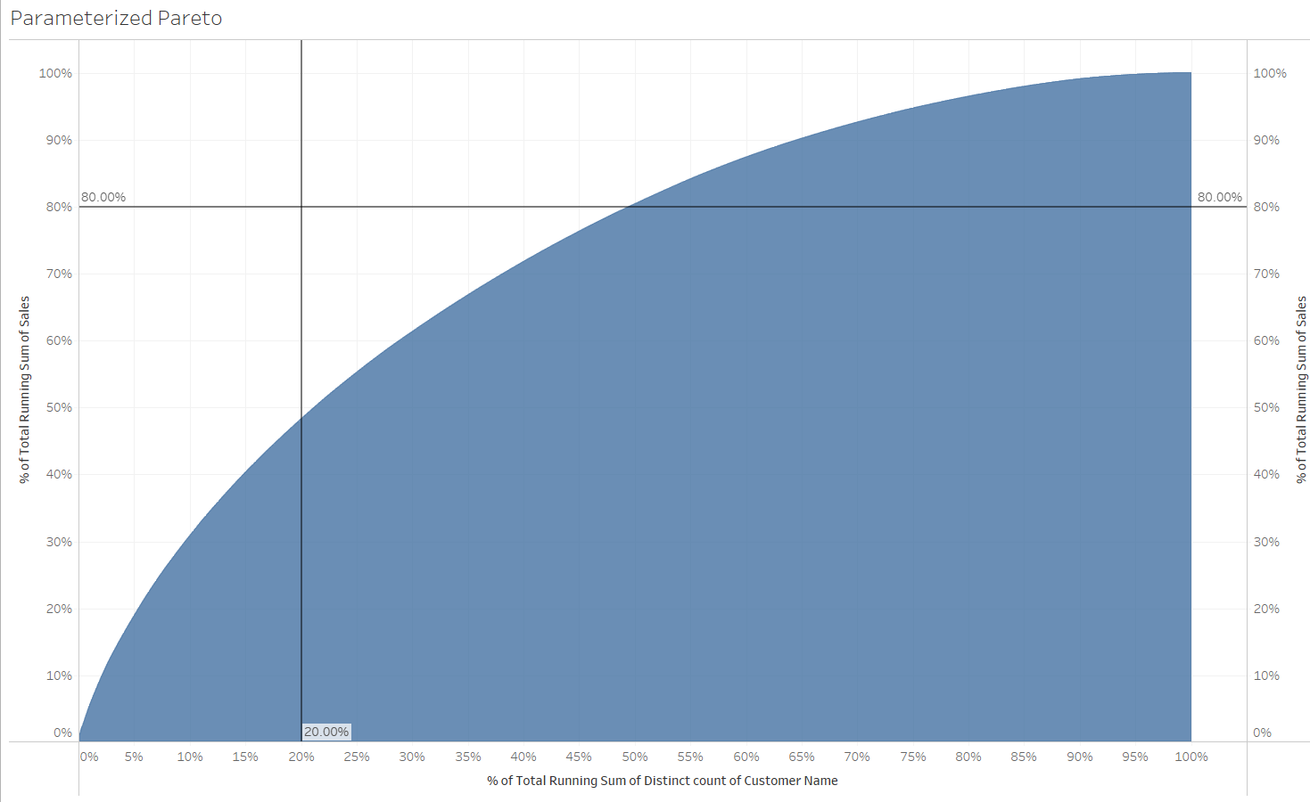
The second section focused on Advanced LODs and Table Calculations which, as difficult as they are to wrap your head around at the beginning, allow for some unique visualisations I hope to carry into future dashboards. For example, below is a Pareto Chart. This follows the principle that "roughly 80% of the effects come from 20% of the causes for any given event". In this example, it visualises that roughly 80% of sales come from around 20% of customers; however, as we can see from the Superstore data, it currently shows 45% of customers responsible for 80% of sales.
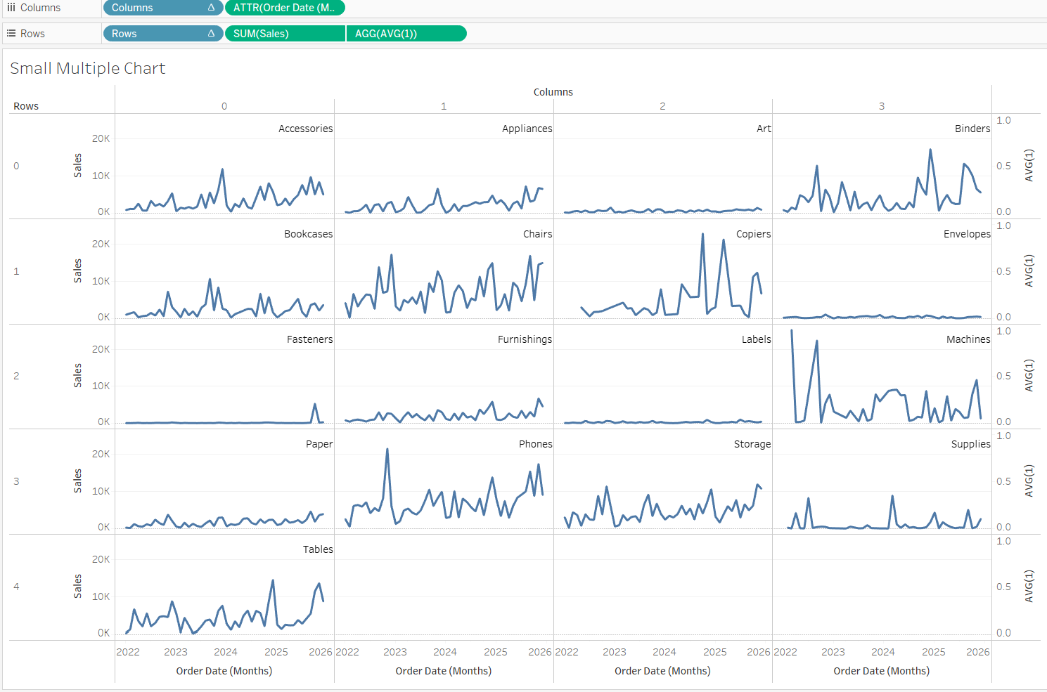
Another useful chart, when used in the correct circumstances, could prove to be very effective for an exploratory dashboard, is the Small Multiples Chart. As shown below, it can help visualise different sub-categories broken down by the same timeframe and measure in a single view to quickly compare them against one another. Here we have all of the sub-categories broken down by sales by month. As shown, it helps to quickly identify that art and envelopes have substantially lower sales across time compared to other sub-categories.
Finally, we had our second external client project this week. Fortunately for our cohort, we had the same client as our last project, which provided a rare opportunity for us not only to improve the work we had finished previously but also to get hands-on with a new dataset and provide insight into another section of the business. I was tasked with taking a Customer and Product Overview dashboard, focusing on the Customer Overview section to improve it based on feedback received, while also enhancing the dashboard’s ability to drive the initial questions about the customers which my colleagues’ dashboards would support through more specific analyses.
This involved including a region filter, rearranging the charts to make better use of the space on the dashboard, and creating a scatter plot that allowed the user greater control in scoping out different customers. This is demonstrated in a recent Workout Wednesday, where you are able to highlight an area and zoom in to that area. With a dashboard action, it allowed me to do this for the Customer Dashboard, including a reset button which made it more intuitive for those less fluent with Tableau. Overall, the project for the cohort went well. Everyone put in a lot of effort for each other, and the client was happy with the deliverables.
Next week promises to be jam-packed, with another client project, our LWTDSL Public Training Session, and a day of Power BI to top it all off.