


After a week of learning the most basic concepts of a data analytics workflow and our first technical lessons in data cleaning and preparation, it was time to start the cycle again this week with the theory of what makes an effective visualization.
For the most part, humans tend to subconsciously register a few basic characteristics of an object (let alone a dashboard) before consciously understanding its meaning or significance. These basic aspects are known as pre-attentive attributes and good execution of these attributes are important to create a striking visualization that conveys meaning while retaining a clean style. These attributes consist of the length, width, orientation, size, shape, enclosure, position, grouping, color hue and color intensity of a viz.
But does that mean we have to pay constant attention to all of these factors during the process of a viz? Do all of these factors matter equally as much? Ideally it’s good to take into account everything but a good viz can be made even just focusing on a few select categories. Even before I started at the Data School when I was in college, I’ve always noticed that charts and graphs made by academics or institutions have always tended to be of poor quality due to their focus on just showing the data rather than communicating deeper insights.
Take for example this chart by Argentina’s National Statistical Institute which showcases the change in Argentina’s economic activity over a 2 year period in 6 month intervals.
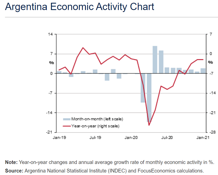
What did you notice about this visualization?
While it communicated the basic message of Argentina’s change in economic activity, breaking it down into monthly and yearly intervals, I am left with some questions as an outsider. What measure is this chart using? Nominal GDP, Real GDP, GDP PPP or something else entirely? A simple label would help this chart immensely. Secondly, the Y-axes have different percentage values for the month-on-month and year-on-year graphs, while there might be a legitimate reason for this, it’s not very obvious why and creates a more confusing chart for those who may not be paying very close attention.
Additionally, not only is one unsure of what measure is being used to gauge economic activity in this chart, but the monthly bar chart is ultimately redundant with the use of the line chart as the line is more granular and conveys the same information in a more visually striking way. In some cases the bars are so miniscule they are unreadable with the line showing the change more clearly.
So how could we clean this chart while retaining the original meaning? While we have not yet started working with Tableau this week, and we don’t have access to the data anyways, good visualization practice can be represented nonetheless. Let’s use Excalidraw as a fun way to recreate this chart.

While this is a crude representation, the basic visual concepts have been improved. With the removal of grid lines and the unnecessary second axis, we have improved the cleanness of the dashboard giving it a simpler appearance without taking away any of the meaning.
We have removed the bar chart and instead replaced it with interactable tooltips that can show the performance of a given point in time in reference to the last month as a more detailed replacement. Arguably the most important thing is including an actual metric to represent change in economic activity from the original.
And so we have constructed a cleaner dashboard without taking away any of the meaning while also improving functionality. Hopefully this showcases the basic principles of removing a dashboard's unnecessary features.