Have you ever seen a dashboard with an image or logo and upon further inspection noticed that it was actually composed of hundreds of data points? Ever wondered how the heck someone has built that? Well in about 5 minutes you'll discover that it's a lot easier than it seems and can be used to take your next fun project to the next level.
STEP 1: Design
First, we want to start off by having an idea of what sort of image we can build with the data we have. There is no hard boundary and you can build any image with any amount of data. However, the quality of the final result will depend on both the amount of data available and the complexity of the image you want to resemble. Images should also be a single colour. Multicoloured images can be used but will require this process to be done multiple times and a way to slice the data points.
0-500 data points - Would be suitable for a simple logo or word (ie. Hulu logo)
501 - 3000 data points - (ie. clip art style image)
3001 - 5000 - More intricate images and logos with more intricate details but may look scarce if the logo is too big or intricate
5001 + can build most images very close if not identical (ie. a sports logo)
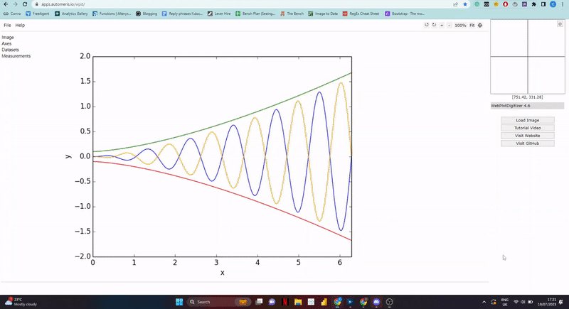
STEP 2: Automeris
Once you have an image visit https://apps.automeris.io/wpd/
This website is used to help identify precise data points and plot them against an image of an existing graph. Its a great tool for people who have an image of a chart and need to identify the data points. Luckily for us, this also works for images.
1) Select load image on right hand side and load in the logo or image you want to copy
2) Select 2D (X-Y) Plot and align axis and proceed
3) It will now take you to a page with your images and a crosshair cursor. Here select the minimum x value followed by the maximum x value. Then do the same for the y axis.
4) Leave points 1 and 2 as default and tick "assume axis is perfectly aligned"
5) Here we can start to assign data points to our image. Start off by changing the "colour foreground" to the colour of the image
6) Hit run
7) You should see data points covering the image. You will want to make sure you have just more image points than the actual data points in your data set. If you have too few or too many you can adjust this by changing the ΔX and ΔY parameters. The higher you go the fewer data points. So if you need more data points select a lower number and vice versa.
8) Once you have the correct amount. Select "view data" on the left-hand side and download it as csv file.
Heres a GIF of the process:
STEP 3: Excel
Once the csv is downloaded we need to prep it before adding it as additional columns to our real dataset. Because we have an excess of data points in our image if we just add the column then a portion of our image will be cut off and not show. Therefore first we must randomise the data before adding it to our data set. To do this, open it in excel and create a new column called 'Rand' then next to the x and y axis cells add rand=(). This will create a random number apply that to the whole column and then sort the data by that random field.
Once that's randomised it means that we will no longer be missing a portion of the image but rather random points throughout which is okay because our image will still be easily recognisable.
Add the x and y columns to our original data set and delete any excess rows which don't have a data point.
STEP 4: Tableau
Now for the easiest part. Build in Tableau. Here we just need to add the x and y axis to the view. Add our unique separator to the definition on the marks card and viola, our image with our data points. From here you can do the further formatting and change the colour and size as you wish. I recommend changing the chart to a circle and adjusting the size of the dots until they're identifiable but still compact enough to create an image.
Now enjoy :)
If at any point you're stuck, here is a video tutorial which you can follow along to:
