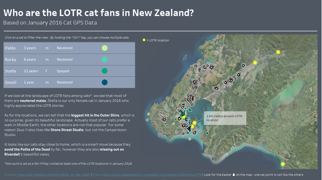
Some thoughts on our first day in Dashboarding Week. Our job was to work with cat tracking data and create a dashboard. We had GPS and "demographic" data about cats' whereabouts, routes, gender, age, etc. in the US, UK and New Zealand. I chose to work with New Zealand cats as I thought it would be cool to add an external data source - some Lord of the Ring locations and play around with that a little bit.
I visualised the south part of Wellington to focus my data. I added some LOTR locations to the map and based on the cat GPS data and determined "who are the LOTR fan cats".
What's I think is good
- I find the idea creative and engaging (while it's also obviously a joke)
- I managed to get pictures in the tooltips which I wanted to learn how to do for some time now
- the colors are clean and consistent
- I also included an Easter egg in the map to add one more layer of fun
What could be better
- the dashboard is quite static, some interaction could increase the fun
- widening the range of data could provide even more fun to scroll around in all New Zealand
- tooltips are cool, but they could use some further formatting and also, they are constructed in a more complicated way than necessary
- further data preparation could enable even more analysis like distance calculations, drawing lines in Tableau, etc.
You can check out the dashboard here:
https://public.tableau.com/app/profile/bogl.rka.lipka/viz/WhoaretheLOTRcatfansinNewZealand/LOTRFanCats