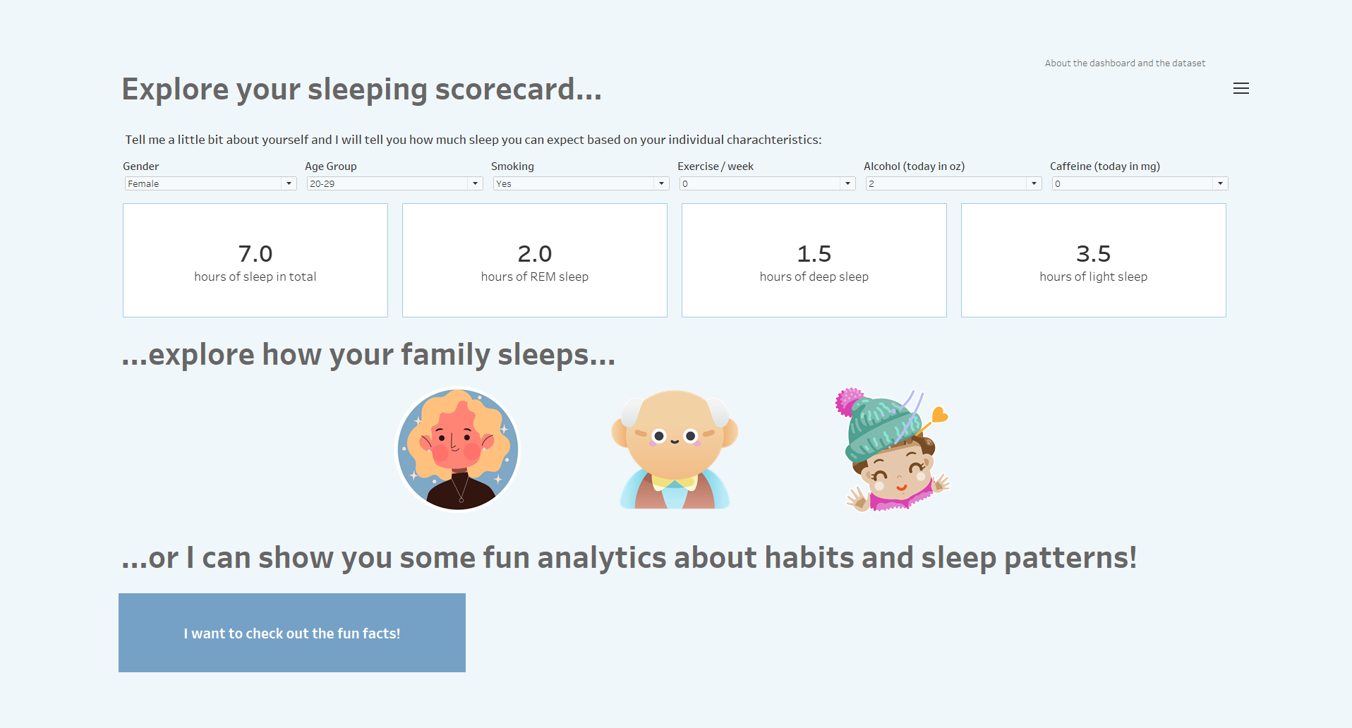
Today was our last day in Dashboard Week. Our task was to use sleeping related data gathered with Apple watches and do whatever we want. :) I decided to go for a fun dashboard, not serious analysis, as the dataset is not too big with 452 people.
I did 3 things:
- sleeping predictions based the users demographics and habits
- sleeping analysis of the "user's family"
- fun facts highlighted based on the data
What went well
- the dashboard is engaging and motivates the users to interact
- I find the dashboard creative
- the structure and layout are clean
What could be better
- I don't have total average is in the dashboard that can be used for personal comparison
- because there is not much data, it can happen that certain combinations of user data will display a null
You can check out the result here:
https://public.tableau.com/app/profile/bogl.rka.lipka/viz/Exploreyoursleepingcard/Overview?publish=yes