


Color psychology is the study of how different colors affect our behavior, emotions, and decision-making. It is a branch of psychology that investigates the psychological effects of color on humans and is used in fields such as marketing, design, and art therapy.
There are a few key principles to understand when it comes to color psychology:
1. Different colors have different meanings and associations. For example, red is often associated with passion, anger, and danger, while blue is often associated with calmness, trust, and reliability.
2. The meanings and associations of colors can vary based on cultural and personal experiences. For example, white is often associated with purity and innocence in Western cultures, but in some Eastern cultures, it is associated with death and mourning.
3. The way a color is used (e.g. its intensity, saturation, and context) can affect its psychological impact. For example, a bright red may be attention-grabbing and energizing, while a muted red may be calming and soothing.
So, how can we use this knowledge of color psychology in dashboards?
In design, color can be used to create or underline a desired mood. For example, a dashboard about natural resources can be colored with green and blue because they are associated with relaxation and calmness. On the other hand, on a sport related dashboard we can use the color red because it is associated with energy and motivation.
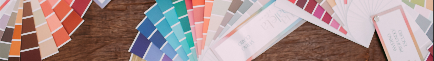
Overview of some colors and their most associated meanings
Red is a bold and energetic color that is often associated with passion and excitement. It’s been shown to increase heart rate and can be used to grab attention and create a sense of urgency.
More on red (external website)
Tableau Public example (external website)
Blue is a calming and trustworthy color that is often associated with reliability and intelligence. It’s been shown to lower heart rate and can be used to create a sense of calm and trust.
More on blue (external website)
Tableau Public example (external website)
Yellow is a cheerful and energetic color that is often associated with happiness and creativity. It’s been shown to increase feelings of happiness and can be used to create a sense of joy and playfulness.
More on yellow (external website)
Tableau Public example (external website)
Green is a refreshing and soothing color that is often associated with nature and growth. It’s been shown to have a calming effect and can be used to create a sense of balance and harmony.
More on green (external website)
Tableau Public example (external website)
Purple is a luxurious and sophisticated color that is often associated with royalty and mystery. It’s been shown to increase feelings of creativity and can be used to create a sense of luxury and exclusivity.
More on purple (external website)
Tableau Public example (external website)
Orange is a warm and energetic color that is often associated with creativity and adventure. It’s been shown to increase feelings of enthusiasm and can be used to create a sense of excitement and playfulness.
More on orange (external website)
Tableau Public example (external website)
It's important to note that color psychology is not an exact science and the psychological effects of color can vary from person to person. However, understanding the general meanings and associations of different colors can be helpful in creating the desired emotional response when reading your dashboard.