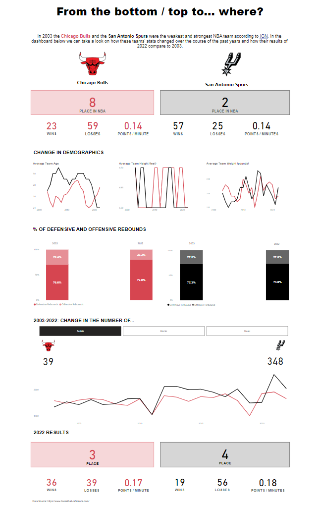
Our second task in the Dashboard Week was to use basketball data between 2003-2022 and do whatever we want in PowerBI.
I chose to compare two teams in one dashboard. I chose one team that was in the bottom and a team that was in the top in 2003 - the Chicago Bulls and the San Antonio Spurs. What I wanted to do is present data trends in different categories that can influence a team’s success. I chose demographics, rebound data and what I understand, technical skills: assist, block, steal. My goal was to generate a dashboard that can provide some hypotheses for why a team became better or worse.
What went well
- today webscraping with PowerBI and data preparation went smoothly
- I like the layout of the dashboard, I find the result clean and well structured
- the navigation buttons help a lot in presenting different dimensions in a clean way
What could be better
- the KPIs at the top and bottom could be clearer marked with the years (2003 / 2022)
- the data point 0.14 (points / minute) could be better explained or another KPI might be actually better to use here
- I don't like that the years that are filtered are still shown on my bar chart
- the line charts are hard to read at the moment, I would add data labels to the end points of the line (next thing to learn how to do in PowerBI)
+1 positive was that I actually decided to change one of the teams - originally I had the Golden State Warriors, not the San Antonio Spurs - in the last 40 minutes before our presentation and I was actually able to swap all data very fast and adjust the colors from blue to black. I like this comparison much better, than what I originally had, namely two of the worst teams from 2003.