


Our first Makeover Monday was about Global Petownership in different countries. We got some feedback given from a paired partner from the UK cohort and had to try to implement it.
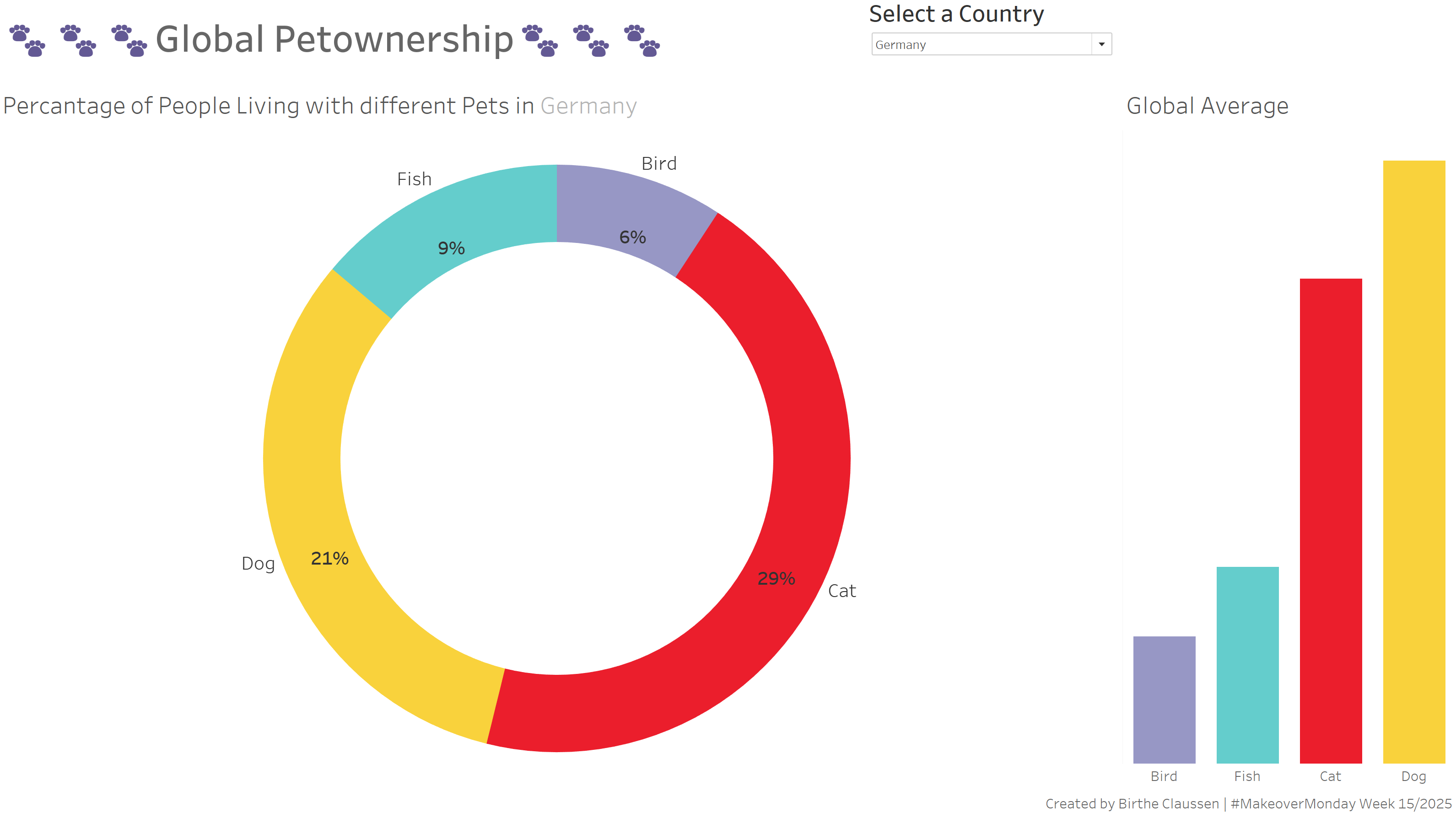
First my try on the MoM. It is okay. I ran out of time… My idea was a donut chart and a stacked bar chart for the average values. But it does not look as good as I imagined initially. I wanted to use icons of the animals, but had no time. Also no colour in the background. It is pretty basic. But the filter works or the donut chart and the country name changes.
My UK partner liked the use of colour and the dynamic country name. (Yay, thanks 🩷)
But I could work on the donut. Rather than using it part to whole for the pet type by country, I could split it into the different animals, so the percentages could add up to 100%.
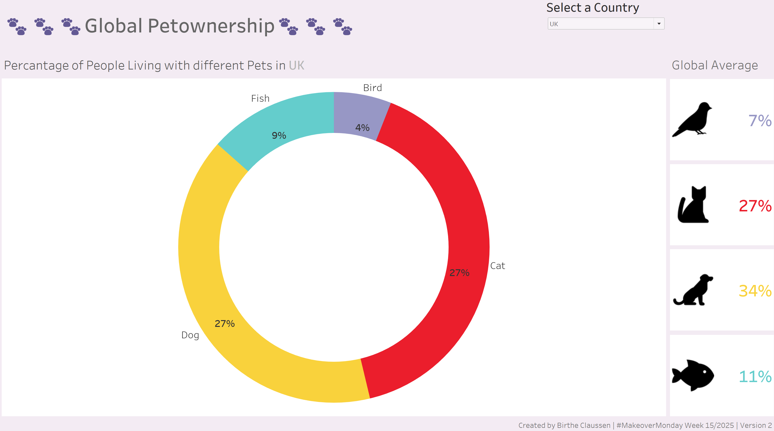
Well… I tried. And failed. Miserably.
First I added some colour to the background and tried to implement some icons, as initially planned. The rest of the time I tried to work on the donut chart, so the percentages would add up to 10. But it did not work. I have watched several tutorial videos and tried different things, but nothing worked. Now I am sad and have a terrible migraine…
Maybe I will put the Animal Averages from the right side to the left side. Also I would love to finally change the donut chart and do it right. But I still have no idea how… Anyway, have a nice day. 😊