


As Data Consultants our job is to take raw data and create understanding and insights from it. When doing this, statistics are a useful method of analysis, using mathematical techniques to help interpret and present data in a useful way.
There are two main types of statistics. Descriptive Statistics which summarise the data we have, and Inferential Statistics which uses a sample of data to make predictions about wider populations. Here we will be focusing on Descriptive Stats.
Averages
Averages are a common way of understanding the tendencies in data. When we think of an average, we often think first of the mean, but there are three main averages used in statistics.
Mean
Mean is the sum of all values, divided by the number of values. Mathematically this looks like:
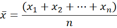
Here each x is a value in our data field, and n is the total number of values.
For example, if our dataset is {2,5,8,10,15}, the Mean = (2+5+8+10+15)/5 = 8.
In Tableau, we can use the function AVG([expression]) to find the mean.
While this is a useful average, it is also very susceptible to outliers, meaning that one outlier can throw the average off quite dramatically. Less effected by outliers is the median…
Median
The Median is the middle value of an ordered data set. If the dataset has an even number of values, it will be the value between the two middle values.
For example, if our dataset is {2,5,8,10,15} the Median = 8. However, if our dataset is {2,5,8,10,15,20}, the Median = (8+10)/2 = 9.
In Tableau we can use the function MEDIAN([expression]) to easily find this value.
Mode
The Mode is the value that appears most frequently in a dataset.
For example, if our dataset is {2,5,8,10,5,15} then the Mode = 5.
This can be used for both numerical and categorical data and is not skewed by outliers. However, it is the least frequently used of these averages, since it can only be used when handling smaller amounts of data.
Normal Distribution: This is where most values in a dataset are close to the mean, with less values the further away you get from the mean. When a dataset is normally distributed, the mean, median and mode will all be equal.
Weighted Average
The weighted average is a way to calculate an average when some points contribute more than others. By assigning ‘weights’ to each data point, you make some values count more than others in the final average.
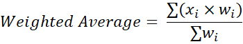
Where x is a value in the dataset and w is the weight of each value.
For example, say you buy 5 items that are £2 each, 3 items that are £3 each and 2 items that are £4 each. Your dataset will look something like this:
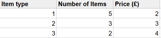
The Mean Average price would be (2+3+4)/3=9/3=£3.
The Weighted Average price would be (2x5+3x3+4x2)/(5+3+1) = 27/10 = £2.70.
This is very useful to use as it offers a precise average that is more representative of the broader dataset.
In Tableau this looks like SUM([value expression]x[weight expression])/SUM([weight expression])
Variability
This section of statistics is used to describe dispersion within a dataset. In the following measures, there are options for Sample or Population data. Population means the data represents the entire group being studied, while Sample is a smaller subset group, which can be used to make predictions about the larger population. Which one is used depends on the data at hand.
Variance
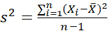
The variance is calculated by finding the average of squared differences between each value and the mean. Mathematically this looks like:
Sample Variance :
Population Variance :
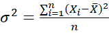
Where X is a value in the data, X̅ is the mean average and n is the number of values.
In Tableau these can be calculated with the functions VAR([expression]) and VARP([expression]) for Samples and Population Variance respectively.
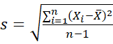
Standard Deviation
Standard Deviation Measures the distance of the data from the mean, telling you how spread out the data is. If this is close to 0, all data points are close to the mean. If it has a higher value, data points are more spread out.
Standard Deviation is calculated by finding the square root of the Variance. Mathematically this looks like:
Sample Standard Deviation :
Population Standard Deviation :
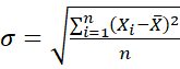
Where X is a value in the data, X̅ is the mean average and n is the number of values.
In Tableau these can be calculated with the functions STDEV([expression]) and STDEVP([expression]) for Samples and Population Variance respectively.
Graphical Representations
Histograms
These are a graphical representation of the distribution of numerical values in the dataset. They are a great way to quickly reveal patterns within the data, such as tendencies, spread of values and outliers.
To make a histogram in Tableau, start by creating bins of equal size. The size of the Bin is the number of values in each one, and this can either be set as a fixed size, or be set as a parameter.
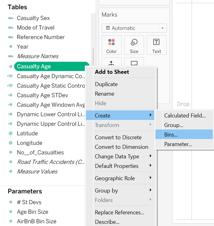
Once the Bins have been made as a new field, the histogram can be built in the worksheet using the Bin for the columns and the numerical field as the rows.
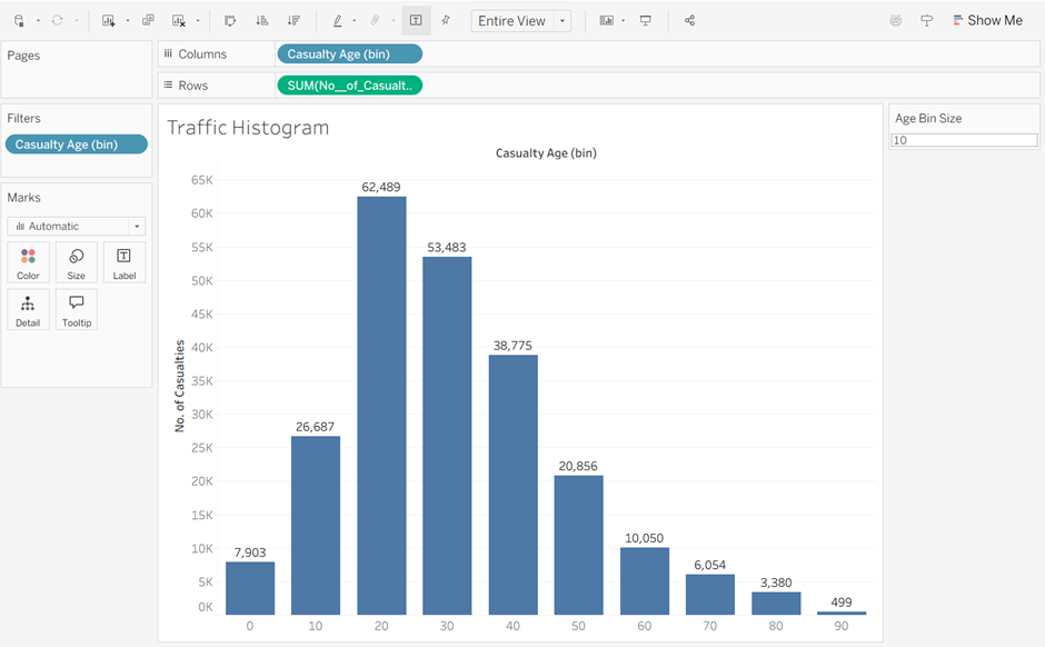
When using these, make sure you consider the real world reasons behind why the data that might impact the shape of the histogram.
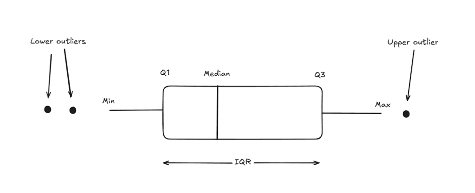
Box Plots
These are a graphical representation of the dataset based on five components: minimum, first quartile (Q1), median (Q2), third quartile (Q3) and maximum. They are a great way to spot trends and variations, identify outliers, and compare groups across datasets.
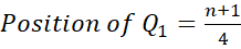
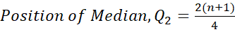
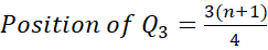
Mathematically the positions of quartiles are worked out as follows:
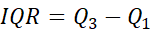
The Interquartile Range (IQR) is composed of the middle 50% of the data (the values between Q1 and Q3). This is important as it helps to identify outliers. To calculate the IQR:
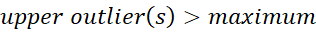
From this we can work out the minimum and maximum of our boxplot:
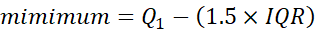
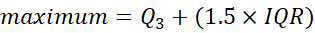
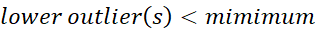
So if the IQR is the middle 50% of the data, the minimum and maximum show where the full 100% of values should theoretically fall. Therefore, anything outside of these are outliers.
Visually this looks like:
To build this in Tableau, put the numerical field in the columns box, and set the dimension as a detail. Set the shape in the marks card to Circle. Then under the Analytics pane, drag the Box Plot option onto the chart.
For example, looking at the distribution of average room price per night in different boroughs of London, the result will look something like this:
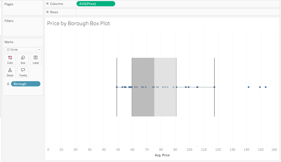
Again, it is important to ask why the outliers here might have happened. In this example, one of the outliers is the borough of Kensington and Chelsea, which is a more expensive part of London to stay in, explaining why it falls outside the expected range.
Control Charts
These monitor the stability of a process by plotting data over time, and consider three components: a central line (mean), an upper control limit and a lower control limit. They are useful in finding problems as they occur in an ongoing process, assessing the effectiveness of change in the process and predicting the range of outcomes within the process.
The upper and lower control limits are usually set at 3 standard deviations either side of the central line, so can be calculated as follows:


Where X̅ is the mean and σ is the standard deviation.
For tips on building control charts in Tableau, check out this blog post.