Have you ever tried to make an infographic in Tableau?
Last week we had the chance to follow the training of Caroline Beavon, a data designer expert of infographics in general and in Tableau.
I really enjoyed her lesson and tips about the topic.
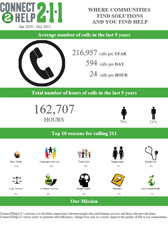
In week two of our training I already went through some infographics in Tableau. We cooperated with Connect2Help 211 and here is what I have created:
The aim was to give a macro picture of what they do, average calls per year and some other important metrics. At the end I want to show the top 10 reasons for calling 211 like basic needs, community services, family life etc…
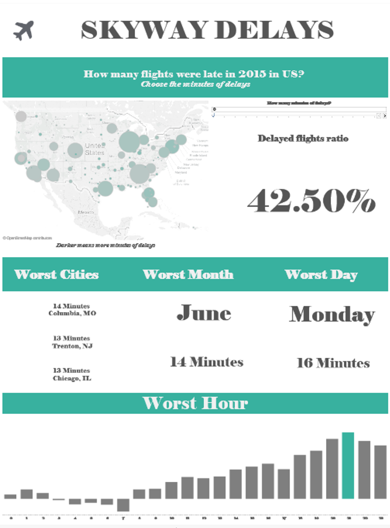
After Caroline’s lesson, I decided to do the project of this week as an infographic, analysing the flight delays in 2015 in US.
Here is what I did:
I created an interactive infographic where you have a parameter where you can choose the number of minutes of delays. Then you get the ratio between the number of flights in late over the total number of flights (and the map changes accordantly).
Then I wanted to focus on the worst 3 airport (with at least 1000 flights per year), worst month, worst day of the week and worst hour.
Hope to make another infographic soon!


