


To finish off refresher week, we completed a two-day dashboard week project focused on PitchSide Pro, a global e-commerce retailer specializing in football kits, national team gear, boots, and fan culture collectibles.
Over the last five years, their business has expanded through seasonal spikes, digital channel growth, and major tournament moments. Executive leadership needed a centralized, low-cognitive-load reporting suite to understand revenue drivers, monitor discounting impact, and optimize customer acquisition channels.
To address this brief, I built a two-page report suite featuring an Executive Overview and a Customer Overview.
Data Modeling
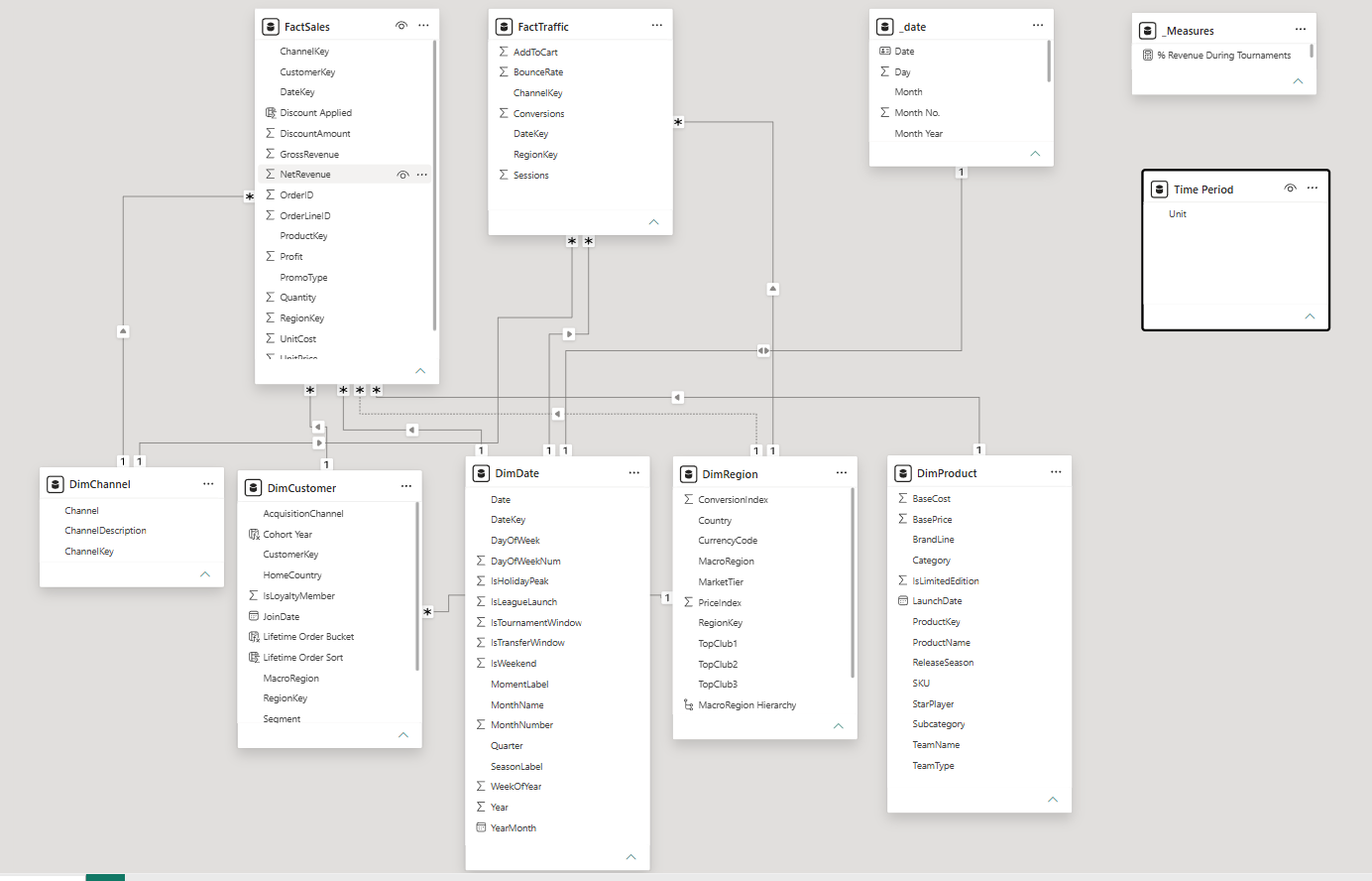
The backend relies on a clean star schema linking FactSales and FactTraffic to core dimension tables (DimCustomer, DimProduct, DimChannel, and _date). To support dynamic time-intelligence slicers and clean visual organization, I also created dedicated _Measures, _Date, and Time Period tables.
Design & Build Process
After initial sketching, I moved into Power BI to construct the core visual layout. One key design decision was implementing a toggle button allowing executives to switch all card metrics between Previous Month and Previous Year baselines.
While this created a seamless user experience on the canvas, it required building out a robust set of underlying DAX measures across all 10 core KPIs—which consumed a significant portion of the build time.
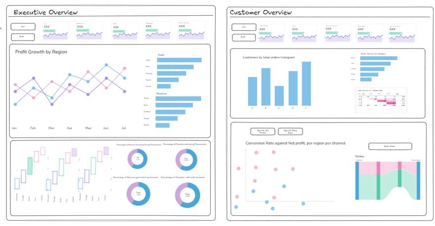
During the build, I continuously iterated on chart choices when initial concepts failed to deliver clear insights. For example, I completely reworked the bottom row visuals across both pages to better highlight cross-channel performance:
- Promotional Erosion: Uncovered that while heavy Q4 discounting drives huge gross volume, tournament event windows (like Continental Championship 2024) generate significantly higher average daily profit margins without sacrificing brand value.
- Mobile App Dominance: Replaced a standard channel distribution with an inverted engagement scatter plot, immediately proving that APAC and EMEA Mobile Apps drive our highest conversion rates .
Dashboard: