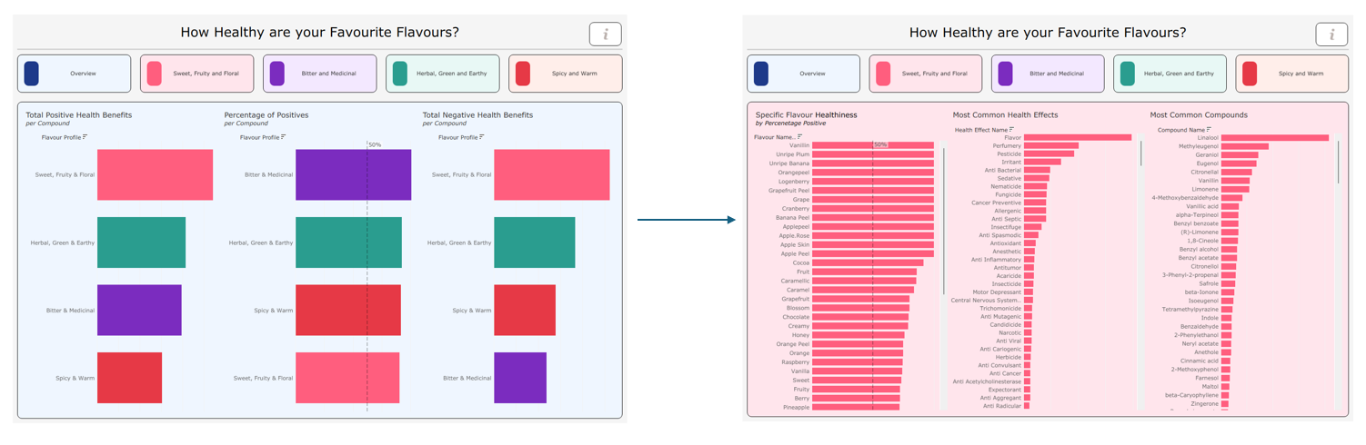
As there was no blog for yesterdays dashboard and last week was a prologue this is my first official dashboard week blog.
Todays brief was to use the 1Gb FooDB dataset the worlds largest data source on food chemistry and biology. The goal was to build a clean 1920x1080 interactive Tableau dashboard for food education purposes.
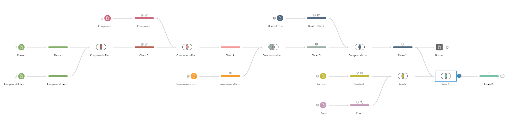
I prepped the data using Tableau Prep excluding many of the tables that I didn't believe would be useful.
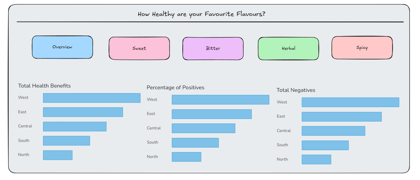
I sketched a rough plan for a dashboard with buttons at the top allowing the user to swap between different flavour profiles for a detailed breakdown beneath.
In order to make the dashboard functionality I made extensive use of dynamic zone visibility.
For each of the buttons I created a sheet with a single calculated field.
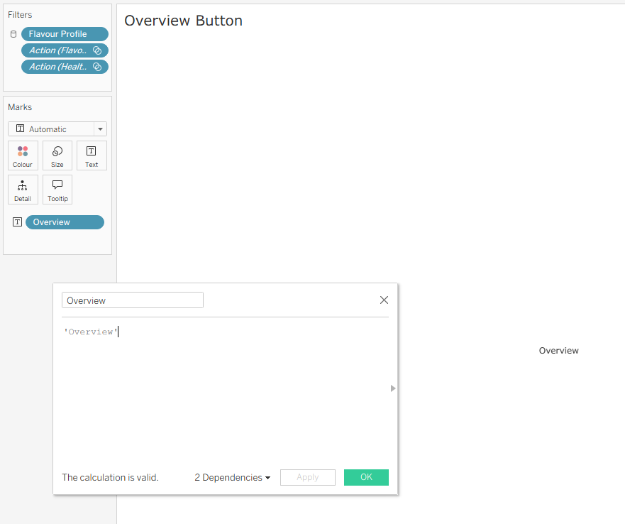
I then created a parameter that I would use these buttons to change.
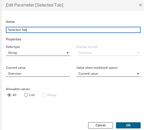
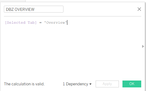
Next was creating calculated fields for each of my buttons again using overview as an example:
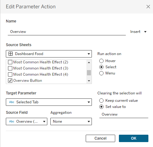
And finally configuring the dashboard actions:
And this was my final dashboard analysing the health impacts and compound make-up of different flavour profiles, with the ability to swap between the top tabs: