


The brief today was to make an infographic dashboard using the kaggle my anime dataset. This contained data on the users and the anime including their popularity and rating scores.
The data didn't require much cleaning this week and I decided to just used the anime_cleaned table.
My idea for the sketch as to keep it quite broad. I wanted to have a genre bubble chart and then cards displaying the top 3 most popular and the top 3 highest rated title.
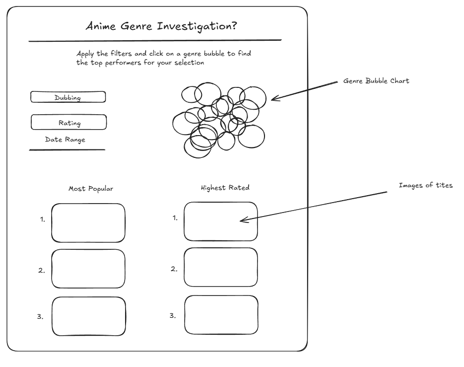
Overall I spent most of my time formatting this cards as for an infographic the most important part was the visual appeal.
This is the final dashboard I ended up with:
The feedback I received was good and that it looked nice just should swap out the donut chart for a heatmap to better visualise differences in magnitude.