


Tooltips are a powerful way to allow users to find out more information about a visualisation on Tableau. They function by either hovering or functioning over a data point. The tooltips hold whatever information the creator wants. They can be used to highlight data, or send a message to your user.
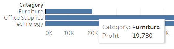
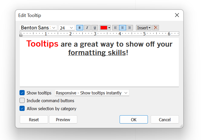
By default, a tooltip should bring up the information displayed on the chart by hovering over a data point. These are very generic and can be amended via the tooltip icon on the marks card. A popup window will appear once clicked, which holds a text box where text can be edited as usual, as well as adding in fields within <>. These fields can be selected by the insert drop down in the top right corner. Cells can also be right clicked and the ‘Show Tooltip’ option selected to add the field into the tooltip. With some design, tooltips can look well-made and can really highlight the information which needs to be conveyed.
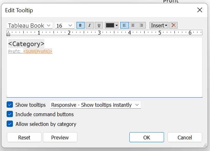
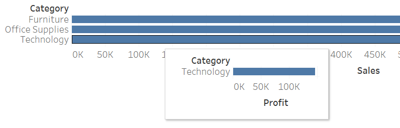
Other insert options include adding the date of the data connection, which is useful when a dashboard or chart gets consistently updated. Parameters can also be added which will change as the parameters do. A more recent update in Tableau is the option to add charts/sheets to the tooltip, giving further usability, being able to drill down to do further analysis into the data point.
Be sure to make sure the tooltip is on the required marks card, for example when using a double axis. The tooltip may need to be on a different marks card, or both, to correspond to all the tooltips.
Another useful way of using tooltips is to send a message to the user. A common way of executing this is to create a button as a new sheet. To create a button a singular shape is needed. Once the tooltip on the sheet is edited to hold the desired message, once the user hovers over the shape, the information will be displayed.
Command buttons are the options which appear once clicking on a data point. The options include exclude, group, etc and they appear at the top of the tooltip. The option ‘Include Command Buttons’ can be unchecked the remove this option for the user.
Once confident with the simple tooltip interface, the best thing to do is to get in and try different combinations to see what fits with the style of dashboard being created. A combination of the use of features can really make a difference to how much information a user can get when using your dashboard. Remember, as tooltips are designed to display quick information, too much information on the tooltip can make it hard for the user to take in.
Beau Foletti | DS33