


After a challenging first week of data cleaning, I was excited to start exploring the creative side of data. Week two of training taught me that not al data communication is the same. As consultants, were tasked with helping clients make sense of their data and a huge part of that involves choosing the right communication style for the right audience; Exploratory or Explanatory.
The Exploratory Analysis
The exploratory approach, as its name suggest, allows users to explore the data in their own way. This is done by giving them the tools to find their own answers, especially when there's no specific question or defined answer. The approach is usually geared at an audience who is an expert in the field of data. Some elements you would expect are:
- Elements of interactivity such as filters, drilldowns, buttons etc.
- Clear signposting to guide the user on how to interact with the dashboard.
- Dynamic Text tooltips & labelling, titles and colours.
- Flexibility in units and scale of data.
An example of exploratory analysis below shows these elements:
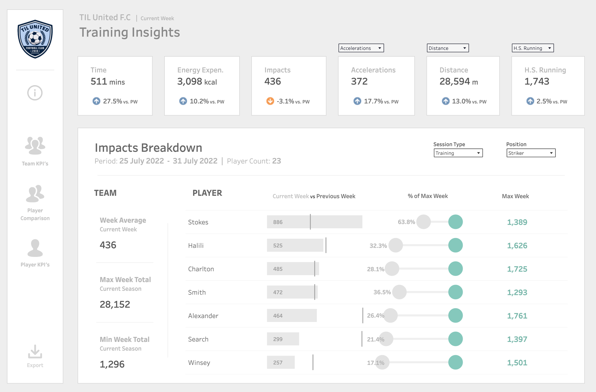
This dashboard of training insights is a perfect example of an explanatory analysis. The filters would allow the user to dig into the data themselves and helps with unpredictable questions about the data. It does not provide a final answer, rather it provokes a question.
The Explanatory Analysis
The explanatory approach on the contrary is about guiding your audience to a specific conclusion. Its about translating key findings into a clear, predefined narrative regardless of the user. It is often used when the user has a specific question or doesn't have the luxury of time to browse the data. Some elements you would expect are:
- Summaries of key insights of the data.
- Guided journey through the data.
- Little to no interactivity.
- Emphasis on pre-attentive attributes to aid ease of grabbing important info.
An example of explanatory analysis is shown below:
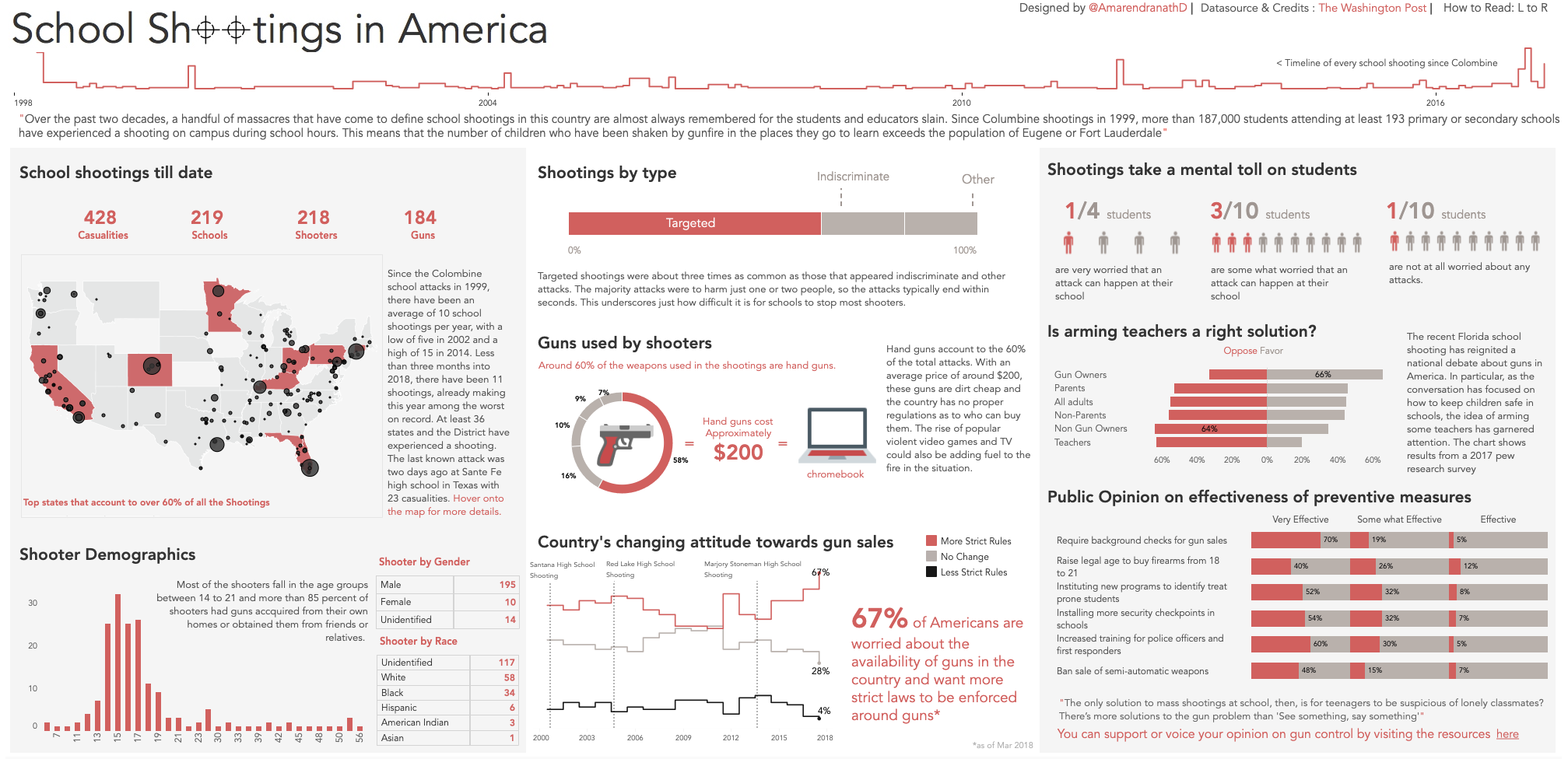
The school shooting in America dashboard is clear and has a tailored message. It makes good use of colour to drive home the key insights and contains a guided journey so you can see the timeline of school shootings. There's barely any interactivity on the dashboard as the a clear story is being told.
Which approach should you use?
In the real world, you might have to combine both approaches to get the best elements of both. This would of course depend on the use case. Some users might want the information quick and digestible but not know exactly what they want answered. These are the cases where you might opt for a more explanatory viz. On the other hand, some users might know exactly what they're looking for, but still want some flexibilty with the data, hence you create a more explanatory dashboard. So ultimately, understanding your client and their needs is the deciding factor in what type of approach you choose for your dashboard.