Today's challenge for Dashboard Week was to tackle The Data Lab Data Visualisation Competition 2025 brief. The goal was to create a compelling visual story on the co-benefits of climate action using the UK Co-Benefits Atlas dataset, focused on clarity, persuasion, and insight.
Plan
9:00 - 10:00: Go over brief, get data and begin exploring
10:00 - 10:30: Research on the atlas and infographic styles
10:30 - 11:30: Sketching and data prep planning
11:30 - 12:00: Data prep execution
12:00 - 12:30: Lunch
12:30 - 3:00: Build and format dashboard
3:00 - 3:30: Presentation prep
The Data and Preparation
The UK Co-Benefits Atlas models the socio-economic co-benefits of reaching net-zero across 46,426 small areas in the UK from 2025 to 2050. The dataset included eleven co-benefit categories (air quality, physical activity, excess cold, etc.) organized with years as columns and co-benefit types as rows for each small area.
To enable temporal visualization showing how benefits grow over time, I needed to unpivot this wide-format structure in Power Query, transforming year columns into rows with a Year field and corresponding Benefit values. I also filtered the data to focus solely on air quality benefits for Greater Manchester.
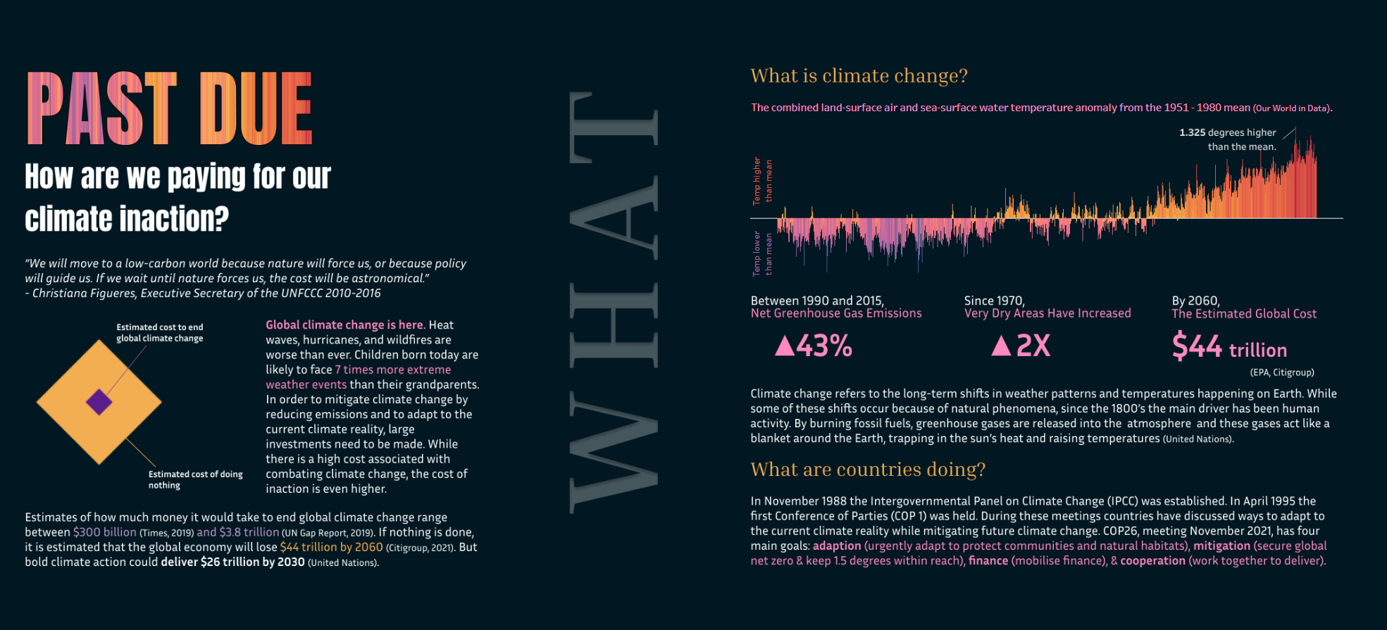
The Inspiration


The Sketch
In short, there wasn't a proper sketch. The plan I'd set at 9 AM had completely fallen apart by 11:30. I'd abandoned the formal sketching phase entirely because I still hadn't locked down what story I was telling. Without a clear narrative, I couldn't sketch the dashboard structure.
By the time I finally committed to focusing on air quality benefits for Greater Manchester (around 12 AM), I was already behind schedule. I'd burned nearly two and a half hours on indecision.
Today's task was different from previous Dashboard Week challenges, and significantly more demanding than I anticipated. I severely underestimated how much time it would take just to get my head around what the task was asking for.
The biggest issue? I didn't know the extent of the data until I started prepping it. The brief was open-ended: choose your audience, choose your co-benefits, tell a story. That freedom became paralyzing.
I started by exploring multiple narrative angles:
- The "fuel poverty solution" combining excess cold and dampness
- An "active travel dividend" focusing on physical activity
- A comprehensive overview of all co-benefits
- An inequality angle (until I realized I didn't have deprivation data)
But here's where things derailed: every time I thought I'd found a story, I'd abandon it because it required heavy data prep. The data was in wide format with years as columns, meaning any temporal analysis needed unpivoting. I kept trying to avoid this, looking for shortcuts, hoping to find a story I could tell with the data as-is.
This was not the best decision. Instead of biting the bullet and doing the data prep for one solid story, I wasted time trying to shrink the scope, which paradoxically meant I was spending more time being indecisive than I would have spent just committing and prepping the data properly.
The Dashboard
In the end, I produced a dashboard in the style of an infographic

