Using colour can add a lot of impact to visualisations. It can be used to show distinct categories, highlight when certain targets have been met, or highlight values that fall into different categories. This blog will provide a brief introduction into the different ways colour can be applied to visualisations in Power BI, for cases where adding categories to the legend is simply not enough! The examples will be using the sample superstore data.
Method 1 - using a rule
The below bar chart shows the sum of sales for each sub-category in the data table. The two shades of blue indicate whether the sum of sales for a sub-category is above or below a sales target. The sales target is set at as 200,000 which is indicated by the reference line.
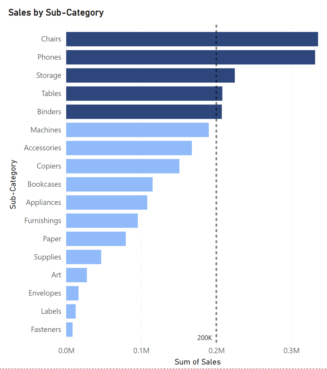
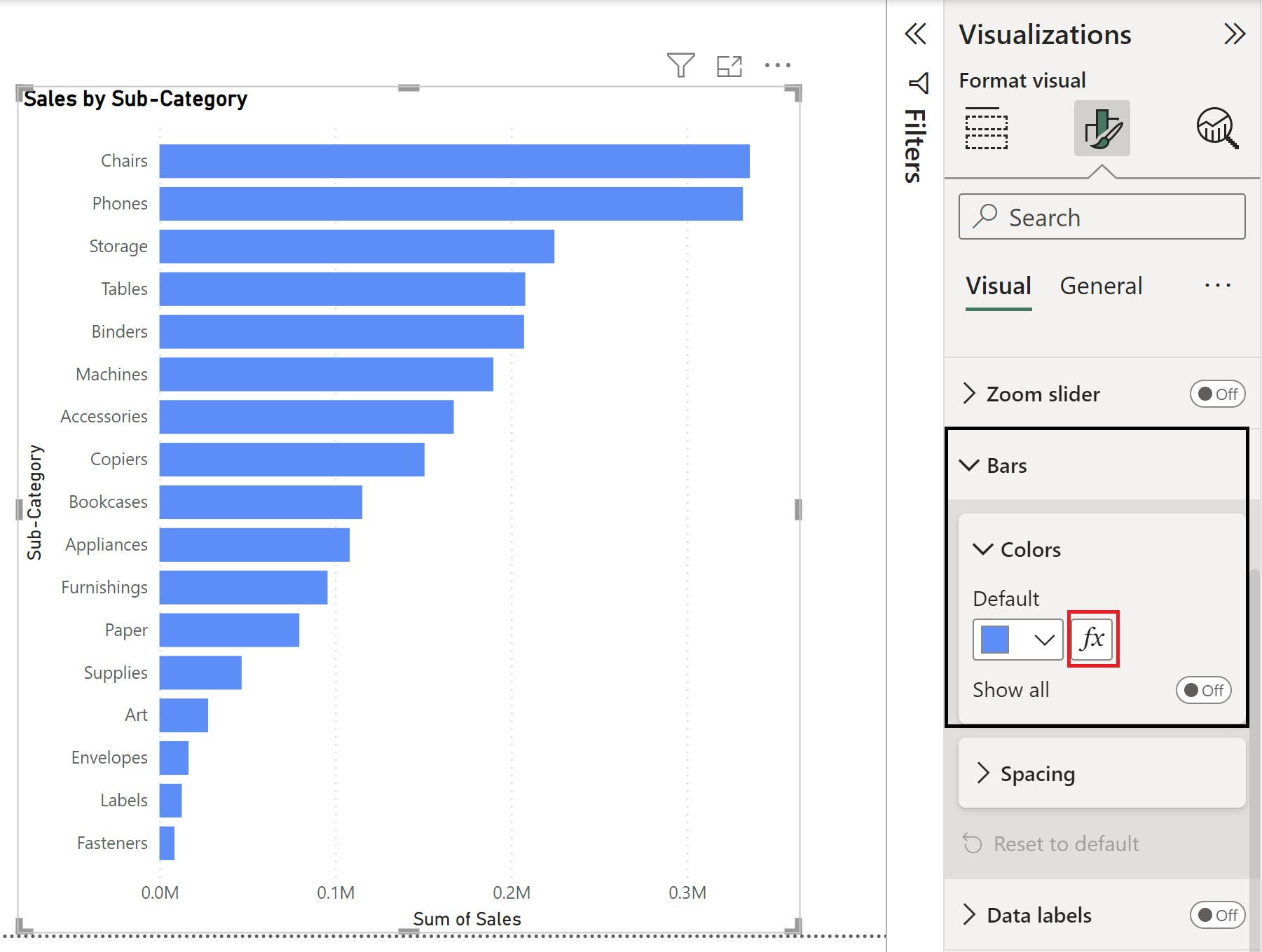
Start by creating a bar chart with sub-category on the y-axis and the sum of sales on the x-axis.
Following this, select format visual from the visualization bar. From there, click to expand 'Bars' and select the conditional formatting option (this is highlighted in red below).
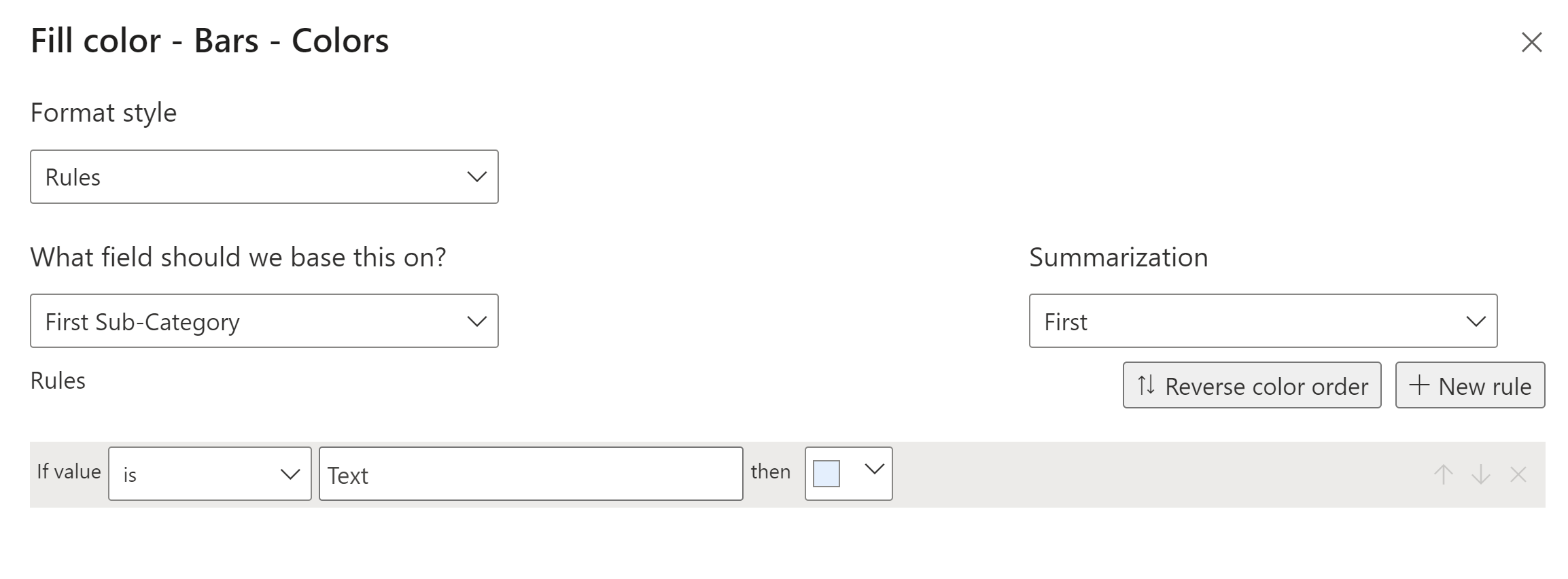
This gives us the following starter box:
Currently, there are no conditions set so the rule is based on the sub-category field.
To format our bars, we need to set the field to be based on the sum of sales and enter our conditions. For the 200,000 sales target, our condition looks as follows:
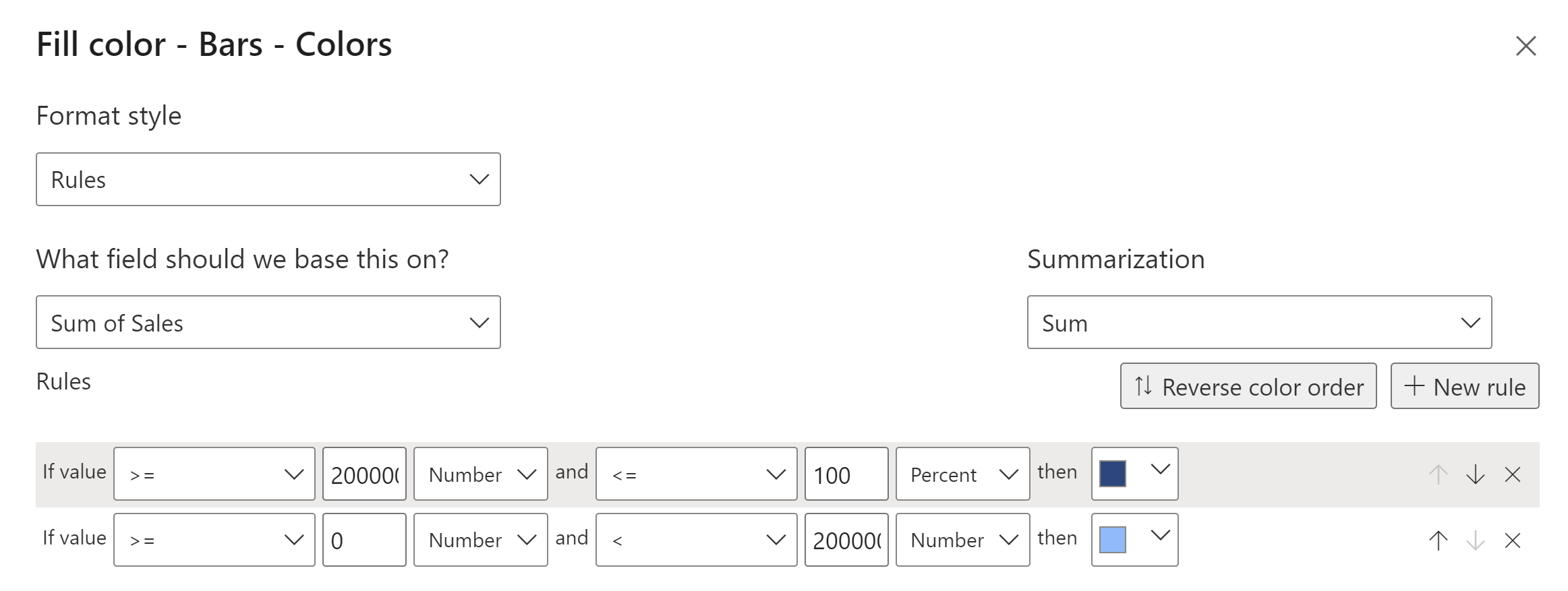
It reads, if the value of sales is above or equal to 200,000 and is below or equal to 100% (this helps future proof our visualisation if we do not know what the max sales value is going to be) , then colour the bars dark blue. If the value is above or equal to 0 and is below 200,000, then colour the bars light blue.
To set the constant line, follow these steps:
Select analytics, expand 'constant line', enter the desired value, in our case this is 200,000 to clearly signify to the viewer where the benchmark is for the change in colour. Below the value there is also the option to format the line itself.

Method 2 - using a measure
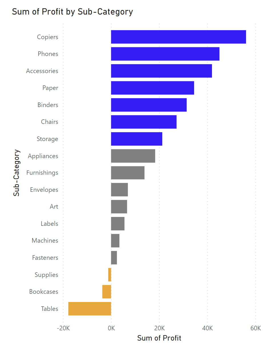
The second version of this bar chart has three colours based on set groups. The three defined groups are, sub-categories with profit above 20,000, sub-categories with profit below 20,000 but above 0, and negative values. As there are values below 0 we have used distinct colours rather than a gradient of the same colour.
To create these three colour groups, we can create a measure = using an 'IF' statement. The first step of this is to select 'Measure Tools' from the top ribbon, followed by 'New Measure'. That will generate calculation field, which is highlighted in red below.

The calculation for the three colour groups can be written as follows:

Once the measure is written, simply press enter. Now the measure will pop up in the data pane on the far right. To add the measure to the bar chart, follow the steps as in method one to select format visual from the visualization bar. From there, click to expand 'Bars' and select the conditional formatting option. Once the pop up opens, add the new measure as the field to colour the bars.
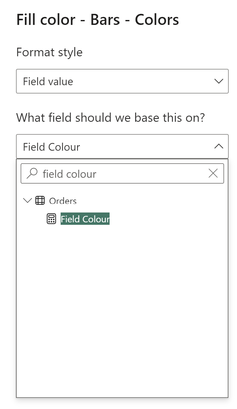
Click enter and the bars will change. The thresholds can be adjusted in the measure calculation. Note: the colour names in the measure will bring back the default shade on the bar chart. To choose specific shades, search for the colour hex code and include that instead of the colour name.
I hope these two methods prove a useful starting point to explore the different options for conditional formatting of colour in Power BI. Stay colourful!
