DS53 recently, had the opportunity to explore Tableau Next, Salesforce's next-generation analytics platform, with a focus on "agentic analytics" powered by AI.
We were able to play around with various elements of Tableau Next , from building a semantic model to creating our first dashboards on the platform.
Step 1: Build Your Semantic Model
A semantic model is essentially a metadata layer that translates complex raw data into business friendly terms and logic.
It defines standardised metrics, hierarchies, and relationships across different data sources, ensuring everyone in the organisation uses a consistent, single source when analysing data and generating insights.
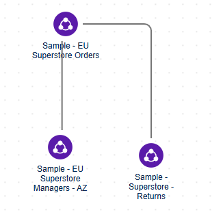
The model is built using relationships similar to Tableau by dragging and dropping tables.

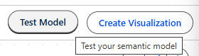
You can also test the semantic model on the top right to ensure it is working the way you want to.
For this session we only used a small model to build our charts and dashboards.
Step 2: Creating a Pulse Metric in Tableau Next
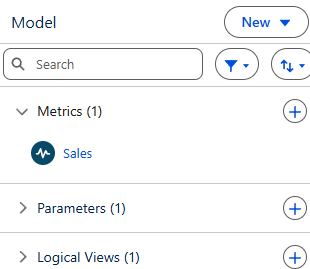
In the semantic model, you are able to create a metric which can be integrated into a dashboard.
First start by specifying what you want the metric to show
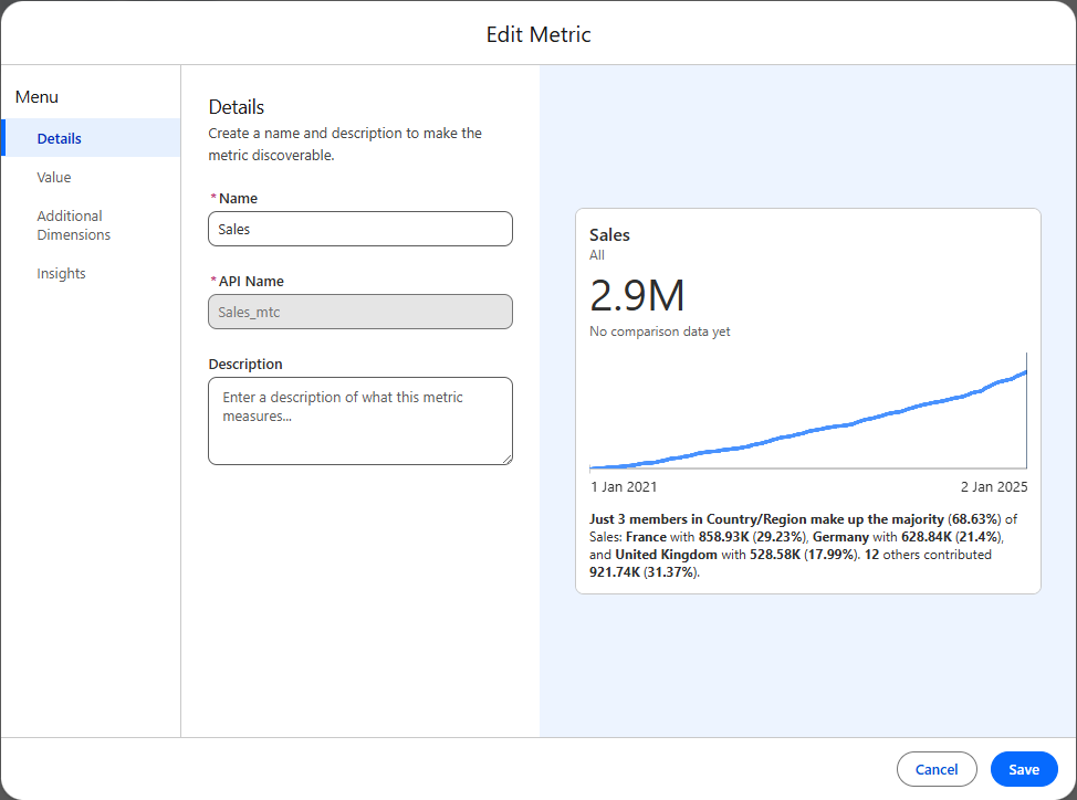
By adding additional dimensions you are setting out what filters will impact your metric, therefore if you know you want your dashboard to filter for certain fields make sure to add these at this stage.

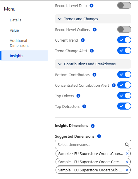
You can also edit the insights section to reflect what you would like to show specifically.
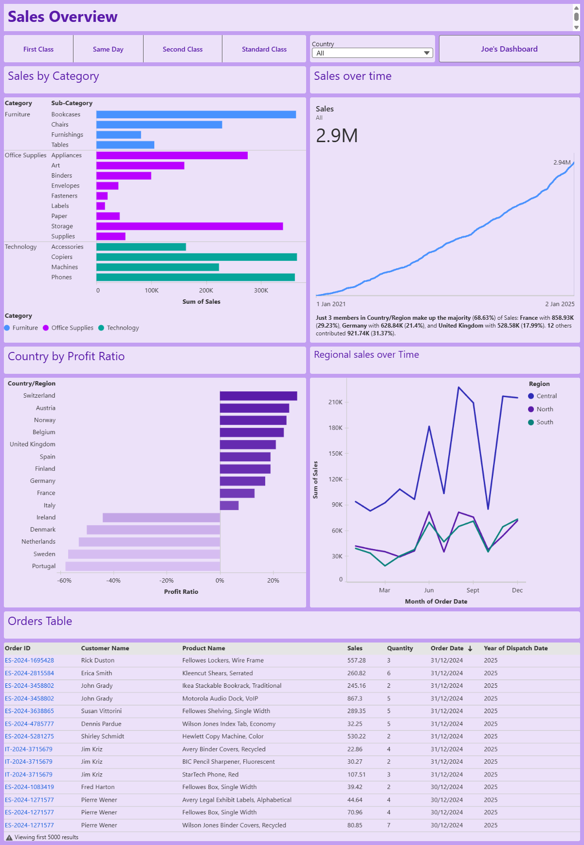
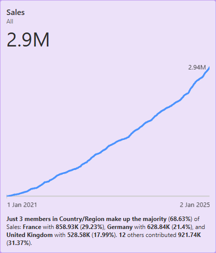
With some formatting on a dashboard you could be left with something like this
Step 3: Building Charts
When building charts in Tableau Next the interface is very similar to Tableau Desktop or Public, where drag and drop is your best friend.
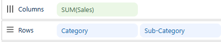
To build this Bar Chart split by Category and Sub-Category for Sales, you would need to configure the window as follows:
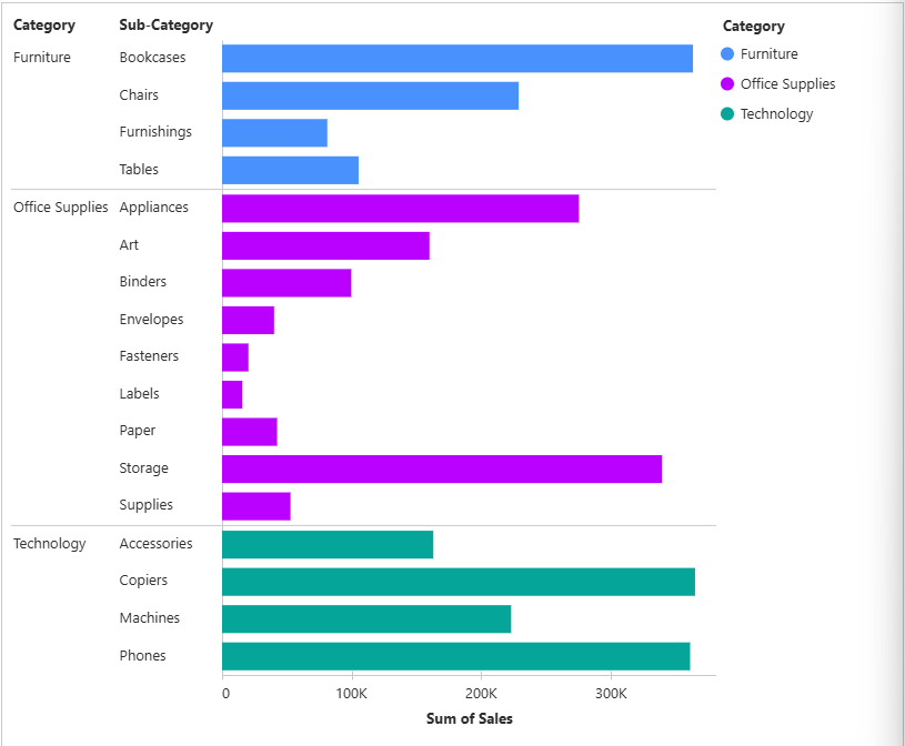
Drag, category and sub-category to rows and Sales (which will be aggregated automatically) and then add category onto the colour marks card.
To create this Profit Ratio by Country/Region, configure the window as follows:
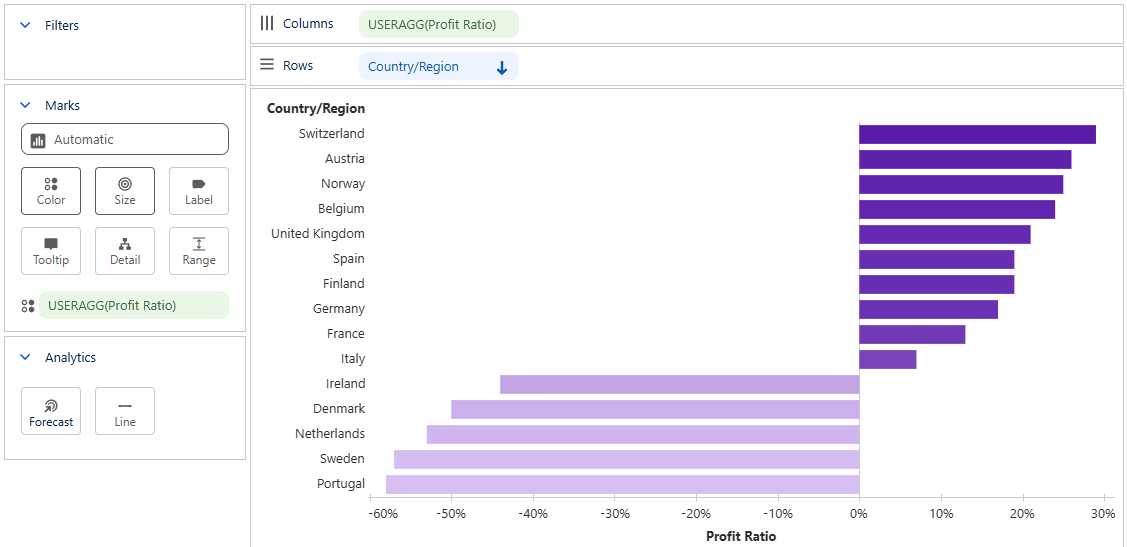
For continuous data, Tableau Next also has the ability to include forecasting

Step 4: Building a Dashboard
Using the toolbar at the top of the screen will allow you to add your visualisations and metrics you have build as well as adding navigation buttons and filters.

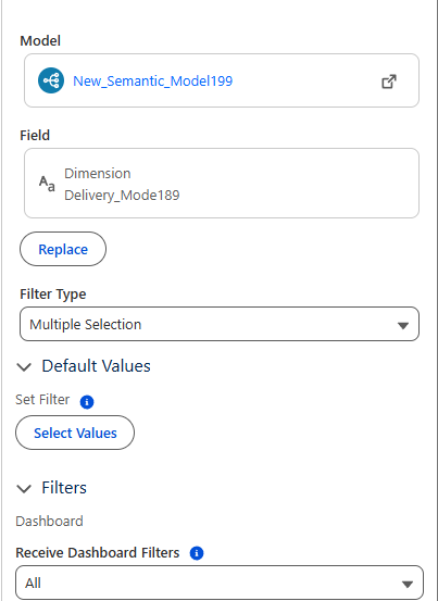
You can add filters by adding toggles

Then configure this by adding the field you want to filter by and set what this will impact.

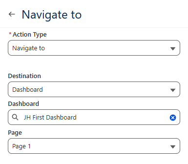
You can also add navigation buttons to your dashboard

I have chosen to navigate to Joe's Dashboard, so the user can click between ours.
Building a dashboard is intuitive on Tableau Next as there is a grid that the charts will be guided by.
Once I did some formatting, I created the following dashboard.